mail@majadadaria.com
@majada.daria
Majada Daria Greenhalf is a Berlin-based multidisciplinary Creative working across creative direction, design and experiential systems. Most recently she was Creative Design Lead at Highsnobiety, where she spent almost six years shaping holistic brand worlds, visual ecosystems, and partnership projects around global cultural moments. She led creative direction, visual identity, apparel graphics and spatial design for platforms such as the Not In-City Series and the Berlin Flagship store, building narrative driven brand activations with a diverse range of partners including Nike, Neue Nationalgalerie, the Barbican, Bar Basso, Coca-Cola and Disney. As Art Directior for Chapter: The Design Journal, a biannual print publication and multimedia platform, she developed a cohesive visual voice that unified automotive, product design, art and travel within one editorial framework. Prior to Highsnobiety, she worked within cultural and luxury contexts including leather goods brand MCM and consulting agency Stan Hema. This earlier experience in editorial and brand design continues to inform her system-driven approach to storytelling.


Creative Direction for Highsnobiety & The Barbican, 2025 — Creative concept and set design for the ‘Brutalist High Tea’ at the Barbican Centre. Reimagining a classic High Tea through the lens of Brutalist architecture, we brought together creatives for a roundtable discussion on London's evolving cultural landscape, against the stunning backdrop of the Barbican Conservatory. Collection design by Bella Conlan.
Creative Direction for Highsnobiety & The Barbican, 2025 — Creative concept and set design for the ‘Brutalist High Tea’ at the Barbican Centre. Reimagining a classic High Tea through the lens of Brutalist architecture, we brought together creatives for a roundtable discussion on London's evolving cultural landscape, against the stunning backdrop of the Barbican Conservatory. Collection design by Bella Conlan.
Creative Direction for Highsnobiety & The Barbican, 2025 — Creative concept and set design for the ‘Brutalist High Tea’ at the Barbican Centre. Reimagining a classic High Tea through the lens of Brutalist architecture, we brought together creatives for a roundtable discussion on London's evolving cultural landscape, against the stunning backdrop of the Barbican Conservatory. Collection design by Bella Conlan.
Creative Direction for Highsnobiety & The Barbican, 2025 — Creative concept and set design for the ‘Brutalist High Tea’ at the Barbican Centre. Reimagining a classic High Tea through the lens of Brutalist architecture, we brought together creatives for a roundtable discussion on London's evolving cultural landscape, against the stunning backdrop of the Barbican Conservatory. Collection design by Bella Conlan.
Creative Direction for Highsnobiety & The Barbican, 2025 — Creative concept and set design for the ‘Brutalist High Tea’ at the Barbican Centre. Reimagining a classic High Tea through the lens of Brutalist architecture, we brought together creatives for a roundtable discussion on London's evolving cultural landscape, against the stunning backdrop of the Barbican Conservatory. Collection design by Bella Conlan.
Creative Direction for Highsnobiety & The Barbican, 2025 — Creative concept and set design for the ‘Brutalist High Tea’ at the Barbican Centre. Reimagining a classic High Tea through the lens of Brutalist architecture, we brought together creatives for a roundtable discussion on London's evolving cultural landscape, against the stunning backdrop of the Barbican Conservatory. Collection design by Bella Conlan.


Art direction for Chapter Magazine, Issue N° I–VII, 2018–22 — Chapter Magazine: The Design Journal is a biannual design publication and multimedia platform, spanning print, digital, video and podcast formats. Chapter brings together disciplines including architecture, product design, mobility, art and luxury within one editorial framework: Acceleration vs. deceleration, opulence vs. understatement, luxury vs. minimalism, comfort vs. adventure. This thinking shaped the visual language Creative Director Timo Schmitt and I developed: generous imagery and expansive photo essays paired with an attention to subtle details that often reveal the most compelling parts of a story. The graphic design balances a grid-based layout and a scientific-style type hierarchy with bolder gestures, including the characterful typeface Droulers by Bureau Brut and elevated paper and print quality. Creative Director Timo Schmitt, Editor-in-Chief Clemens Steinmüller.
Art direction for Chapter Magazine, Issue N° I–VII, 2018–22 — Chapter Magazine: The Design Journal is a biannual design publication and multimedia platform, spanning print, digital, video and podcast formats. Chapter brings together disciplines including architecture, product design, mobility, art and luxury within one editorial framework: Acceleration vs. deceleration, opulence vs. understatement, luxury vs. minimalism, comfort vs. adventure. This thinking shaped the visual language Creative Director Timo Schmitt and I developed: generous imagery and expansive photo essays paired with an attention to subtle details that often reveal the most compelling parts of a story. The graphic design balances a grid-based layout and a scientific-style type hierarchy with bolder gestures, including the characterful typeface Droulers by Bureau Brut and elevated paper and print quality. Creative Director Timo Schmitt, Editor-in-Chief Clemens Steinmüller.
Art direction for Chapter Magazine, Issue N° I–VII, 2018–22 — Chapter Magazine: The Design Journal is a biannual design publication and multimedia platform, spanning print, digital, video and podcast formats. Chapter brings together disciplines including architecture, product design, mobility, art and luxury within one editorial framework: Acceleration vs. deceleration, opulence vs. understatement, luxury vs. minimalism, comfort vs. adventure. This thinking shaped the visual language Creative Director Timo Schmitt and I developed: generous imagery and expansive photo essays paired with an attention to subtle details that often reveal the most compelling parts of a story. The graphic design balances a grid-based layout and a scientific-style type hierarchy with bolder gestures, including the characterful typeface Droulers by Bureau Brut and elevated paper and print quality. Creative Director Timo Schmitt, Editor-in-Chief Clemens Steinmüller.
Art direction for Chapter Magazine, Issue N° I–VII, 2018–22 — Chapter Magazine: The Design Journal is a biannual design publication and multimedia platform, spanning print, digital, video and podcast formats. Chapter brings together disciplines including architecture, product design, mobility, art and luxury within one editorial framework: Acceleration vs. deceleration, opulence vs. understatement, luxury vs. minimalism, comfort vs. adventure. This thinking shaped the visual language Creative Director Timo Schmitt and I developed: generous imagery and expansive photo essays paired with an attention to subtle details that often reveal the most compelling parts of a story. The graphic design balances a grid-based layout and a scientific-style type hierarchy with bolder gestures, including the characterful typeface Droulers by Bureau Brut and elevated paper and print quality. Creative Director Timo Schmitt, Editor-in-Chief Clemens Steinmüller.
Art direction for Chapter Magazine, Issue N° I–VII, 2018–22 — Chapter Magazine: The Design Journal is a biannual design publication and multimedia platform, spanning print, digital, video and podcast formats. Chapter brings together disciplines including architecture, product design, mobility, art and luxury within one editorial framework: Acceleration vs. deceleration, opulence vs. understatement, luxury vs. minimalism, comfort vs. adventure. This thinking shaped the visual language Creative Director Timo Schmitt and I developed: generous imagery and expansive photo essays paired with an attention to subtle details that often reveal the most compelling parts of a story. The graphic design balances a grid-based layout and a scientific-style type hierarchy with bolder gestures, including the characterful typeface Droulers by Bureau Brut and elevated paper and print quality. Creative Director Timo Schmitt, Editor-in-Chief Clemens Steinmüller.
Art direction for Chapter Magazine, Issue N° I–VII, 2018–22 — Chapter Magazine: The Design Journal is a biannual design publication and multimedia platform, spanning print, digital, video and podcast formats. Chapter brings together disciplines including architecture, product design, mobility, art and luxury within one editorial framework: Acceleration vs. deceleration, opulence vs. understatement, luxury vs. minimalism, comfort vs. adventure. This thinking shaped the visual language Creative Director Timo Schmitt and I developed: generous imagery and expansive photo essays paired with an attention to subtle details that often reveal the most compelling parts of a story. The graphic design balances a grid-based layout and a scientific-style type hierarchy with bolder gestures, including the characterful typeface Droulers by Bureau Brut and elevated paper and print quality. Creative Director Timo Schmitt, Editor-in-Chief Clemens Steinmüller.
Art direction for Chapter Magazine, Issue N° I–VII, 2018–22 — Chapter Magazine: The Design Journal is a biannual design publication and multimedia platform, spanning print, digital, video and podcast formats. Chapter brings together disciplines including architecture, product design, mobility, art and luxury within one editorial framework: Acceleration vs. deceleration, opulence vs. understatement, luxury vs. minimalism, comfort vs. adventure. This thinking shaped the visual language Creative Director Timo Schmitt and I developed: generous imagery and expansive photo essays paired with an attention to subtle details that often reveal the most compelling parts of a story. The graphic design balances a grid-based layout and a scientific-style type hierarchy with bolder gestures, including the characterful typeface Droulers by Bureau Brut and elevated paper and print quality. Creative Director Timo Schmitt, Editor-in-Chief Clemens Steinmüller.
Art direction for Chapter Magazine, Issue N° I–VII, 2018–22 — Chapter Magazine: The Design Journal is a biannual design publication and multimedia platform, spanning print, digital, video and podcast formats. Chapter brings together disciplines including architecture, product design, mobility, art and luxury within one editorial framework: Acceleration vs. deceleration, opulence vs. understatement, luxury vs. minimalism, comfort vs. adventure. This thinking shaped the visual language Creative Director Timo Schmitt and I developed: generous imagery and expansive photo essays paired with an attention to subtle details that often reveal the most compelling parts of a story. The graphic design balances a grid-based layout and a scientific-style type hierarchy with bolder gestures, including the characterful typeface Droulers by Bureau Brut and elevated paper and print quality. Creative Director Timo Schmitt, Editor-in-Chief Clemens Steinmüller.
Art direction for Chapter Magazine, Issue N° I–VII, 2018–22 — Chapter Magazine: The Design Journal is a biannual design publication and multimedia platform, spanning print, digital, video and podcast formats. Chapter brings together disciplines including architecture, product design, mobility, art and luxury within one editorial framework: Acceleration vs. deceleration, opulence vs. understatement, luxury vs. minimalism, comfort vs. adventure. This thinking shaped the visual language Creative Director Timo Schmitt and I developed: generous imagery and expansive photo essays paired with an attention to subtle details that often reveal the most compelling parts of a story. The graphic design balances a grid-based layout and a scientific-style type hierarchy with bolder gestures, including the characterful typeface Droulers by Bureau Brut and elevated paper and print quality. Creative Director Timo Schmitt, Editor-in-Chief Clemens Steinmüller.
Art direction for Chapter Magazine, Issue N° I–VII, 2018–22 — Chapter Magazine: The Design Journal is a biannual design publication and multimedia platform, spanning print, digital, video and podcast formats. Chapter brings together disciplines including architecture, product design, mobility, art and luxury within one editorial framework: Acceleration vs. deceleration, opulence vs. understatement, luxury vs. minimalism, comfort vs. adventure. This thinking shaped the visual language Creative Director Timo Schmitt and I developed: generous imagery and expansive photo essays paired with an attention to subtle details that often reveal the most compelling parts of a story. The graphic design balances a grid-based layout and a scientific-style type hierarchy with bolder gestures, including the characterful typeface Droulers by Bureau Brut and elevated paper and print quality. Creative Director Timo Schmitt, Editor-in-Chief Clemens Steinmüller.
Art direction for Chapter Magazine, Issue N° I–VII, 2018–22 — Chapter Magazine: The Design Journal is a biannual design publication and multimedia platform, spanning print, digital, video and podcast formats. Chapter brings together disciplines including architecture, product design, mobility, art and luxury within one editorial framework: Acceleration vs. deceleration, opulence vs. understatement, luxury vs. minimalism, comfort vs. adventure. This thinking shaped the visual language Creative Director Timo Schmitt and I developed: generous imagery and expansive photo essays paired with an attention to subtle details that often reveal the most compelling parts of a story. The graphic design balances a grid-based layout and a scientific-style type hierarchy with bolder gestures, including the characterful typeface Droulers by Bureau Brut and elevated paper and print quality. Creative Director Timo Schmitt, Editor-in-Chief Clemens Steinmüller.
Art direction for Chapter Magazine, Issue N° I–VII, 2018–22 — Chapter Magazine: The Design Journal is a biannual design publication and multimedia platform, spanning print, digital, video and podcast formats. Chapter brings together disciplines including architecture, product design, mobility, art and luxury within one editorial framework: Acceleration vs. deceleration, opulence vs. understatement, luxury vs. minimalism, comfort vs. adventure. This thinking shaped the visual language Creative Director Timo Schmitt and I developed: generous imagery and expansive photo essays paired with an attention to subtle details that often reveal the most compelling parts of a story. The graphic design balances a grid-based layout and a scientific-style type hierarchy with bolder gestures, including the characterful typeface Droulers by Bureau Brut and elevated paper and print quality. Creative Director Timo Schmitt, Editor-in-Chief Clemens Steinmüller.
Art direction for Chapter Magazine, Issue N° I–VII, 2018–22 — Chapter Magazine: The Design Journal is a biannual design publication and multimedia platform, spanning print, digital, video and podcast formats. Chapter brings together disciplines including architecture, product design, mobility, art and luxury within one editorial framework: Acceleration vs. deceleration, opulence vs. understatement, luxury vs. minimalism, comfort vs. adventure. This thinking shaped the visual language Creative Director Timo Schmitt and I developed: generous imagery and expansive photo essays paired with an attention to subtle details that often reveal the most compelling parts of a story. The graphic design balances a grid-based layout and a scientific-style type hierarchy with bolder gestures, including the characterful typeface Droulers by Bureau Brut and elevated paper and print quality. Creative Director Timo Schmitt, Editor-in-Chief Clemens Steinmüller.
Art direction for Chapter Magazine, Issue N° I–VII, 2018–22 — Chapter Magazine: The Design Journal is a biannual design publication and multimedia platform, spanning print, digital, video and podcast formats. Chapter brings together disciplines including architecture, product design, mobility, art and luxury within one editorial framework: Acceleration vs. deceleration, opulence vs. understatement, luxury vs. minimalism, comfort vs. adventure. This thinking shaped the visual language Creative Director Timo Schmitt and I developed: generous imagery and expansive photo essays paired with an attention to subtle details that often reveal the most compelling parts of a story. The graphic design balances a grid-based layout and a scientific-style type hierarchy with bolder gestures, including the characterful typeface Droulers by Bureau Brut and elevated paper and print quality. Creative Director Timo Schmitt, Editor-in-Chief Clemens Steinmüller.
Art direction for Chapter Magazine, Issue N° I–VII, 2018–22 — Chapter Magazine: The Design Journal is a biannual design publication and multimedia platform, spanning print, digital, video and podcast formats. Chapter brings together disciplines including architecture, product design, mobility, art and luxury within one editorial framework: Acceleration vs. deceleration, opulence vs. understatement, luxury vs. minimalism, comfort vs. adventure. This thinking shaped the visual language Creative Director Timo Schmitt and I developed: generous imagery and expansive photo essays paired with an attention to subtle details that often reveal the most compelling parts of a story. The graphic design balances a grid-based layout and a scientific-style type hierarchy with bolder gestures, including the characterful typeface Droulers by Bureau Brut and elevated paper and print quality. Creative Director Timo Schmitt, Editor-in-Chief Clemens Steinmüller.
Art direction for Chapter Magazine, Issue N° I–VII, 2018–22 — Chapter Magazine: The Design Journal is a biannual design publication and multimedia platform, spanning print, digital, video and podcast formats. Chapter brings together disciplines including architecture, product design, mobility, art and luxury within one editorial framework: Acceleration vs. deceleration, opulence vs. understatement, luxury vs. minimalism, comfort vs. adventure. This thinking shaped the visual language Creative Director Timo Schmitt and I developed: generous imagery and expansive photo essays paired with an attention to subtle details that often reveal the most compelling parts of a story. The graphic design balances a grid-based layout and a scientific-style type hierarchy with bolder gestures, including the characterful typeface Droulers by Bureau Brut and elevated paper and print quality. Creative Director Timo Schmitt, Editor-in-Chief Clemens Steinmüller.
Art direction for Chapter Magazine, Issue N° I–VII, 2018–22 — Chapter Magazine: The Design Journal is a biannual design publication and multimedia platform, spanning print, digital, video and podcast formats. Chapter brings together disciplines including architecture, product design, mobility, art and luxury within one editorial framework: Acceleration vs. deceleration, opulence vs. understatement, luxury vs. minimalism, comfort vs. adventure. This thinking shaped the visual language Creative Director Timo Schmitt and I developed: generous imagery and expansive photo essays paired with an attention to subtle details that often reveal the most compelling parts of a story. The graphic design balances a grid-based layout and a scientific-style type hierarchy with bolder gestures, including the characterful typeface Droulers by Bureau Brut and elevated paper and print quality. Creative Director Timo Schmitt, Editor-in-Chief Clemens Steinmüller.
Art direction for Chapter Magazine, Issue N° I–VII, 2018–22 — Chapter Magazine: The Design Journal is a biannual design publication and multimedia platform, spanning print, digital, video and podcast formats. Chapter brings together disciplines including architecture, product design, mobility, art and luxury within one editorial framework: Acceleration vs. deceleration, opulence vs. understatement, luxury vs. minimalism, comfort vs. adventure. This thinking shaped the visual language Creative Director Timo Schmitt and I developed: generous imagery and expansive photo essays paired with an attention to subtle details that often reveal the most compelling parts of a story. The graphic design balances a grid-based layout and a scientific-style type hierarchy with bolder gestures, including the characterful typeface Droulers by Bureau Brut and elevated paper and print quality. Creative Director Timo Schmitt, Editor-in-Chief Clemens Steinmüller.
Art direction for Chapter Magazine, Issue N° I–VII, 2018–22 — Chapter Magazine: The Design Journal is a biannual design publication and multimedia platform, spanning print, digital, video and podcast formats. Chapter brings together disciplines including architecture, product design, mobility, art and luxury within one editorial framework: Acceleration vs. deceleration, opulence vs. understatement, luxury vs. minimalism, comfort vs. adventure. This thinking shaped the visual language Creative Director Timo Schmitt and I developed: generous imagery and expansive photo essays paired with an attention to subtle details that often reveal the most compelling parts of a story. The graphic design balances a grid-based layout and a scientific-style type hierarchy with bolder gestures, including the characterful typeface Droulers by Bureau Brut and elevated paper and print quality. Creative Director Timo Schmitt, Editor-in-Chief Clemens Steinmüller.
Art direction for Chapter Magazine, Issue N° I–VII, 2018–22 — Chapter Magazine: The Design Journal is a biannual design publication and multimedia platform, spanning print, digital, video and podcast formats. Chapter brings together disciplines including architecture, product design, mobility, art and luxury within one editorial framework: Acceleration vs. deceleration, opulence vs. understatement, luxury vs. minimalism, comfort vs. adventure. This thinking shaped the visual language Creative Director Timo Schmitt and I developed: generous imagery and expansive photo essays paired with an attention to subtle details that often reveal the most compelling parts of a story. The graphic design balances a grid-based layout and a scientific-style type hierarchy with bolder gestures, including the characterful typeface Droulers by Bureau Brut and elevated paper and print quality. Creative Director Timo Schmitt, Editor-in-Chief Clemens Steinmüller.
Art direction for Chapter Magazine, Issue N° I–VII, 2018–22 — Chapter Magazine: The Design Journal is a biannual design publication and multimedia platform, spanning print, digital, video and podcast formats. Chapter brings together disciplines including architecture, product design, mobility, art and luxury within one editorial framework: Acceleration vs. deceleration, opulence vs. understatement, luxury vs. minimalism, comfort vs. adventure. This thinking shaped the visual language Creative Director Timo Schmitt and I developed: generous imagery and expansive photo essays paired with an attention to subtle details that often reveal the most compelling parts of a story. The graphic design balances a grid-based layout and a scientific-style type hierarchy with bolder gestures, including the characterful typeface Droulers by Bureau Brut and elevated paper and print quality. Creative Director Timo Schmitt, Editor-in-Chief Clemens Steinmüller.
Art direction for Chapter Magazine, Issue N° I–VII, 2018–22 — Chapter Magazine: The Design Journal is a biannual design publication and multimedia platform, spanning print, digital, video and podcast formats. Chapter brings together disciplines including architecture, product design, mobility, art and luxury within one editorial framework: Acceleration vs. deceleration, opulence vs. understatement, luxury vs. minimalism, comfort vs. adventure. This thinking shaped the visual language Creative Director Timo Schmitt and I developed: generous imagery and expansive photo essays paired with an attention to subtle details that often reveal the most compelling parts of a story. The graphic design balances a grid-based layout and a scientific-style type hierarchy with bolder gestures, including the characterful typeface Droulers by Bureau Brut and elevated paper and print quality. Creative Director Timo Schmitt, Editor-in-Chief Clemens Steinmüller.
Art direction for Chapter Magazine, Issue N° I–VII, 2018–22 — Chapter Magazine: The Design Journal is a biannual design publication and multimedia platform, spanning print, digital, video and podcast formats. Chapter brings together disciplines including architecture, product design, mobility, art and luxury within one editorial framework: Acceleration vs. deceleration, opulence vs. understatement, luxury vs. minimalism, comfort vs. adventure. This thinking shaped the visual language Creative Director Timo Schmitt and I developed: generous imagery and expansive photo essays paired with an attention to subtle details that often reveal the most compelling parts of a story. The graphic design balances a grid-based layout and a scientific-style type hierarchy with bolder gestures, including the characterful typeface Droulers by Bureau Brut and elevated paper and print quality. Creative Director Timo Schmitt, Editor-in-Chief Clemens Steinmüller.
Art direction for Chapter Magazine, Issue N° I–VII, 2018–22 — Chapter Magazine: The Design Journal is a biannual design publication and multimedia platform, spanning print, digital, video and podcast formats. Chapter brings together disciplines including architecture, product design, mobility, art and luxury within one editorial framework: Acceleration vs. deceleration, opulence vs. understatement, luxury vs. minimalism, comfort vs. adventure. This thinking shaped the visual language Creative Director Timo Schmitt and I developed: generous imagery and expansive photo essays paired with an attention to subtle details that often reveal the most compelling parts of a story. The graphic design balances a grid-based layout and a scientific-style type hierarchy with bolder gestures, including the characterful typeface Droulers by Bureau Brut and elevated paper and print quality. Creative Director Timo Schmitt, Editor-in-Chief Clemens Steinmüller.
Art direction for Chapter Magazine, Issue N° I–VII, 2018–22 — Chapter Magazine: The Design Journal is a biannual design publication and multimedia platform, spanning print, digital, video and podcast formats. Chapter brings together disciplines including architecture, product design, mobility, art and luxury within one editorial framework: Acceleration vs. deceleration, opulence vs. understatement, luxury vs. minimalism, comfort vs. adventure. This thinking shaped the visual language Creative Director Timo Schmitt and I developed: generous imagery and expansive photo essays paired with an attention to subtle details that often reveal the most compelling parts of a story. The graphic design balances a grid-based layout and a scientific-style type hierarchy with bolder gestures, including the characterful typeface Droulers by Bureau Brut and elevated paper and print quality. Creative Director Timo Schmitt, Editor-in-Chief Clemens Steinmüller.
Art direction for Chapter Magazine, Issue N° I–VII, 2018–22 — Chapter Magazine: The Design Journal is a biannual design publication and multimedia platform, spanning print, digital, video and podcast formats. Chapter brings together disciplines including architecture, product design, mobility, art and luxury within one editorial framework: Acceleration vs. deceleration, opulence vs. understatement, luxury vs. minimalism, comfort vs. adventure. This thinking shaped the visual language Creative Director Timo Schmitt and I developed: generous imagery and expansive photo essays paired with an attention to subtle details that often reveal the most compelling parts of a story. The graphic design balances a grid-based layout and a scientific-style type hierarchy with bolder gestures, including the characterful typeface Droulers by Bureau Brut and elevated paper and print quality. Creative Director Timo Schmitt, Editor-in-Chief Clemens Steinmüller.
Art direction for Chapter Magazine, Issue N° I–VII, 2018–22 — Chapter Magazine: The Design Journal is a biannual design publication and multimedia platform, spanning print, digital, video and podcast formats. Chapter brings together disciplines including architecture, product design, mobility, art and luxury within one editorial framework: Acceleration vs. deceleration, opulence vs. understatement, luxury vs. minimalism, comfort vs. adventure. This thinking shaped the visual language Creative Director Timo Schmitt and I developed: generous imagery and expansive photo essays paired with an attention to subtle details that often reveal the most compelling parts of a story. The graphic design balances a grid-based layout and a scientific-style type hierarchy with bolder gestures, including the characterful typeface Droulers by Bureau Brut and elevated paper and print quality. Creative Director Timo Schmitt, Editor-in-Chief Clemens Steinmüller.
Art direction for Chapter Magazine, Issue N° I–VII, 2018–22 — Chapter Magazine: The Design Journal is a biannual design publication and multimedia platform, spanning print, digital, video and podcast formats. Chapter brings together disciplines including architecture, product design, mobility, art and luxury within one editorial framework: Acceleration vs. deceleration, opulence vs. understatement, luxury vs. minimalism, comfort vs. adventure. This thinking shaped the visual language Creative Director Timo Schmitt and I developed: generous imagery and expansive photo essays paired with an attention to subtle details that often reveal the most compelling parts of a story. The graphic design balances a grid-based layout and a scientific-style type hierarchy with bolder gestures, including the characterful typeface Droulers by Bureau Brut and elevated paper and print quality. Creative Director Timo Schmitt, Editor-in-Chief Clemens Steinmüller.
Art direction for Chapter Magazine, Issue N° I–VII, 2018–22 — Chapter Magazine: The Design Journal is a biannual design publication and multimedia platform, spanning print, digital, video and podcast formats. Chapter brings together disciplines including architecture, product design, mobility, art and luxury within one editorial framework: Acceleration vs. deceleration, opulence vs. understatement, luxury vs. minimalism, comfort vs. adventure. This thinking shaped the visual language Creative Director Timo Schmitt and I developed: generous imagery and expansive photo essays paired with an attention to subtle details that often reveal the most compelling parts of a story. The graphic design balances a grid-based layout and a scientific-style type hierarchy with bolder gestures, including the characterful typeface Droulers by Bureau Brut and elevated paper and print quality. Creative Director Timo Schmitt, Editor-in-Chief Clemens Steinmüller.
Art direction for Chapter Magazine, Issue N° I–VII, 2018–22 — Chapter Magazine: The Design Journal is a biannual design publication and multimedia platform, spanning print, digital, video and podcast formats. Chapter brings together disciplines including architecture, product design, mobility, art and luxury within one editorial framework: Acceleration vs. deceleration, opulence vs. understatement, luxury vs. minimalism, comfort vs. adventure. This thinking shaped the visual language Creative Director Timo Schmitt and I developed: generous imagery and expansive photo essays paired with an attention to subtle details that often reveal the most compelling parts of a story. The graphic design balances a grid-based layout and a scientific-style type hierarchy with bolder gestures, including the characterful typeface Droulers by Bureau Brut and elevated paper and print quality. Creative Director Timo Schmitt, Editor-in-Chief Clemens Steinmüller.


Creative direction and strategy for Not In Milan: Classics Reinvented, 2025 — Multi-partner activation during Milan Design Week. A large-scale exhibition space showcasing installations, retail and experiential programming under the theme of ‘Classics Reinvented’. The project brought together partners including Levi’s, Slam Jam, Bar Basso and Fila under the theme ‘Classics Reinvented,’ blending legacy with contemporary culture. A design showcase featured curated works by NM3, Parasite 2.0 and Zanotta among others. The activation ran for five days during Design Week at Magma, a 500 qm space located next to the Fondazione Prada. The multi-brand partner integration featured 10 events, key moments included the Slam Jam x Public Possession opening night, an UGG gallery experience with Reese Cooper, a roundtable talk with Levi’s, and exclusive events with Fila, Smart and L’Artisan Parfumeur. Off-site events inluded an aperitivo at Bar Basso. Event production Fasten Seat Belt.
Creative direction and strategy for Not In Milan: Classics Reinvented, 2025 — Multi-partner activation during Milan Design Week. A large-scale exhibition space showcasing installations, retail and experiential programming under the theme of ‘Classics Reinvented’. The project brought together partners including Levi’s, Slam Jam, Bar Basso and Fila under the theme ‘Classics Reinvented,’ blending legacy with contemporary culture. A design showcase featured curated works by NM3, Parasite 2.0 and Zanotta among others. The activation ran for five days during Design Week at Magma, a 500 qm space located next to the Fondazione Prada. The multi-brand partner integration featured 10 events, key moments included the Slam Jam x Public Possession opening night, an UGG gallery experience with Reese Cooper, a roundtable talk with Levi’s, and exclusive events with Fila, Smart and L’Artisan Parfumeur. Off-site events inluded an aperitivo at Bar Basso. Event production Fasten Seat Belt.
Creative direction and strategy for Not In Milan: Classics Reinvented, 2025 — Multi-partner activation during Milan Design Week. A large-scale exhibition space showcasing installations, retail and experiential programming under the theme of ‘Classics Reinvented’. The project brought together partners including Levi’s, Slam Jam, Bar Basso and Fila under the theme ‘Classics Reinvented,’ blending legacy with contemporary culture. A design showcase featured curated works by NM3, Parasite 2.0 and Zanotta among others. The activation ran for five days during Design Week at Magma, a 500 qm space located next to the Fondazione Prada. The multi-brand partner integration featured 10 events, key moments included the Slam Jam x Public Possession opening night, an UGG gallery experience with Reese Cooper, a roundtable talk with Levi’s, and exclusive events with Fila, Smart and L’Artisan Parfumeur. Off-site events inluded an aperitivo at Bar Basso. Event production Fasten Seat Belt.
Creative direction and strategy for Not In Milan: Classics Reinvented, 2025 — Multi-partner activation during Milan Design Week. A large-scale exhibition space showcasing installations, retail and experiential programming under the theme of ‘Classics Reinvented’. The project brought together partners including Levi’s, Slam Jam, Bar Basso and Fila under the theme ‘Classics Reinvented,’ blending legacy with contemporary culture. A design showcase featured curated works by NM3, Parasite 2.0 and Zanotta among others. The activation ran for five days during Design Week at Magma, a 500 qm space located next to the Fondazione Prada. The multi-brand partner integration featured 10 events, key moments included the Slam Jam x Public Possession opening night, an UGG gallery experience with Reese Cooper, a roundtable talk with Levi’s, and exclusive events with Fila, Smart and L’Artisan Parfumeur. Off-site events inluded an aperitivo at Bar Basso. Event production Fasten Seat Belt.
Creative direction and strategy for Not In Milan: Classics Reinvented, 2025 — Multi-partner activation during Milan Design Week. A large-scale exhibition space showcasing installations, retail and experiential programming under the theme of ‘Classics Reinvented’. The project brought together partners including Levi’s, Slam Jam, Bar Basso and Fila under the theme ‘Classics Reinvented,’ blending legacy with contemporary culture. A design showcase featured curated works by NM3, Parasite 2.0 and Zanotta among others. The activation ran for five days during Design Week at Magma, a 500 qm space located next to the Fondazione Prada. The multi-brand partner integration featured 10 events, key moments included the Slam Jam x Public Possession opening night, an UGG gallery experience with Reese Cooper, a roundtable talk with Levi’s, and exclusive events with Fila, Smart and L’Artisan Parfumeur. Off-site events inluded an aperitivo at Bar Basso. Event production Fasten Seat Belt.
Creative direction and strategy for Not In Milan: Classics Reinvented, 2025 — Multi-partner activation during Milan Design Week. A large-scale exhibition space showcasing installations, retail and experiential programming under the theme of ‘Classics Reinvented’. The project brought together partners including Levi’s, Slam Jam, Bar Basso and Fila under the theme ‘Classics Reinvented,’ blending legacy with contemporary culture. A design showcase featured curated works by NM3, Parasite 2.0 and Zanotta among others. The activation ran for five days during Design Week at Magma, a 500 qm space located next to the Fondazione Prada. The multi-brand partner integration featured 10 events, key moments included the Slam Jam x Public Possession opening night, an UGG gallery experience with Reese Cooper, a roundtable talk with Levi’s, and exclusive events with Fila, Smart and L’Artisan Parfumeur. Off-site events inluded an aperitivo at Bar Basso. Event production Fasten Seat Belt.
Creative direction and strategy for Not In Milan: Classics Reinvented, 2025 — Multi-partner activation during Milan Design Week. A large-scale exhibition space showcasing installations, retail and experiential programming under the theme of ‘Classics Reinvented’. The project brought together partners including Levi’s, Slam Jam, Bar Basso and Fila under the theme ‘Classics Reinvented,’ blending legacy with contemporary culture. A design showcase featured curated works by NM3, Parasite 2.0 and Zanotta among others. The activation ran for five days during Design Week at Magma, a 500 qm space located next to the Fondazione Prada. The multi-brand partner integration featured 10 events, key moments included the Slam Jam x Public Possession opening night, an UGG gallery experience with Reese Cooper, a roundtable talk with Levi’s, and exclusive events with Fila, Smart and L’Artisan Parfumeur. Off-site events inluded an aperitivo at Bar Basso. Event production Fasten Seat Belt.
Creative direction and strategy for Not In Milan: Classics Reinvented, 2025 — Multi-partner activation during Milan Design Week. A large-scale exhibition space showcasing installations, retail and experiential programming under the theme of ‘Classics Reinvented’. The project brought together partners including Levi’s, Slam Jam, Bar Basso and Fila under the theme ‘Classics Reinvented,’ blending legacy with contemporary culture. A design showcase featured curated works by NM3, Parasite 2.0 and Zanotta among others. The activation ran for five days during Design Week at Magma, a 500 qm space located next to the Fondazione Prada. The multi-brand partner integration featured 10 events, key moments included the Slam Jam x Public Possession opening night, an UGG gallery experience with Reese Cooper, a roundtable talk with Levi’s, and exclusive events with Fila, Smart and L’Artisan Parfumeur. Off-site events inluded an aperitivo at Bar Basso. Event production Fasten Seat Belt.
Creative direction and strategy for Not In Milan: Classics Reinvented, 2025 — Multi-partner activation during Milan Design Week. A large-scale exhibition space showcasing installations, retail and experiential programming under the theme of ‘Classics Reinvented’. The project brought together partners including Levi’s, Slam Jam, Bar Basso and Fila under the theme ‘Classics Reinvented,’ blending legacy with contemporary culture. A design showcase featured curated works by NM3, Parasite 2.0 and Zanotta among others. The activation ran for five days during Design Week at Magma, a 500 qm space located next to the Fondazione Prada. The multi-brand partner integration featured 10 events, key moments included the Slam Jam x Public Possession opening night, an UGG gallery experience with Reese Cooper, a roundtable talk with Levi’s, and exclusive events with Fila, Smart and L’Artisan Parfumeur. Off-site events inluded an aperitivo at Bar Basso. Event production Fasten Seat Belt.
Creative direction and strategy for Not In Milan: Classics Reinvented, 2025 — Multi-partner activation during Milan Design Week. A large-scale exhibition space showcasing installations, retail and experiential programming under the theme of ‘Classics Reinvented’. The project brought together partners including Levi’s, Slam Jam, Bar Basso and Fila under the theme ‘Classics Reinvented,’ blending legacy with contemporary culture. A design showcase featured curated works by NM3, Parasite 2.0 and Zanotta among others. The activation ran for five days during Design Week at Magma, a 500 qm space located next to the Fondazione Prada. The multi-brand partner integration featured 10 events, key moments included the Slam Jam x Public Possession opening night, an UGG gallery experience with Reese Cooper, a roundtable talk with Levi’s, and exclusive events with Fila, Smart and L’Artisan Parfumeur. Off-site events inluded an aperitivo at Bar Basso. Event production Fasten Seat Belt.
Creative direction and strategy for Not In Milan: Classics Reinvented, 2025 — Multi-partner activation during Milan Design Week. A large-scale exhibition space showcasing installations, retail and experiential programming under the theme of ‘Classics Reinvented’. The project brought together partners including Levi’s, Slam Jam, Bar Basso and Fila under the theme ‘Classics Reinvented,’ blending legacy with contemporary culture. A design showcase featured curated works by NM3, Parasite 2.0 and Zanotta among others. The activation ran for five days during Design Week at Magma, a 500 qm space located next to the Fondazione Prada. The multi-brand partner integration featured 10 events, key moments included the Slam Jam x Public Possession opening night, an UGG gallery experience with Reese Cooper, a roundtable talk with Levi’s, and exclusive events with Fila, Smart and L’Artisan Parfumeur. Off-site events inluded an aperitivo at Bar Basso. Event production Fasten Seat Belt.
Creative direction and strategy for Not In Milan: Classics Reinvented, 2025 — Multi-partner activation during Milan Design Week. A large-scale exhibition space showcasing installations, retail and experiential programming under the theme of ‘Classics Reinvented’. The project brought together partners including Levi’s, Slam Jam, Bar Basso and Fila under the theme ‘Classics Reinvented,’ blending legacy with contemporary culture. A design showcase featured curated works by NM3, Parasite 2.0 and Zanotta among others. The activation ran for five days during Design Week at Magma, a 500 qm space located next to the Fondazione Prada. The multi-brand partner integration featured 10 events, key moments included the Slam Jam x Public Possession opening night, an UGG gallery experience with Reese Cooper, a roundtable talk with Levi’s, and exclusive events with Fila, Smart and L’Artisan Parfumeur. Off-site events inluded an aperitivo at Bar Basso. Event production Fasten Seat Belt.
Creative direction and strategy for Not In Milan: Classics Reinvented, 2025 — Multi-partner activation during Milan Design Week. A large-scale exhibition space showcasing installations, retail and experiential programming under the theme of ‘Classics Reinvented’. The project brought together partners including Levi’s, Slam Jam, Bar Basso and Fila under the theme ‘Classics Reinvented,’ blending legacy with contemporary culture. A design showcase featured curated works by NM3, Parasite 2.0 and Zanotta among others. The activation ran for five days during Design Week at Magma, a 500 qm space located next to the Fondazione Prada. The multi-brand partner integration featured 10 events, key moments included the Slam Jam x Public Possession opening night, an UGG gallery experience with Reese Cooper, a roundtable talk with Levi’s, and exclusive events with Fila, Smart and L’Artisan Parfumeur. Off-site events inluded an aperitivo at Bar Basso. Event production Fasten Seat Belt.
Creative direction and strategy for Not In Milan: Classics Reinvented, 2025 — Multi-partner activation during Milan Design Week. A large-scale exhibition space showcasing installations, retail and experiential programming under the theme of ‘Classics Reinvented’. The project brought together partners including Levi’s, Slam Jam, Bar Basso and Fila under the theme ‘Classics Reinvented,’ blending legacy with contemporary culture. A design showcase featured curated works by NM3, Parasite 2.0 and Zanotta among others. The activation ran for five days during Design Week at Magma, a 500 qm space located next to the Fondazione Prada. The multi-brand partner integration featured 10 events, key moments included the Slam Jam x Public Possession opening night, an UGG gallery experience with Reese Cooper, a roundtable talk with Levi’s, and exclusive events with Fila, Smart and L’Artisan Parfumeur. Off-site events inluded an aperitivo at Bar Basso. Event production Fasten Seat Belt.
Creative direction and strategy for Not In Milan: Classics Reinvented, 2025 — Multi-partner activation during Milan Design Week. A large-scale exhibition space showcasing installations, retail and experiential programming under the theme of ‘Classics Reinvented’. The project brought together partners including Levi’s, Slam Jam, Bar Basso and Fila under the theme ‘Classics Reinvented,’ blending legacy with contemporary culture. A design showcase featured curated works by NM3, Parasite 2.0 and Zanotta among others. The activation ran for five days during Design Week at Magma, a 500 qm space located next to the Fondazione Prada. The multi-brand partner integration featured 10 events, key moments included the Slam Jam x Public Possession opening night, an UGG gallery experience with Reese Cooper, a roundtable talk with Levi’s, and exclusive events with Fila, Smart and L’Artisan Parfumeur. Off-site events inluded an aperitivo at Bar Basso. Event production Fasten Seat Belt.


Spatial Concept and design for Highsnobiety New York, 2025 — Retail pop-up and exhibition space at 45 Grand St. during NYFW, built around an image-led spatial language with draped large-scale prints and image plinths: A walk-in print magazine marking its relaunch under the new editor in chief, with New York-focused collabs and a video installation from ‘Everything Is Streetwear’ celebrating Highsnobiety’s 20-year anniversary. Paired with New York-centric design elements including a State Guide created in collaboration with the I Love NY®, a reinvented coffee cart with Heven, and custom bodega-style stands, bags and lottery tickets. VP, Creative Design Chloé Techoueyres, VP, Brand Hendrik Jürgens.
Spatial Concept and design for Highsnobiety New York, 2025 — Retail pop-up and exhibition space at 45 Grand St. during NYFW, built around an image-led spatial language with draped large-scale prints and image plinths: A walk-in print magazine marking its relaunch under the new editor in chief, with New York-focused collabs and a video installation from ‘Everything Is Streetwear’ celebrating Highsnobiety’s 20-year anniversary. Paired with New York-centric design elements including a State Guide created in collaboration with the I Love NY®, a reinvented coffee cart with Heven, and custom bodega-style stands, bags and lottery tickets. VP, Creative Design Chloé Techoueyres, VP, Brand Hendrik Jürgens.
Spatial Concept and design for Highsnobiety New York, 2025 — Retail pop-up and exhibition space at 45 Grand St. during NYFW, built around an image-led spatial language with draped large-scale prints and image plinths: A walk-in print magazine marking its relaunch under the new editor in chief, with New York-focused collabs and a video installation from ‘Everything Is Streetwear’ celebrating Highsnobiety’s 20-year anniversary. Paired with New York-centric design elements including a State Guide created in collaboration with the I Love NY®, a reinvented coffee cart with Heven, and custom bodega-style stands, bags and lottery tickets. VP, Creative Design Chloé Techoueyres, VP, Brand Hendrik Jürgens.
Spatial Concept and design for Highsnobiety New York, 2025 — Retail pop-up and exhibition space at 45 Grand St. during NYFW, built around an image-led spatial language with draped large-scale prints and image plinths: A walk-in print magazine marking its relaunch under the new editor in chief, with New York-focused collabs and a video installation from ‘Everything Is Streetwear’ celebrating Highsnobiety’s 20-year anniversary. Paired with New York-centric design elements including a State Guide created in collaboration with the I Love NY®, a reinvented coffee cart with Heven, and custom bodega-style stands, bags and lottery tickets. VP, Creative Design Chloé Techoueyres, VP, Brand Hendrik Jürgens.
Spatial Concept and design for Highsnobiety New York, 2025 — Retail pop-up and exhibition space at 45 Grand St. during NYFW, built around an image-led spatial language with draped large-scale prints and image plinths: A walk-in print magazine marking its relaunch under the new editor in chief, with New York-focused collabs and a video installation from ‘Everything Is Streetwear’ celebrating Highsnobiety’s 20-year anniversary. Paired with New York-centric design elements including a State Guide created in collaboration with the I Love NY®, a reinvented coffee cart with Heven, and custom bodega-style stands, bags and lottery tickets. VP, Creative Design Chloé Techoueyres, VP, Brand Hendrik Jürgens.
Spatial Concept and design for Highsnobiety New York, 2025 — Retail pop-up and exhibition space at 45 Grand St. during NYFW, built around an image-led spatial language with draped large-scale prints and image plinths: A walk-in print magazine marking its relaunch under the new editor in chief, with New York-focused collabs and a video installation from ‘Everything Is Streetwear’ celebrating Highsnobiety’s 20-year anniversary. Paired with New York-centric design elements including a State Guide created in collaboration with the I Love NY®, a reinvented coffee cart with Heven, and custom bodega-style stands, bags and lottery tickets. VP, Creative Design Chloé Techoueyres, VP, Brand Hendrik Jürgens.
Spatial Concept and design for Highsnobiety New York, 2025 — Retail pop-up and exhibition space at 45 Grand St. during NYFW, built around an image-led spatial language with draped large-scale prints and image plinths: A walk-in print magazine marking its relaunch under the new editor in chief, with New York-focused collabs and a video installation from ‘Everything Is Streetwear’ celebrating Highsnobiety’s 20-year anniversary. Paired with New York-centric design elements including a State Guide created in collaboration with the I Love NY®, a reinvented coffee cart with Heven, and custom bodega-style stands, bags and lottery tickets. VP, Creative Design Chloé Techoueyres, VP, Brand Hendrik Jürgens.
Spatial Concept and design for Highsnobiety New York, 2025 — Retail pop-up and exhibition space at 45 Grand St. during NYFW, built around an image-led spatial language with draped large-scale prints and image plinths: A walk-in print magazine marking its relaunch under the new editor in chief, with New York-focused collabs and a video installation from ‘Everything Is Streetwear’ celebrating Highsnobiety’s 20-year anniversary. Paired with New York-centric design elements including a State Guide created in collaboration with the I Love NY®, a reinvented coffee cart with Heven, and custom bodega-style stands, bags and lottery tickets. VP, Creative Design Chloé Techoueyres, VP, Brand Hendrik Jürgens.


Creative Direction for Highsnobiety & Coca-Cola Euros activation, 2024 – Multi-channel brand partnership during the European Football Championship, connecting product, retail and spatial experience through a capsule collection and in-store activation aligned with Coca-Cola’s global ‘Rituals’ campaign. The football kit design blends retro football aesthetics with lucky charm symbolism, inspired by the superstitions surrounding football culture. During the Euros, the collection was launched with a stadium-inspired event at the Highsnobiety Flagship Store; the retail enviorenment was built around a museal display language, framing “lucky” objects and football memorabilia as cultural artefacts. Creative concept and direction with Samir Matanda, Spatial production Designliga.
Creative Direction for Highsnobiety & Coca-Cola Euros activation, 2024 – Multi-channel brand partnership during the European Football Championship, connecting product, retail and spatial experience through a capsule collection and in-store activation aligned with Coca-Cola’s global ‘Rituals’ campaign. The football kit design blends retro football aesthetics with lucky charm symbolism, inspired by the superstitions surrounding football culture. During the Euros, the collection was launched with a stadium-inspired event at the Highsnobiety Flagship Store; the retail enviorenment was built around a museal display language, framing “lucky” objects and football memorabilia as cultural artefacts. Creative concept and direction with Samir Matanda, Spatial production Designliga.
Creative Direction for Highsnobiety & Coca-Cola Euros activation, 2024 – Multi-channel brand partnership during the European Football Championship, connecting product, retail and spatial experience through a capsule collection and in-store activation aligned with Coca-Cola’s global ‘Rituals’ campaign. The football kit design blends retro football aesthetics with lucky charm symbolism, inspired by the superstitions surrounding football culture. During the Euros, the collection was launched with a stadium-inspired event at the Highsnobiety Flagship Store; the retail enviorenment was built around a museal display language, framing “lucky” objects and football memorabilia as cultural artefacts. Creative concept and direction with Samir Matanda, Spatial production Designliga.
Creative Direction for Highsnobiety & Coca-Cola Euros activation, 2024 – Multi-channel brand partnership during the European Football Championship, connecting product, retail and spatial experience through a capsule collection and in-store activation aligned with Coca-Cola’s global ‘Rituals’ campaign. The football kit design blends retro football aesthetics with lucky charm symbolism, inspired by the superstitions surrounding football culture. During the Euros, the collection was launched with a stadium-inspired event at the Highsnobiety Flagship Store; the retail enviorenment was built around a museal display language, framing “lucky” objects and football memorabilia as cultural artefacts. Creative concept and direction with Samir Matanda, Spatial production Designliga.
Creative Direction for Highsnobiety & Coca-Cola Euros activation, 2024 – Multi-channel brand partnership during the European Football Championship, connecting product, retail and spatial experience through a capsule collection and in-store activation aligned with Coca-Cola’s global ‘Rituals’ campaign. The football kit design blends retro football aesthetics with lucky charm symbolism, inspired by the superstitions surrounding football culture. During the Euros, the collection was launched with a stadium-inspired event at the Highsnobiety Flagship Store; the retail enviorenment was built around a museal display language, framing “lucky” objects and football memorabilia as cultural artefacts. Creative concept and direction with Samir Matanda, Spatial production Designliga.
Creative Direction for Highsnobiety & Coca-Cola Euros activation, 2024 – Multi-channel brand partnership during the European Football Championship, connecting product, retail and spatial experience through a capsule collection and in-store activation aligned with Coca-Cola’s global ‘Rituals’ campaign. The football kit design blends retro football aesthetics with lucky charm symbolism, inspired by the superstitions surrounding football culture. During the Euros, the collection was launched with a stadium-inspired event at the Highsnobiety Flagship Store; the retail enviorenment was built around a museal display language, framing “lucky” objects and football memorabilia as cultural artefacts. Creative concept and direction with Samir Matanda, Spatial production Designliga.
Creative Direction for Highsnobiety & Coca-Cola Euros activation, 2024 – Multi-channel brand partnership during the European Football Championship, connecting product, retail and spatial experience through a capsule collection and in-store activation aligned with Coca-Cola’s global ‘Rituals’ campaign. The football kit design blends retro football aesthetics with lucky charm symbolism, inspired by the superstitions surrounding football culture. During the Euros, the collection was launched with a stadium-inspired event at the Highsnobiety Flagship Store; the retail enviorenment was built around a museal display language, framing “lucky” objects and football memorabilia as cultural artefacts. Creative concept and direction with Samir Matanda, Spatial production Designliga.
Creative Direction for Highsnobiety & Coca-Cola Euros activation, 2024 – Multi-channel brand partnership during the European Football Championship, connecting product, retail and spatial experience through a capsule collection and in-store activation aligned with Coca-Cola’s global ‘Rituals’ campaign. The football kit design blends retro football aesthetics with lucky charm symbolism, inspired by the superstitions surrounding football culture. During the Euros, the collection was launched with a stadium-inspired event at the Highsnobiety Flagship Store; the retail enviorenment was built around a museal display language, framing “lucky” objects and football memorabilia as cultural artefacts. Creative concept and direction with Samir Matanda, Spatial production Designliga.
Creative Direction for Highsnobiety & Coca-Cola Euros activation, 2024 – Multi-channel brand partnership during the European Football Championship, connecting product, retail and spatial experience through a capsule collection and in-store activation aligned with Coca-Cola’s global ‘Rituals’ campaign. The football kit design blends retro football aesthetics with lucky charm symbolism, inspired by the superstitions surrounding football culture. During the Euros, the collection was launched with a stadium-inspired event at the Highsnobiety Flagship Store; the retail enviorenment was built around a museal display language, framing “lucky” objects and football memorabilia as cultural artefacts. Creative concept and direction with Samir Matanda, Spatial production Designliga.
Creative Direction for Highsnobiety & Coca-Cola Euros activation, 2024 – Multi-channel brand partnership during the European Football Championship, connecting product, retail and spatial experience through a capsule collection and in-store activation aligned with Coca-Cola’s global ‘Rituals’ campaign. The football kit design blends retro football aesthetics with lucky charm symbolism, inspired by the superstitions surrounding football culture. During the Euros, the collection was launched with a stadium-inspired event at the Highsnobiety Flagship Store; the retail enviorenment was built around a museal display language, framing “lucky” objects and football memorabilia as cultural artefacts. Creative concept and direction with Samir Matanda, Spatial production Designliga.
Creative Direction for Highsnobiety & Coca-Cola Euros activation, 2024 – Multi-channel brand partnership during the European Football Championship, connecting product, retail and spatial experience through a capsule collection and in-store activation aligned with Coca-Cola’s global ‘Rituals’ campaign. The football kit design blends retro football aesthetics with lucky charm symbolism, inspired by the superstitions surrounding football culture. During the Euros, the collection was launched with a stadium-inspired event at the Highsnobiety Flagship Store; the retail enviorenment was built around a museal display language, framing “lucky” objects and football memorabilia as cultural artefacts. Creative concept and direction with Samir Matanda, Spatial production Designliga.
Creative Direction for Highsnobiety & Coca-Cola Euros activation, 2024 – Multi-channel brand partnership during the European Football Championship, connecting product, retail and spatial experience through a capsule collection and in-store activation aligned with Coca-Cola’s global ‘Rituals’ campaign. The football kit design blends retro football aesthetics with lucky charm symbolism, inspired by the superstitions surrounding football culture. During the Euros, the collection was launched with a stadium-inspired event at the Highsnobiety Flagship Store; the retail enviorenment was built around a museal display language, framing “lucky” objects and football memorabilia as cultural artefacts. Creative concept and direction with Samir Matanda, Spatial production Designliga.
Creative Direction for Highsnobiety & Coca-Cola Euros activation, 2024 – Multi-channel brand partnership during the European Football Championship, connecting product, retail and spatial experience through a capsule collection and in-store activation aligned with Coca-Cola’s global ‘Rituals’ campaign. The football kit design blends retro football aesthetics with lucky charm symbolism, inspired by the superstitions surrounding football culture. During the Euros, the collection was launched with a stadium-inspired event at the Highsnobiety Flagship Store; the retail enviorenment was built around a museal display language, framing “lucky” objects and football memorabilia as cultural artefacts. Creative concept and direction with Samir Matanda, Spatial production Designliga.
Creative Direction for Highsnobiety & Coca-Cola Euros activation, 2024 – Multi-channel brand partnership during the European Football Championship, connecting product, retail and spatial experience through a capsule collection and in-store activation aligned with Coca-Cola’s global ‘Rituals’ campaign. The football kit design blends retro football aesthetics with lucky charm symbolism, inspired by the superstitions surrounding football culture. During the Euros, the collection was launched with a stadium-inspired event at the Highsnobiety Flagship Store; the retail enviorenment was built around a museal display language, framing “lucky” objects and football memorabilia as cultural artefacts. Creative concept and direction with Samir Matanda, Spatial production Designliga.
Creative Direction for Highsnobiety & Coca-Cola Euros activation, 2024 – Multi-channel brand partnership during the European Football Championship, connecting product, retail and spatial experience through a capsule collection and in-store activation aligned with Coca-Cola’s global ‘Rituals’ campaign. The football kit design blends retro football aesthetics with lucky charm symbolism, inspired by the superstitions surrounding football culture. During the Euros, the collection was launched with a stadium-inspired event at the Highsnobiety Flagship Store; the retail enviorenment was built around a museal display language, framing “lucky” objects and football memorabilia as cultural artefacts. Creative concept and direction with Samir Matanda, Spatial production Designliga.
Creative Direction for Highsnobiety & Coca-Cola Euros activation, 2024 – Multi-channel brand partnership during the European Football Championship, connecting product, retail and spatial experience through a capsule collection and in-store activation aligned with Coca-Cola’s global ‘Rituals’ campaign. The football kit design blends retro football aesthetics with lucky charm symbolism, inspired by the superstitions surrounding football culture. During the Euros, the collection was launched with a stadium-inspired event at the Highsnobiety Flagship Store; the retail enviorenment was built around a museal display language, framing “lucky” objects and football memorabilia as cultural artefacts. Creative concept and direction with Samir Matanda, Spatial production Designliga.


Creative Direction for Highsnobiety Not In Milan, 2024 – As the Creative Design lead, I had the chance to approach Highsnobiety's Milan Design Week activation comprehensively: from overall strategy and creative direction to the design of capsule product, and event design. Strategy with Nina Kong, Creative campaign Laura Fritz.
Creative Direction for Highsnobiety Not In Milan, 2024 – As the Creative Design lead, I had the chance to approach Highsnobiety's Milan Design Week activation comprehensively: from overall strategy and creative direction to the design of capsule product, and event design. Strategy with Nina Kong, Creative campaign Laura Fritz.
Creative Direction for Highsnobiety Not In Milan, 2024 – As the Creative Design lead, I had the chance to approach Highsnobiety's Milan Design Week activation comprehensively: from overall strategy and creative direction to the design of capsule product, and event design. Strategy with Nina Kong, Creative campaign Laura Fritz.
Creative Direction for Highsnobiety Not In Milan, 2024 – As the Creative Design lead, I had the chance to approach Highsnobiety's Milan Design Week activation comprehensively: from overall strategy and creative direction to the design of capsule product, and event design. Strategy with Nina Kong, Creative campaign Laura Fritz.
Creative Direction for Highsnobiety Not In Milan, 2024 – As the Creative Design lead, I had the chance to approach Highsnobiety's Milan Design Week activation comprehensively: from overall strategy and creative direction to the design of capsule product, and event design. Strategy with Nina Kong, Creative campaign Laura Fritz.
Creative Direction for Highsnobiety Not In Milan, 2024 – As the Creative Design lead, I had the chance to approach Highsnobiety's Milan Design Week activation comprehensively: from overall strategy and creative direction to the design of capsule product, and event design. Strategy with Nina Kong, Creative campaign Laura Fritz.
Creative Direction for Highsnobiety Not In Milan, 2024 – As the Creative Design lead, I had the chance to approach Highsnobiety's Milan Design Week activation comprehensively: from overall strategy and creative direction to the design of capsule product, and event design. Strategy with Nina Kong, Creative campaign Laura Fritz.
Creative Direction for Highsnobiety Not In Milan, 2024 – As the Creative Design lead, I had the chance to approach Highsnobiety's Milan Design Week activation comprehensively: from overall strategy and creative direction to the design of capsule product, and event design. Strategy with Nina Kong, Creative campaign Laura Fritz.
Creative Direction for Highsnobiety Not In Milan, 2024 – As the Creative Design lead, I had the chance to approach Highsnobiety's Milan Design Week activation comprehensively: from overall strategy and creative direction to the design of capsule product, and event design. Strategy with Nina Kong, Creative campaign Laura Fritz.
Creative Direction for Highsnobiety Not In Milan, 2024 – As the Creative Design lead, I had the chance to approach Highsnobiety's Milan Design Week activation comprehensively: from overall strategy and creative direction to the design of capsule product, and event design. Strategy with Nina Kong, Creative campaign Laura Fritz.
Creative Direction for Highsnobiety Not In Milan, 2024 – As the Creative Design lead, I had the chance to approach Highsnobiety's Milan Design Week activation comprehensively: from overall strategy and creative direction to the design of capsule product, and event design. Strategy with Nina Kong, Creative campaign Laura Fritz.
Creative Direction for Highsnobiety Not In Milan, 2024 – As the Creative Design lead, I had the chance to approach Highsnobiety's Milan Design Week activation comprehensively: from overall strategy and creative direction to the design of capsule product, and event design. Strategy with Nina Kong, Creative campaign Laura Fritz.
Creative Direction for Highsnobiety Not In Milan, 2024 – As the Creative Design lead, I had the chance to approach Highsnobiety's Milan Design Week activation comprehensively: from overall strategy and creative direction to the design of capsule product, and event design. Strategy with Nina Kong, Creative campaign Laura Fritz.
Creative Direction for Highsnobiety Not In Milan, 2024 – As the Creative Design lead, I had the chance to approach Highsnobiety's Milan Design Week activation comprehensively: from overall strategy and creative direction to the design of capsule product, and event design. Strategy with Nina Kong, Creative campaign Laura Fritz.
Creative Direction for Highsnobiety Not In Milan, 2024 – As the Creative Design lead, I had the chance to approach Highsnobiety's Milan Design Week activation comprehensively: from overall strategy and creative direction to the design of capsule product, and event design. Strategy with Nina Kong, Creative campaign Laura Fritz.


Spatial design for Highsnobiety Not in London, Selfridges, 2024 — Creative concept and spatial design for Highsnobiety retail space during London Fashion Week. The installation draws inspiration from the city’s iconic architecture, blending elements of London’s cityscape within the interior of Selfridges.The installation featured multiple spatial interventions, including a minimalist rebuild of the Beigel Bake façade on the menswear floor that echoed a simultaneous takeover at the Brick Lane shop with co-branded signage and product moments. London Photography Marcin Józefiak, Spatial production Brian Jones, Blonstein.
Spatial design for Highsnobiety Not in London, Selfridges, 2024 — Creative concept and spatial design for Highsnobiety retail space during London Fashion Week. The installation draws inspiration from the city’s iconic architecture, blending elements of London’s cityscape within the interior of Selfridges.The installation featured multiple spatial interventions, including a minimalist rebuild of the Beigel Bake façade on the menswear floor that echoed a simultaneous takeover at the Brick Lane shop with co-branded signage and product moments. London Photography Marcin Józefiak, Spatial production Brian Jones, Blonstein.
Spatial design for Highsnobiety Not in London, Selfridges, 2024 — Creative concept and spatial design for Highsnobiety retail space during London Fashion Week. The installation draws inspiration from the city’s iconic architecture, blending elements of London’s cityscape within the interior of Selfridges.The installation featured multiple spatial interventions, including a minimalist rebuild of the Beigel Bake façade on the menswear floor that echoed a simultaneous takeover at the Brick Lane shop with co-branded signage and product moments. London Photography Marcin Józefiak, Spatial production Brian Jones, Blonstein.
Spatial design for Highsnobiety Not in London, Selfridges, 2024 — Creative concept and spatial design for Highsnobiety retail space during London Fashion Week. The installation draws inspiration from the city’s iconic architecture, blending elements of London’s cityscape within the interior of Selfridges.The installation featured multiple spatial interventions, including a minimalist rebuild of the Beigel Bake façade on the menswear floor that echoed a simultaneous takeover at the Brick Lane shop with co-branded signage and product moments. London Photography Marcin Józefiak, Spatial production Brian Jones, Blonstein.
Spatial design for Highsnobiety Not in London, Selfridges, 2024 — Creative concept and spatial design for Highsnobiety retail space during London Fashion Week. The installation draws inspiration from the city’s iconic architecture, blending elements of London’s cityscape within the interior of Selfridges.The installation featured multiple spatial interventions, including a minimalist rebuild of the Beigel Bake façade on the menswear floor that echoed a simultaneous takeover at the Brick Lane shop with co-branded signage and product moments. London Photography Marcin Józefiak, Spatial production Brian Jones, Blonstein.
Spatial design for Highsnobiety Not in London, Selfridges, 2024 — Creative concept and spatial design for Highsnobiety retail space during London Fashion Week. The installation draws inspiration from the city’s iconic architecture, blending elements of London’s cityscape within the interior of Selfridges.The installation featured multiple spatial interventions, including a minimalist rebuild of the Beigel Bake façade on the menswear floor that echoed a simultaneous takeover at the Brick Lane shop with co-branded signage and product moments. London Photography Marcin Józefiak, Spatial production Brian Jones, Blonstein.
Spatial design for Highsnobiety Not in London, Selfridges, 2024 — Creative concept and spatial design for Highsnobiety retail space during London Fashion Week. The installation draws inspiration from the city’s iconic architecture, blending elements of London’s cityscape within the interior of Selfridges.The installation featured multiple spatial interventions, including a minimalist rebuild of the Beigel Bake façade on the menswear floor that echoed a simultaneous takeover at the Brick Lane shop with co-branded signage and product moments. London Photography Marcin Józefiak, Spatial production Brian Jones, Blonstein.
Spatial design for Highsnobiety Not in London, Selfridges, 2024 — Creative concept and spatial design for Highsnobiety retail space during London Fashion Week. The installation draws inspiration from the city’s iconic architecture, blending elements of London’s cityscape within the interior of Selfridges.The installation featured multiple spatial interventions, including a minimalist rebuild of the Beigel Bake façade on the menswear floor that echoed a simultaneous takeover at the Brick Lane shop with co-branded signage and product moments. London Photography Marcin Józefiak, Spatial production Brian Jones, Blonstein.
Spatial design for Highsnobiety Not in London, Selfridges, 2024 — Creative concept and spatial design for Highsnobiety retail space during London Fashion Week. The installation draws inspiration from the city’s iconic architecture, blending elements of London’s cityscape within the interior of Selfridges.The installation featured multiple spatial interventions, including a minimalist rebuild of the Beigel Bake façade on the menswear floor that echoed a simultaneous takeover at the Brick Lane shop with co-branded signage and product moments. London Photography Marcin Józefiak, Spatial production Brian Jones, Blonstein.
Spatial design for Highsnobiety Not in London, Selfridges, 2024 — Creative concept and spatial design for Highsnobiety retail space during London Fashion Week. The installation draws inspiration from the city’s iconic architecture, blending elements of London’s cityscape within the interior of Selfridges.The installation featured multiple spatial interventions, including a minimalist rebuild of the Beigel Bake façade on the menswear floor that echoed a simultaneous takeover at the Brick Lane shop with co-branded signage and product moments. London Photography Marcin Józefiak, Spatial production Brian Jones, Blonstein.
Spatial design for Highsnobiety Not in London, Selfridges, 2024 — Creative concept and spatial design for Highsnobiety retail space during London Fashion Week. The installation draws inspiration from the city’s iconic architecture, blending elements of London’s cityscape within the interior of Selfridges.The installation featured multiple spatial interventions, including a minimalist rebuild of the Beigel Bake façade on the menswear floor that echoed a simultaneous takeover at the Brick Lane shop with co-branded signage and product moments. London Photography Marcin Józefiak, Spatial production Brian Jones, Blonstein.
Spatial design for Highsnobiety Not in London, Selfridges, 2024 — Creative concept and spatial design for Highsnobiety retail space during London Fashion Week. The installation draws inspiration from the city’s iconic architecture, blending elements of London’s cityscape within the interior of Selfridges.The installation featured multiple spatial interventions, including a minimalist rebuild of the Beigel Bake façade on the menswear floor that echoed a simultaneous takeover at the Brick Lane shop with co-branded signage and product moments. London Photography Marcin Józefiak, Spatial production Brian Jones, Blonstein.


Design for INDIE Magazine, Issue N° 58–61, 2018 — INDIE is a Berlin-based fashion and lifestyle magazine launched in 2003. Originally rooted in sub-, youth and pop culture, INDIE set out to create a new visual language to communicate trends in consumer culture, becoming one of the few original international style magazines from the German-speaking market. A comprehensive re-design was developed starting from Issue 58. While core guidelines such as structure, grid and typefaces stayed consistent, each issue was tuned to its theme through typography and specific visual or textual elements: The ‘Nonsense’ issue includes limericks by Edward Lear, while ‘Work’ features scans of office artifacts. Redesign with Timo Schmitt. Art Director Timo Schmitt.
Design for INDIE Magazine, Issue N° 58–61, 2018 — INDIE is a Berlin-based fashion and lifestyle magazine launched in 2003. Originally rooted in sub-, youth and pop culture, INDIE set out to create a new visual language to communicate trends in consumer culture, becoming one of the few original international style magazines from the German-speaking market. A comprehensive re-design was developed starting from Issue 58. While core guidelines such as structure, grid and typefaces stayed consistent, each issue was tuned to its theme through typography and specific visual or textual elements: The ‘Nonsense’ issue includes limericks by Edward Lear, while ‘Work’ features scans of office artifacts. Redesign with Timo Schmitt. Art Director Timo Schmitt.
Design for INDIE Magazine, Issue N° 58–61, 2018 — INDIE is a Berlin-based fashion and lifestyle magazine launched in 2003. Originally rooted in sub-, youth and pop culture, INDIE set out to create a new visual language to communicate trends in consumer culture, becoming one of the few original international style magazines from the German-speaking market. A comprehensive re-design was developed starting from Issue 58. While core guidelines such as structure, grid and typefaces stayed consistent, each issue was tuned to its theme through typography and specific visual or textual elements: The ‘Nonsense’ issue includes limericks by Edward Lear, while ‘Work’ features scans of office artifacts. Redesign with Timo Schmitt. Art Director Timo Schmitt.
Design for INDIE Magazine, Issue N° 58–61, 2018 — INDIE is a Berlin-based fashion and lifestyle magazine launched in 2003. Originally rooted in sub-, youth and pop culture, INDIE set out to create a new visual language to communicate trends in consumer culture, becoming one of the few original international style magazines from the German-speaking market. A comprehensive re-design was developed starting from Issue 58. While core guidelines such as structure, grid and typefaces stayed consistent, each issue was tuned to its theme through typography and specific visual or textual elements: The ‘Nonsense’ issue includes limericks by Edward Lear, while ‘Work’ features scans of office artifacts. Redesign with Timo Schmitt. Art Director Timo Schmitt.
Design for INDIE Magazine, Issue N° 58–61, 2018 — INDIE is a Berlin-based fashion and lifestyle magazine launched in 2003. Originally rooted in sub-, youth and pop culture, INDIE set out to create a new visual language to communicate trends in consumer culture, becoming one of the few original international style magazines from the German-speaking market. A comprehensive re-design was developed starting from Issue 58. While core guidelines such as structure, grid and typefaces stayed consistent, each issue was tuned to its theme through typography and specific visual or textual elements: The ‘Nonsense’ issue includes limericks by Edward Lear, while ‘Work’ features scans of office artifacts. Redesign with Timo Schmitt. Art Director Timo Schmitt.
Design for INDIE Magazine, Issue N° 58–61, 2018 — INDIE is a Berlin-based fashion and lifestyle magazine launched in 2003. Originally rooted in sub-, youth and pop culture, INDIE set out to create a new visual language to communicate trends in consumer culture, becoming one of the few original international style magazines from the German-speaking market. A comprehensive re-design was developed starting from Issue 58. While core guidelines such as structure, grid and typefaces stayed consistent, each issue was tuned to its theme through typography and specific visual or textual elements: The ‘Nonsense’ issue includes limericks by Edward Lear, while ‘Work’ features scans of office artifacts. Redesign with Timo Schmitt. Art Director Timo Schmitt.
Design for INDIE Magazine, Issue N° 58–61, 2018 — INDIE is a Berlin-based fashion and lifestyle magazine launched in 2003. Originally rooted in sub-, youth and pop culture, INDIE set out to create a new visual language to communicate trends in consumer culture, becoming one of the few original international style magazines from the German-speaking market. A comprehensive re-design was developed starting from Issue 58. While core guidelines such as structure, grid and typefaces stayed consistent, each issue was tuned to its theme through typography and specific visual or textual elements: The ‘Nonsense’ issue includes limericks by Edward Lear, while ‘Work’ features scans of office artifacts. Redesign with Timo Schmitt. Art Director Timo Schmitt.
Design for INDIE Magazine, Issue N° 58–61, 2018 — INDIE is a Berlin-based fashion and lifestyle magazine launched in 2003. Originally rooted in sub-, youth and pop culture, INDIE set out to create a new visual language to communicate trends in consumer culture, becoming one of the few original international style magazines from the German-speaking market. A comprehensive re-design was developed starting from Issue 58. While core guidelines such as structure, grid and typefaces stayed consistent, each issue was tuned to its theme through typography and specific visual or textual elements: The ‘Nonsense’ issue includes limericks by Edward Lear, while ‘Work’ features scans of office artifacts. Redesign with Timo Schmitt. Art Director Timo Schmitt.
Design for INDIE Magazine, Issue N° 58–61, 2018 — INDIE is a Berlin-based fashion and lifestyle magazine launched in 2003. Originally rooted in sub-, youth and pop culture, INDIE set out to create a new visual language to communicate trends in consumer culture, becoming one of the few original international style magazines from the German-speaking market. A comprehensive re-design was developed starting from Issue 58. While core guidelines such as structure, grid and typefaces stayed consistent, each issue was tuned to its theme through typography and specific visual or textual elements: The ‘Nonsense’ issue includes limericks by Edward Lear, while ‘Work’ features scans of office artifacts. Redesign with Timo Schmitt. Art Director Timo Schmitt.
Design for INDIE Magazine, Issue N° 58–61, 2018 — INDIE is a Berlin-based fashion and lifestyle magazine launched in 2003. Originally rooted in sub-, youth and pop culture, INDIE set out to create a new visual language to communicate trends in consumer culture, becoming one of the few original international style magazines from the German-speaking market. A comprehensive re-design was developed starting from Issue 58. While core guidelines such as structure, grid and typefaces stayed consistent, each issue was tuned to its theme through typography and specific visual or textual elements: The ‘Nonsense’ issue includes limericks by Edward Lear, while ‘Work’ features scans of office artifacts. Redesign with Timo Schmitt. Art Director Timo Schmitt.
Design for INDIE Magazine, Issue N° 58–61, 2018 — INDIE is a Berlin-based fashion and lifestyle magazine launched in 2003. Originally rooted in sub-, youth and pop culture, INDIE set out to create a new visual language to communicate trends in consumer culture, becoming one of the few original international style magazines from the German-speaking market. A comprehensive re-design was developed starting from Issue 58. While core guidelines such as structure, grid and typefaces stayed consistent, each issue was tuned to its theme through typography and specific visual or textual elements: The ‘Nonsense’ issue includes limericks by Edward Lear, while ‘Work’ features scans of office artifacts. Redesign with Timo Schmitt. Art Director Timo Schmitt.
Design for INDIE Magazine, Issue N° 58–61, 2018 — INDIE is a Berlin-based fashion and lifestyle magazine launched in 2003. Originally rooted in sub-, youth and pop culture, INDIE set out to create a new visual language to communicate trends in consumer culture, becoming one of the few original international style magazines from the German-speaking market. A comprehensive re-design was developed starting from Issue 58. While core guidelines such as structure, grid and typefaces stayed consistent, each issue was tuned to its theme through typography and specific visual or textual elements: The ‘Nonsense’ issue includes limericks by Edward Lear, while ‘Work’ features scans of office artifacts. Redesign with Timo Schmitt. Art Director Timo Schmitt.
Design for INDIE Magazine, Issue N° 58–61, 2018 — INDIE is a Berlin-based fashion and lifestyle magazine launched in 2003. Originally rooted in sub-, youth and pop culture, INDIE set out to create a new visual language to communicate trends in consumer culture, becoming one of the few original international style magazines from the German-speaking market. A comprehensive re-design was developed starting from Issue 58. While core guidelines such as structure, grid and typefaces stayed consistent, each issue was tuned to its theme through typography and specific visual or textual elements: The ‘Nonsense’ issue includes limericks by Edward Lear, while ‘Work’ features scans of office artifacts. Redesign with Timo Schmitt. Art Director Timo Schmitt.
Design for INDIE Magazine, Issue N° 58–61, 2018 — INDIE is a Berlin-based fashion and lifestyle magazine launched in 2003. Originally rooted in sub-, youth and pop culture, INDIE set out to create a new visual language to communicate trends in consumer culture, becoming one of the few original international style magazines from the German-speaking market. A comprehensive re-design was developed starting from Issue 58. While core guidelines such as structure, grid and typefaces stayed consistent, each issue was tuned to its theme through typography and specific visual or textual elements: The ‘Nonsense’ issue includes limericks by Edward Lear, while ‘Work’ features scans of office artifacts. Redesign with Timo Schmitt. Art Director Timo Schmitt.
Design for INDIE Magazine, Issue N° 58–61, 2018 — INDIE is a Berlin-based fashion and lifestyle magazine launched in 2003. Originally rooted in sub-, youth and pop culture, INDIE set out to create a new visual language to communicate trends in consumer culture, becoming one of the few original international style magazines from the German-speaking market. A comprehensive re-design was developed starting from Issue 58. While core guidelines such as structure, grid and typefaces stayed consistent, each issue was tuned to its theme through typography and specific visual or textual elements: The ‘Nonsense’ issue includes limericks by Edward Lear, while ‘Work’ features scans of office artifacts. Redesign with Timo Schmitt. Art Director Timo Schmitt.


APPAREL GRAPHICS FOR HIGHSNOBIETY COLLABORATIONS, 2021–25 — [IMG 1–6] Disney: Pixar, 2023: The design re-frames Pixar Animation Studios as a tech pioneer, featuring the 1986 “Pixar Image Computer,” the iconic lamp from Luxo Jr. and the Pixar Ball in archive-style prints and details. [IMG 7–8] Salone del Mobile, 2023: The Icons T-Shirt features over 40 design classics such as Gae Aulenti’s ‘Tavolo con Ruote’, rendered as 3D- illustrations. [IMG 9–12] Salone del Mobile, 2024: A continuation of the 2023 designs featuring iconic chair designs, a ‘.Milano’ all over print and archive materials. [IMG 13] Not In Milan, 2024: Aperitivo T-Shirt. [IMG 14–20] Not In London, 2025: Playfully twisting classic British tropes. Including collabs with Barbour and Chiltern Firehouse. Product installation at the BFC space, at 180 The Strand. [IMG 21] New Balance: Berlin Marathon, 2024: Special edition T-Shirt and customisation graphics. [IMG 22] Thom Browne, 2021: A co-branded office ID card as the campaign’s seeding piece. [IMG 23–25] Coca-Cola x Disneyland Paris: Classic Paris, 2022: To bring two iconic CIs together in a unique way, we zoomed in on the secondary typographic elements “Classic” and “Paris” respectively and reimagined those as a joint logo. Concept and design with Chloé Techoueyres, Creative campaign by Laura Fritz. [IMG 26–29] Bar Basso, 2023: A salute to Milan’s legendary cocktail bar, riffing on the “Negroni Sbagliato” moment with print tees, appliqués and co-branded bar tools. [IMG 30–32] Neue Nationalgalerie, 2022: Drawing on Mies van der Rohe’s architecture and the German art movement ‘Neue Sachlichkeit‘. [IMG 33–36] Tresor, 2022:A tribute to Berlin’s techno originators, built around archival Tresor materials, e.g. from a handwritten letter by Jeff Mills. [IMG 37–39] Disney: Fantasia, 2022: Embroidery, intarsia knit and film still prints from Disney’s 1940 classic movie. Creative campaign by Laura Fritz. [IMG 40] Lacoste, 2023: Co-branded logo mark.
APPAREL GRAPHICS FOR HIGHSNOBIETY COLLABORATIONS, 2021–25 — [IMG 1–6] Disney: Pixar, 2023: The design re-frames Pixar Animation Studios as a tech pioneer, featuring the 1986 “Pixar Image Computer,” the iconic lamp from Luxo Jr. and the Pixar Ball in archive-style prints and details. [IMG 7–8] Salone del Mobile, 2023: The Icons T-Shirt features over 40 design classics such as Gae Aulenti’s ‘Tavolo con Ruote’, rendered as 3D- illustrations. [IMG 9–12] Salone del Mobile, 2024: A continuation of the 2023 designs featuring iconic chair designs, a ‘.Milano’ all over print and archive materials. [IMG 13] Not In Milan, 2024: Aperitivo T-Shirt. [IMG 14–20] Not In London, 2025: Playfully twisting classic British tropes. Including collabs with Barbour and Chiltern Firehouse. Product installation at the BFC space, at 180 The Strand. [IMG 21] New Balance: Berlin Marathon, 2024: Special edition T-Shirt and customisation graphics. [IMG 22] Thom Browne, 2021: A co-branded office ID card as the campaign’s seeding piece. [IMG 23–25] Coca-Cola x Disneyland Paris: Classic Paris, 2022: To bring two iconic CIs together in a unique way, we zoomed in on the secondary typographic elements “Classic” and “Paris” respectively and reimagined those as a joint logo. Concept and design with Chloé Techoueyres, Creative campaign by Laura Fritz. [IMG 26–29] Bar Basso, 2023: A salute to Milan’s legendary cocktail bar, riffing on the “Negroni Sbagliato” moment with print tees, appliqués and co-branded bar tools. [IMG 30–32] Neue Nationalgalerie, 2022: Drawing on Mies van der Rohe’s architecture and the German art movement ‘Neue Sachlichkeit‘. [IMG 33–36] Tresor, 2022:A tribute to Berlin’s techno originators, built around archival Tresor materials, e.g. from a handwritten letter by Jeff Mills. [IMG 37–39] Disney: Fantasia, 2022: Embroidery, intarsia knit and film still prints from Disney’s 1940 classic movie. Creative campaign by Laura Fritz. [IMG 40] Lacoste, 2023: Co-branded logo mark.
APPAREL GRAPHICS FOR HIGHSNOBIETY COLLABORATIONS, 2021–25 — [IMG 1–6] Disney: Pixar, 2023: The design re-frames Pixar Animation Studios as a tech pioneer, featuring the 1986 “Pixar Image Computer,” the iconic lamp from Luxo Jr. and the Pixar Ball in archive-style prints and details. [IMG 7–8] Salone del Mobile, 2023: The Icons T-Shirt features over 40 design classics such as Gae Aulenti’s ‘Tavolo con Ruote’, rendered as 3D- illustrations. [IMG 9–12] Salone del Mobile, 2024: A continuation of the 2023 designs featuring iconic chair designs, a ‘.Milano’ all over print and archive materials. [IMG 13] Not In Milan, 2024: Aperitivo T-Shirt. [IMG 14–20] Not In London, 2025: Playfully twisting classic British tropes. Including collabs with Barbour and Chiltern Firehouse. Product installation at the BFC space, at 180 The Strand. [IMG 21] New Balance: Berlin Marathon, 2024: Special edition T-Shirt and customisation graphics. [IMG 22] Thom Browne, 2021: A co-branded office ID card as the campaign’s seeding piece. [IMG 23–25] Coca-Cola x Disneyland Paris: Classic Paris, 2022: To bring two iconic CIs together in a unique way, we zoomed in on the secondary typographic elements “Classic” and “Paris” respectively and reimagined those as a joint logo. Concept and design with Chloé Techoueyres, Creative campaign by Laura Fritz. [IMG 26–29] Bar Basso, 2023: A salute to Milan’s legendary cocktail bar, riffing on the “Negroni Sbagliato” moment with print tees, appliqués and co-branded bar tools. [IMG 30–32] Neue Nationalgalerie, 2022: Drawing on Mies van der Rohe’s architecture and the German art movement ‘Neue Sachlichkeit‘. [IMG 33–36] Tresor, 2022:A tribute to Berlin’s techno originators, built around archival Tresor materials, e.g. from a handwritten letter by Jeff Mills. [IMG 37–39] Disney: Fantasia, 2022: Embroidery, intarsia knit and film still prints from Disney’s 1940 classic movie. Creative campaign by Laura Fritz. [IMG 40] Lacoste, 2023: Co-branded logo mark.
APPAREL GRAPHICS FOR HIGHSNOBIETY COLLABORATIONS, 2021–25 — [IMG 1–6] Disney: Pixar, 2023: The design re-frames Pixar Animation Studios as a tech pioneer, featuring the 1986 “Pixar Image Computer,” the iconic lamp from Luxo Jr. and the Pixar Ball in archive-style prints and details. [IMG 7–8] Salone del Mobile, 2023: The Icons T-Shirt features over 40 design classics such as Gae Aulenti’s ‘Tavolo con Ruote’, rendered as 3D- illustrations. [IMG 9–12] Salone del Mobile, 2024: A continuation of the 2023 designs featuring iconic chair designs, a ‘.Milano’ all over print and archive materials. [IMG 13] Not In Milan, 2024: Aperitivo T-Shirt. [IMG 14–20] Not In London, 2025: Playfully twisting classic British tropes. Including collabs with Barbour and Chiltern Firehouse. Product installation at the BFC space, at 180 The Strand. [IMG 21] New Balance: Berlin Marathon, 2024: Special edition T-Shirt and customisation graphics. [IMG 22] Thom Browne, 2021: A co-branded office ID card as the campaign’s seeding piece. [IMG 23–25] Coca-Cola x Disneyland Paris: Classic Paris, 2022: To bring two iconic CIs together in a unique way, we zoomed in on the secondary typographic elements “Classic” and “Paris” respectively and reimagined those as a joint logo. Concept and design with Chloé Techoueyres, Creative campaign by Laura Fritz. [IMG 26–29] Bar Basso, 2023: A salute to Milan’s legendary cocktail bar, riffing on the “Negroni Sbagliato” moment with print tees, appliqués and co-branded bar tools. [IMG 30–32] Neue Nationalgalerie, 2022: Drawing on Mies van der Rohe’s architecture and the German art movement ‘Neue Sachlichkeit‘. [IMG 33–36] Tresor, 2022:A tribute to Berlin’s techno originators, built around archival Tresor materials, e.g. from a handwritten letter by Jeff Mills. [IMG 37–39] Disney: Fantasia, 2022: Embroidery, intarsia knit and film still prints from Disney’s 1940 classic movie. Creative campaign by Laura Fritz. [IMG 40] Lacoste, 2023: Co-branded logo mark.
APPAREL GRAPHICS FOR HIGHSNOBIETY COLLABORATIONS, 2021–25 — [IMG 1–6] Disney: Pixar, 2023: The design re-frames Pixar Animation Studios as a tech pioneer, featuring the 1986 “Pixar Image Computer,” the iconic lamp from Luxo Jr. and the Pixar Ball in archive-style prints and details. [IMG 7–8] Salone del Mobile, 2023: The Icons T-Shirt features over 40 design classics such as Gae Aulenti’s ‘Tavolo con Ruote’, rendered as 3D- illustrations. [IMG 9–12] Salone del Mobile, 2024: A continuation of the 2023 designs featuring iconic chair designs, a ‘.Milano’ all over print and archive materials. [IMG 13] Not In Milan, 2024: Aperitivo T-Shirt. [IMG 14–20] Not In London, 2025: Playfully twisting classic British tropes. Including collabs with Barbour and Chiltern Firehouse. Product installation at the BFC space, at 180 The Strand. [IMG 21] New Balance: Berlin Marathon, 2024: Special edition T-Shirt and customisation graphics. [IMG 22] Thom Browne, 2021: A co-branded office ID card as the campaign’s seeding piece. [IMG 23–25] Coca-Cola x Disneyland Paris: Classic Paris, 2022: To bring two iconic CIs together in a unique way, we zoomed in on the secondary typographic elements “Classic” and “Paris” respectively and reimagined those as a joint logo. Concept and design with Chloé Techoueyres, Creative campaign by Laura Fritz. [IMG 26–29] Bar Basso, 2023: A salute to Milan’s legendary cocktail bar, riffing on the “Negroni Sbagliato” moment with print tees, appliqués and co-branded bar tools. [IMG 30–32] Neue Nationalgalerie, 2022: Drawing on Mies van der Rohe’s architecture and the German art movement ‘Neue Sachlichkeit‘. [IMG 33–36] Tresor, 2022:A tribute to Berlin’s techno originators, built around archival Tresor materials, e.g. from a handwritten letter by Jeff Mills. [IMG 37–39] Disney: Fantasia, 2022: Embroidery, intarsia knit and film still prints from Disney’s 1940 classic movie. Creative campaign by Laura Fritz. [IMG 40] Lacoste, 2023: Co-branded logo mark.
APPAREL GRAPHICS FOR HIGHSNOBIETY COLLABORATIONS, 2021–25 — [IMG 1–6] Disney: Pixar, 2023: The design re-frames Pixar Animation Studios as a tech pioneer, featuring the 1986 “Pixar Image Computer,” the iconic lamp from Luxo Jr. and the Pixar Ball in archive-style prints and details. [IMG 7–8] Salone del Mobile, 2023: The Icons T-Shirt features over 40 design classics such as Gae Aulenti’s ‘Tavolo con Ruote’, rendered as 3D- illustrations. [IMG 9–12] Salone del Mobile, 2024: A continuation of the 2023 designs featuring iconic chair designs, a ‘.Milano’ all over print and archive materials. [IMG 13] Not In Milan, 2024: Aperitivo T-Shirt. [IMG 14–20] Not In London, 2025: Playfully twisting classic British tropes. Including collabs with Barbour and Chiltern Firehouse. Product installation at the BFC space, at 180 The Strand. [IMG 21] New Balance: Berlin Marathon, 2024: Special edition T-Shirt and customisation graphics. [IMG 22] Thom Browne, 2021: A co-branded office ID card as the campaign’s seeding piece. [IMG 23–25] Coca-Cola x Disneyland Paris: Classic Paris, 2022: To bring two iconic CIs together in a unique way, we zoomed in on the secondary typographic elements “Classic” and “Paris” respectively and reimagined those as a joint logo. Concept and design with Chloé Techoueyres, Creative campaign by Laura Fritz. [IMG 26–29] Bar Basso, 2023: A salute to Milan’s legendary cocktail bar, riffing on the “Negroni Sbagliato” moment with print tees, appliqués and co-branded bar tools. [IMG 30–32] Neue Nationalgalerie, 2022: Drawing on Mies van der Rohe’s architecture and the German art movement ‘Neue Sachlichkeit‘. [IMG 33–36] Tresor, 2022:A tribute to Berlin’s techno originators, built around archival Tresor materials, e.g. from a handwritten letter by Jeff Mills. [IMG 37–39] Disney: Fantasia, 2022: Embroidery, intarsia knit and film still prints from Disney’s 1940 classic movie. Creative campaign by Laura Fritz. [IMG 40] Lacoste, 2023: Co-branded logo mark.
APPAREL GRAPHICS FOR HIGHSNOBIETY COLLABORATIONS, 2021–25 — [IMG 1–6] Disney: Pixar, 2023: The design re-frames Pixar Animation Studios as a tech pioneer, featuring the 1986 “Pixar Image Computer,” the iconic lamp from Luxo Jr. and the Pixar Ball in archive-style prints and details. [IMG 7–8] Salone del Mobile, 2023: The Icons T-Shirt features over 40 design classics such as Gae Aulenti’s ‘Tavolo con Ruote’, rendered as 3D- illustrations. [IMG 9–12] Salone del Mobile, 2024: A continuation of the 2023 designs featuring iconic chair designs, a ‘.Milano’ all over print and archive materials. [IMG 13] Not In Milan, 2024: Aperitivo T-Shirt. [IMG 14–20] Not In London, 2025: Playfully twisting classic British tropes. Including collabs with Barbour and Chiltern Firehouse. Product installation at the BFC space, at 180 The Strand. [IMG 21] New Balance: Berlin Marathon, 2024: Special edition T-Shirt and customisation graphics. [IMG 22] Thom Browne, 2021: A co-branded office ID card as the campaign’s seeding piece. [IMG 23–25] Coca-Cola x Disneyland Paris: Classic Paris, 2022: To bring two iconic CIs together in a unique way, we zoomed in on the secondary typographic elements “Classic” and “Paris” respectively and reimagined those as a joint logo. Concept and design with Chloé Techoueyres, Creative campaign by Laura Fritz. [IMG 26–29] Bar Basso, 2023: A salute to Milan’s legendary cocktail bar, riffing on the “Negroni Sbagliato” moment with print tees, appliqués and co-branded bar tools. [IMG 30–32] Neue Nationalgalerie, 2022: Drawing on Mies van der Rohe’s architecture and the German art movement ‘Neue Sachlichkeit‘. [IMG 33–36] Tresor, 2022:A tribute to Berlin’s techno originators, built around archival Tresor materials, e.g. from a handwritten letter by Jeff Mills. [IMG 37–39] Disney: Fantasia, 2022: Embroidery, intarsia knit and film still prints from Disney’s 1940 classic movie. Creative campaign by Laura Fritz. [IMG 40] Lacoste, 2023: Co-branded logo mark.
APPAREL GRAPHICS FOR HIGHSNOBIETY COLLABORATIONS, 2021–25 — [IMG 1–6] Disney: Pixar, 2023: The design re-frames Pixar Animation Studios as a tech pioneer, featuring the 1986 “Pixar Image Computer,” the iconic lamp from Luxo Jr. and the Pixar Ball in archive-style prints and details. [IMG 7–8] Salone del Mobile, 2023: The Icons T-Shirt features over 40 design classics such as Gae Aulenti’s ‘Tavolo con Ruote’, rendered as 3D- illustrations. [IMG 9–12] Salone del Mobile, 2024: A continuation of the 2023 designs featuring iconic chair designs, a ‘.Milano’ all over print and archive materials. [IMG 13] Not In Milan, 2024: Aperitivo T-Shirt. [IMG 14–20] Not In London, 2025: Playfully twisting classic British tropes. Including collabs with Barbour and Chiltern Firehouse. Product installation at the BFC space, at 180 The Strand. [IMG 21] New Balance: Berlin Marathon, 2024: Special edition T-Shirt and customisation graphics. [IMG 22] Thom Browne, 2021: A co-branded office ID card as the campaign’s seeding piece. [IMG 23–25] Coca-Cola x Disneyland Paris: Classic Paris, 2022: To bring two iconic CIs together in a unique way, we zoomed in on the secondary typographic elements “Classic” and “Paris” respectively and reimagined those as a joint logo. Concept and design with Chloé Techoueyres, Creative campaign by Laura Fritz. [IMG 26–29] Bar Basso, 2023: A salute to Milan’s legendary cocktail bar, riffing on the “Negroni Sbagliato” moment with print tees, appliqués and co-branded bar tools. [IMG 30–32] Neue Nationalgalerie, 2022: Drawing on Mies van der Rohe’s architecture and the German art movement ‘Neue Sachlichkeit‘. [IMG 33–36] Tresor, 2022:A tribute to Berlin’s techno originators, built around archival Tresor materials, e.g. from a handwritten letter by Jeff Mills. [IMG 37–39] Disney: Fantasia, 2022: Embroidery, intarsia knit and film still prints from Disney’s 1940 classic movie. Creative campaign by Laura Fritz. [IMG 40] Lacoste, 2023: Co-branded logo mark.
APPAREL GRAPHICS FOR HIGHSNOBIETY COLLABORATIONS, 2021–25 — [IMG 1–6] Disney: Pixar, 2023: The design re-frames Pixar Animation Studios as a tech pioneer, featuring the 1986 “Pixar Image Computer,” the iconic lamp from Luxo Jr. and the Pixar Ball in archive-style prints and details. [IMG 7–8] Salone del Mobile, 2023: The Icons T-Shirt features over 40 design classics such as Gae Aulenti’s ‘Tavolo con Ruote’, rendered as 3D- illustrations. [IMG 9–12] Salone del Mobile, 2024: A continuation of the 2023 designs featuring iconic chair designs, a ‘.Milano’ all over print and archive materials. [IMG 13] Not In Milan, 2024: Aperitivo T-Shirt. [IMG 14–20] Not In London, 2025: Playfully twisting classic British tropes. Including collabs with Barbour and Chiltern Firehouse. Product installation at the BFC space, at 180 The Strand. [IMG 21] New Balance: Berlin Marathon, 2024: Special edition T-Shirt and customisation graphics. [IMG 22] Thom Browne, 2021: A co-branded office ID card as the campaign’s seeding piece. [IMG 23–25] Coca-Cola x Disneyland Paris: Classic Paris, 2022: To bring two iconic CIs together in a unique way, we zoomed in on the secondary typographic elements “Classic” and “Paris” respectively and reimagined those as a joint logo. Concept and design with Chloé Techoueyres, Creative campaign by Laura Fritz. [IMG 26–29] Bar Basso, 2023: A salute to Milan’s legendary cocktail bar, riffing on the “Negroni Sbagliato” moment with print tees, appliqués and co-branded bar tools. [IMG 30–32] Neue Nationalgalerie, 2022: Drawing on Mies van der Rohe’s architecture and the German art movement ‘Neue Sachlichkeit‘. [IMG 33–36] Tresor, 2022:A tribute to Berlin’s techno originators, built around archival Tresor materials, e.g. from a handwritten letter by Jeff Mills. [IMG 37–39] Disney: Fantasia, 2022: Embroidery, intarsia knit and film still prints from Disney’s 1940 classic movie. Creative campaign by Laura Fritz. [IMG 40] Lacoste, 2023: Co-branded logo mark.
APPAREL GRAPHICS FOR HIGHSNOBIETY COLLABORATIONS, 2021–25 — [IMG 1–6] Disney: Pixar, 2023: The design re-frames Pixar Animation Studios as a tech pioneer, featuring the 1986 “Pixar Image Computer,” the iconic lamp from Luxo Jr. and the Pixar Ball in archive-style prints and details. [IMG 7–8] Salone del Mobile, 2023: The Icons T-Shirt features over 40 design classics such as Gae Aulenti’s ‘Tavolo con Ruote’, rendered as 3D- illustrations. [IMG 9–12] Salone del Mobile, 2024: A continuation of the 2023 designs featuring iconic chair designs, a ‘.Milano’ all over print and archive materials. [IMG 13] Not In Milan, 2024: Aperitivo T-Shirt. [IMG 14–20] Not In London, 2025: Playfully twisting classic British tropes. Including collabs with Barbour and Chiltern Firehouse. Product installation at the BFC space, at 180 The Strand. [IMG 21] New Balance: Berlin Marathon, 2024: Special edition T-Shirt and customisation graphics. [IMG 22] Thom Browne, 2021: A co-branded office ID card as the campaign’s seeding piece. [IMG 23–25] Coca-Cola x Disneyland Paris: Classic Paris, 2022: To bring two iconic CIs together in a unique way, we zoomed in on the secondary typographic elements “Classic” and “Paris” respectively and reimagined those as a joint logo. Concept and design with Chloé Techoueyres, Creative campaign by Laura Fritz. [IMG 26–29] Bar Basso, 2023: A salute to Milan’s legendary cocktail bar, riffing on the “Negroni Sbagliato” moment with print tees, appliqués and co-branded bar tools. [IMG 30–32] Neue Nationalgalerie, 2022: Drawing on Mies van der Rohe’s architecture and the German art movement ‘Neue Sachlichkeit‘. [IMG 33–36] Tresor, 2022:A tribute to Berlin’s techno originators, built around archival Tresor materials, e.g. from a handwritten letter by Jeff Mills. [IMG 37–39] Disney: Fantasia, 2022: Embroidery, intarsia knit and film still prints from Disney’s 1940 classic movie. Creative campaign by Laura Fritz. [IMG 40] Lacoste, 2023: Co-branded logo mark.
APPAREL GRAPHICS FOR HIGHSNOBIETY COLLABORATIONS, 2021–25 — [IMG 1–6] Disney: Pixar, 2023: The design re-frames Pixar Animation Studios as a tech pioneer, featuring the 1986 “Pixar Image Computer,” the iconic lamp from Luxo Jr. and the Pixar Ball in archive-style prints and details. [IMG 7–8] Salone del Mobile, 2023: The Icons T-Shirt features over 40 design classics such as Gae Aulenti’s ‘Tavolo con Ruote’, rendered as 3D- illustrations. [IMG 9–12] Salone del Mobile, 2024: A continuation of the 2023 designs featuring iconic chair designs, a ‘.Milano’ all over print and archive materials. [IMG 13] Not In Milan, 2024: Aperitivo T-Shirt. [IMG 14–20] Not In London, 2025: Playfully twisting classic British tropes. Including collabs with Barbour and Chiltern Firehouse. Product installation at the BFC space, at 180 The Strand. [IMG 21] New Balance: Berlin Marathon, 2024: Special edition T-Shirt and customisation graphics. [IMG 22] Thom Browne, 2021: A co-branded office ID card as the campaign’s seeding piece. [IMG 23–25] Coca-Cola x Disneyland Paris: Classic Paris, 2022: To bring two iconic CIs together in a unique way, we zoomed in on the secondary typographic elements “Classic” and “Paris” respectively and reimagined those as a joint logo. Concept and design with Chloé Techoueyres, Creative campaign by Laura Fritz. [IMG 26–29] Bar Basso, 2023: A salute to Milan’s legendary cocktail bar, riffing on the “Negroni Sbagliato” moment with print tees, appliqués and co-branded bar tools. [IMG 30–32] Neue Nationalgalerie, 2022: Drawing on Mies van der Rohe’s architecture and the German art movement ‘Neue Sachlichkeit‘. [IMG 33–36] Tresor, 2022:A tribute to Berlin’s techno originators, built around archival Tresor materials, e.g. from a handwritten letter by Jeff Mills. [IMG 37–39] Disney: Fantasia, 2022: Embroidery, intarsia knit and film still prints from Disney’s 1940 classic movie. Creative campaign by Laura Fritz. [IMG 40] Lacoste, 2023: Co-branded logo mark.
APPAREL GRAPHICS FOR HIGHSNOBIETY COLLABORATIONS, 2021–25 — [IMG 1–6] Disney: Pixar, 2023: The design re-frames Pixar Animation Studios as a tech pioneer, featuring the 1986 “Pixar Image Computer,” the iconic lamp from Luxo Jr. and the Pixar Ball in archive-style prints and details. [IMG 7–8] Salone del Mobile, 2023: The Icons T-Shirt features over 40 design classics such as Gae Aulenti’s ‘Tavolo con Ruote’, rendered as 3D- illustrations. [IMG 9–12] Salone del Mobile, 2024: A continuation of the 2023 designs featuring iconic chair designs, a ‘.Milano’ all over print and archive materials. [IMG 13] Not In Milan, 2024: Aperitivo T-Shirt. [IMG 14–20] Not In London, 2025: Playfully twisting classic British tropes. Including collabs with Barbour and Chiltern Firehouse. Product installation at the BFC space, at 180 The Strand. [IMG 21] New Balance: Berlin Marathon, 2024: Special edition T-Shirt and customisation graphics. [IMG 22] Thom Browne, 2021: A co-branded office ID card as the campaign’s seeding piece. [IMG 23–25] Coca-Cola x Disneyland Paris: Classic Paris, 2022: To bring two iconic CIs together in a unique way, we zoomed in on the secondary typographic elements “Classic” and “Paris” respectively and reimagined those as a joint logo. Concept and design with Chloé Techoueyres, Creative campaign by Laura Fritz. [IMG 26–29] Bar Basso, 2023: A salute to Milan’s legendary cocktail bar, riffing on the “Negroni Sbagliato” moment with print tees, appliqués and co-branded bar tools. [IMG 30–32] Neue Nationalgalerie, 2022: Drawing on Mies van der Rohe’s architecture and the German art movement ‘Neue Sachlichkeit‘. [IMG 33–36] Tresor, 2022:A tribute to Berlin’s techno originators, built around archival Tresor materials, e.g. from a handwritten letter by Jeff Mills. [IMG 37–39] Disney: Fantasia, 2022: Embroidery, intarsia knit and film still prints from Disney’s 1940 classic movie. Creative campaign by Laura Fritz. [IMG 40] Lacoste, 2023: Co-branded logo mark.
APPAREL GRAPHICS FOR HIGHSNOBIETY COLLABORATIONS, 2021–25 — [IMG 1–6] Disney: Pixar, 2023: The design re-frames Pixar Animation Studios as a tech pioneer, featuring the 1986 “Pixar Image Computer,” the iconic lamp from Luxo Jr. and the Pixar Ball in archive-style prints and details. [IMG 7–8] Salone del Mobile, 2023: The Icons T-Shirt features over 40 design classics such as Gae Aulenti’s ‘Tavolo con Ruote’, rendered as 3D- illustrations. [IMG 9–12] Salone del Mobile, 2024: A continuation of the 2023 designs featuring iconic chair designs, a ‘.Milano’ all over print and archive materials. [IMG 13] Not In Milan, 2024: Aperitivo T-Shirt. [IMG 14–20] Not In London, 2025: Playfully twisting classic British tropes. Including collabs with Barbour and Chiltern Firehouse. Product installation at the BFC space, at 180 The Strand. [IMG 21] New Balance: Berlin Marathon, 2024: Special edition T-Shirt and customisation graphics. [IMG 22] Thom Browne, 2021: A co-branded office ID card as the campaign’s seeding piece. [IMG 23–25] Coca-Cola x Disneyland Paris: Classic Paris, 2022: To bring two iconic CIs together in a unique way, we zoomed in on the secondary typographic elements “Classic” and “Paris” respectively and reimagined those as a joint logo. Concept and design with Chloé Techoueyres, Creative campaign by Laura Fritz. [IMG 26–29] Bar Basso, 2023: A salute to Milan’s legendary cocktail bar, riffing on the “Negroni Sbagliato” moment with print tees, appliqués and co-branded bar tools. [IMG 30–32] Neue Nationalgalerie, 2022: Drawing on Mies van der Rohe’s architecture and the German art movement ‘Neue Sachlichkeit‘. [IMG 33–36] Tresor, 2022:A tribute to Berlin’s techno originators, built around archival Tresor materials, e.g. from a handwritten letter by Jeff Mills. [IMG 37–39] Disney: Fantasia, 2022: Embroidery, intarsia knit and film still prints from Disney’s 1940 classic movie. Creative campaign by Laura Fritz. [IMG 40] Lacoste, 2023: Co-branded logo mark.
APPAREL GRAPHICS FOR HIGHSNOBIETY COLLABORATIONS, 2021–25 — [IMG 1–6] Disney: Pixar, 2023: The design re-frames Pixar Animation Studios as a tech pioneer, featuring the 1986 “Pixar Image Computer,” the iconic lamp from Luxo Jr. and the Pixar Ball in archive-style prints and details. [IMG 7–8] Salone del Mobile, 2023: The Icons T-Shirt features over 40 design classics such as Gae Aulenti’s ‘Tavolo con Ruote’, rendered as 3D- illustrations. [IMG 9–12] Salone del Mobile, 2024: A continuation of the 2023 designs featuring iconic chair designs, a ‘.Milano’ all over print and archive materials. [IMG 13] Not In Milan, 2024: Aperitivo T-Shirt. [IMG 14–20] Not In London, 2025: Playfully twisting classic British tropes. Including collabs with Barbour and Chiltern Firehouse. Product installation at the BFC space, at 180 The Strand. [IMG 21] New Balance: Berlin Marathon, 2024: Special edition T-Shirt and customisation graphics. [IMG 22] Thom Browne, 2021: A co-branded office ID card as the campaign’s seeding piece. [IMG 23–25] Coca-Cola x Disneyland Paris: Classic Paris, 2022: To bring two iconic CIs together in a unique way, we zoomed in on the secondary typographic elements “Classic” and “Paris” respectively and reimagined those as a joint logo. Concept and design with Chloé Techoueyres, Creative campaign by Laura Fritz. [IMG 26–29] Bar Basso, 2023: A salute to Milan’s legendary cocktail bar, riffing on the “Negroni Sbagliato” moment with print tees, appliqués and co-branded bar tools. [IMG 30–32] Neue Nationalgalerie, 2022: Drawing on Mies van der Rohe’s architecture and the German art movement ‘Neue Sachlichkeit‘. [IMG 33–36] Tresor, 2022:A tribute to Berlin’s techno originators, built around archival Tresor materials, e.g. from a handwritten letter by Jeff Mills. [IMG 37–39] Disney: Fantasia, 2022: Embroidery, intarsia knit and film still prints from Disney’s 1940 classic movie. Creative campaign by Laura Fritz. [IMG 40] Lacoste, 2023: Co-branded logo mark.
APPAREL GRAPHICS FOR HIGHSNOBIETY COLLABORATIONS, 2021–25 — [IMG 1–6] Disney: Pixar, 2023: The design re-frames Pixar Animation Studios as a tech pioneer, featuring the 1986 “Pixar Image Computer,” the iconic lamp from Luxo Jr. and the Pixar Ball in archive-style prints and details. [IMG 7–8] Salone del Mobile, 2023: The Icons T-Shirt features over 40 design classics such as Gae Aulenti’s ‘Tavolo con Ruote’, rendered as 3D- illustrations. [IMG 9–12] Salone del Mobile, 2024: A continuation of the 2023 designs featuring iconic chair designs, a ‘.Milano’ all over print and archive materials. [IMG 13] Not In Milan, 2024: Aperitivo T-Shirt. [IMG 14–20] Not In London, 2025: Playfully twisting classic British tropes. Including collabs with Barbour and Chiltern Firehouse. Product installation at the BFC space, at 180 The Strand. [IMG 21] New Balance: Berlin Marathon, 2024: Special edition T-Shirt and customisation graphics. [IMG 22] Thom Browne, 2021: A co-branded office ID card as the campaign’s seeding piece. [IMG 23–25] Coca-Cola x Disneyland Paris: Classic Paris, 2022: To bring two iconic CIs together in a unique way, we zoomed in on the secondary typographic elements “Classic” and “Paris” respectively and reimagined those as a joint logo. Concept and design with Chloé Techoueyres, Creative campaign by Laura Fritz. [IMG 26–29] Bar Basso, 2023: A salute to Milan’s legendary cocktail bar, riffing on the “Negroni Sbagliato” moment with print tees, appliqués and co-branded bar tools. [IMG 30–32] Neue Nationalgalerie, 2022: Drawing on Mies van der Rohe’s architecture and the German art movement ‘Neue Sachlichkeit‘. [IMG 33–36] Tresor, 2022:A tribute to Berlin’s techno originators, built around archival Tresor materials, e.g. from a handwritten letter by Jeff Mills. [IMG 37–39] Disney: Fantasia, 2022: Embroidery, intarsia knit and film still prints from Disney’s 1940 classic movie. Creative campaign by Laura Fritz. [IMG 40] Lacoste, 2023: Co-branded logo mark.
APPAREL GRAPHICS FOR HIGHSNOBIETY COLLABORATIONS, 2021–25 — [IMG 1–6] Disney: Pixar, 2023: The design re-frames Pixar Animation Studios as a tech pioneer, featuring the 1986 “Pixar Image Computer,” the iconic lamp from Luxo Jr. and the Pixar Ball in archive-style prints and details. [IMG 7–8] Salone del Mobile, 2023: The Icons T-Shirt features over 40 design classics such as Gae Aulenti’s ‘Tavolo con Ruote’, rendered as 3D- illustrations. [IMG 9–12] Salone del Mobile, 2024: A continuation of the 2023 designs featuring iconic chair designs, a ‘.Milano’ all over print and archive materials. [IMG 13] Not In Milan, 2024: Aperitivo T-Shirt. [IMG 14–20] Not In London, 2025: Playfully twisting classic British tropes. Including collabs with Barbour and Chiltern Firehouse. Product installation at the BFC space, at 180 The Strand. [IMG 21] New Balance: Berlin Marathon, 2024: Special edition T-Shirt and customisation graphics. [IMG 22] Thom Browne, 2021: A co-branded office ID card as the campaign’s seeding piece. [IMG 23–25] Coca-Cola x Disneyland Paris: Classic Paris, 2022: To bring two iconic CIs together in a unique way, we zoomed in on the secondary typographic elements “Classic” and “Paris” respectively and reimagined those as a joint logo. Concept and design with Chloé Techoueyres, Creative campaign by Laura Fritz. [IMG 26–29] Bar Basso, 2023: A salute to Milan’s legendary cocktail bar, riffing on the “Negroni Sbagliato” moment with print tees, appliqués and co-branded bar tools. [IMG 30–32] Neue Nationalgalerie, 2022: Drawing on Mies van der Rohe’s architecture and the German art movement ‘Neue Sachlichkeit‘. [IMG 33–36] Tresor, 2022:A tribute to Berlin’s techno originators, built around archival Tresor materials, e.g. from a handwritten letter by Jeff Mills. [IMG 37–39] Disney: Fantasia, 2022: Embroidery, intarsia knit and film still prints from Disney’s 1940 classic movie. Creative campaign by Laura Fritz. [IMG 40] Lacoste, 2023: Co-branded logo mark.
APPAREL GRAPHICS FOR HIGHSNOBIETY COLLABORATIONS, 2021–25 — [IMG 1–6] Disney: Pixar, 2023: The design re-frames Pixar Animation Studios as a tech pioneer, featuring the 1986 “Pixar Image Computer,” the iconic lamp from Luxo Jr. and the Pixar Ball in archive-style prints and details. [IMG 7–8] Salone del Mobile, 2023: The Icons T-Shirt features over 40 design classics such as Gae Aulenti’s ‘Tavolo con Ruote’, rendered as 3D- illustrations. [IMG 9–12] Salone del Mobile, 2024: A continuation of the 2023 designs featuring iconic chair designs, a ‘.Milano’ all over print and archive materials. [IMG 13] Not In Milan, 2024: Aperitivo T-Shirt. [IMG 14–20] Not In London, 2025: Playfully twisting classic British tropes. Including collabs with Barbour and Chiltern Firehouse. Product installation at the BFC space, at 180 The Strand. [IMG 21] New Balance: Berlin Marathon, 2024: Special edition T-Shirt and customisation graphics. [IMG 22] Thom Browne, 2021: A co-branded office ID card as the campaign’s seeding piece. [IMG 23–25] Coca-Cola x Disneyland Paris: Classic Paris, 2022: To bring two iconic CIs together in a unique way, we zoomed in on the secondary typographic elements “Classic” and “Paris” respectively and reimagined those as a joint logo. Concept and design with Chloé Techoueyres, Creative campaign by Laura Fritz. [IMG 26–29] Bar Basso, 2023: A salute to Milan’s legendary cocktail bar, riffing on the “Negroni Sbagliato” moment with print tees, appliqués and co-branded bar tools. [IMG 30–32] Neue Nationalgalerie, 2022: Drawing on Mies van der Rohe’s architecture and the German art movement ‘Neue Sachlichkeit‘. [IMG 33–36] Tresor, 2022:A tribute to Berlin’s techno originators, built around archival Tresor materials, e.g. from a handwritten letter by Jeff Mills. [IMG 37–39] Disney: Fantasia, 2022: Embroidery, intarsia knit and film still prints from Disney’s 1940 classic movie. Creative campaign by Laura Fritz. [IMG 40] Lacoste, 2023: Co-branded logo mark.
APPAREL GRAPHICS FOR HIGHSNOBIETY COLLABORATIONS, 2021–25 — [IMG 1–6] Disney: Pixar, 2023: The design re-frames Pixar Animation Studios as a tech pioneer, featuring the 1986 “Pixar Image Computer,” the iconic lamp from Luxo Jr. and the Pixar Ball in archive-style prints and details. [IMG 7–8] Salone del Mobile, 2023: The Icons T-Shirt features over 40 design classics such as Gae Aulenti’s ‘Tavolo con Ruote’, rendered as 3D- illustrations. [IMG 9–12] Salone del Mobile, 2024: A continuation of the 2023 designs featuring iconic chair designs, a ‘.Milano’ all over print and archive materials. [IMG 13] Not In Milan, 2024: Aperitivo T-Shirt. [IMG 14–20] Not In London, 2025: Playfully twisting classic British tropes. Including collabs with Barbour and Chiltern Firehouse. Product installation at the BFC space, at 180 The Strand. [IMG 21] New Balance: Berlin Marathon, 2024: Special edition T-Shirt and customisation graphics. [IMG 22] Thom Browne, 2021: A co-branded office ID card as the campaign’s seeding piece. [IMG 23–25] Coca-Cola x Disneyland Paris: Classic Paris, 2022: To bring two iconic CIs together in a unique way, we zoomed in on the secondary typographic elements “Classic” and “Paris” respectively and reimagined those as a joint logo. Concept and design with Chloé Techoueyres, Creative campaign by Laura Fritz. [IMG 26–29] Bar Basso, 2023: A salute to Milan’s legendary cocktail bar, riffing on the “Negroni Sbagliato” moment with print tees, appliqués and co-branded bar tools. [IMG 30–32] Neue Nationalgalerie, 2022: Drawing on Mies van der Rohe’s architecture and the German art movement ‘Neue Sachlichkeit‘. [IMG 33–36] Tresor, 2022:A tribute to Berlin’s techno originators, built around archival Tresor materials, e.g. from a handwritten letter by Jeff Mills. [IMG 37–39] Disney: Fantasia, 2022: Embroidery, intarsia knit and film still prints from Disney’s 1940 classic movie. Creative campaign by Laura Fritz. [IMG 40] Lacoste, 2023: Co-branded logo mark.
APPAREL GRAPHICS FOR HIGHSNOBIETY COLLABORATIONS, 2021–25 — [IMG 1–6] Disney: Pixar, 2023: The design re-frames Pixar Animation Studios as a tech pioneer, featuring the 1986 “Pixar Image Computer,” the iconic lamp from Luxo Jr. and the Pixar Ball in archive-style prints and details. [IMG 7–8] Salone del Mobile, 2023: The Icons T-Shirt features over 40 design classics such as Gae Aulenti’s ‘Tavolo con Ruote’, rendered as 3D- illustrations. [IMG 9–12] Salone del Mobile, 2024: A continuation of the 2023 designs featuring iconic chair designs, a ‘.Milano’ all over print and archive materials. [IMG 13] Not In Milan, 2024: Aperitivo T-Shirt. [IMG 14–20] Not In London, 2025: Playfully twisting classic British tropes. Including collabs with Barbour and Chiltern Firehouse. Product installation at the BFC space, at 180 The Strand. [IMG 21] New Balance: Berlin Marathon, 2024: Special edition T-Shirt and customisation graphics. [IMG 22] Thom Browne, 2021: A co-branded office ID card as the campaign’s seeding piece. [IMG 23–25] Coca-Cola x Disneyland Paris: Classic Paris, 2022: To bring two iconic CIs together in a unique way, we zoomed in on the secondary typographic elements “Classic” and “Paris” respectively and reimagined those as a joint logo. Concept and design with Chloé Techoueyres, Creative campaign by Laura Fritz. [IMG 26–29] Bar Basso, 2023: A salute to Milan’s legendary cocktail bar, riffing on the “Negroni Sbagliato” moment with print tees, appliqués and co-branded bar tools. [IMG 30–32] Neue Nationalgalerie, 2022: Drawing on Mies van der Rohe’s architecture and the German art movement ‘Neue Sachlichkeit‘. [IMG 33–36] Tresor, 2022:A tribute to Berlin’s techno originators, built around archival Tresor materials, e.g. from a handwritten letter by Jeff Mills. [IMG 37–39] Disney: Fantasia, 2022: Embroidery, intarsia knit and film still prints from Disney’s 1940 classic movie. Creative campaign by Laura Fritz. [IMG 40] Lacoste, 2023: Co-branded logo mark.
APPAREL GRAPHICS FOR HIGHSNOBIETY COLLABORATIONS, 2021–25 — [IMG 1–6] Disney: Pixar, 2023: The design re-frames Pixar Animation Studios as a tech pioneer, featuring the 1986 “Pixar Image Computer,” the iconic lamp from Luxo Jr. and the Pixar Ball in archive-style prints and details. [IMG 7–8] Salone del Mobile, 2023: The Icons T-Shirt features over 40 design classics such as Gae Aulenti’s ‘Tavolo con Ruote’, rendered as 3D- illustrations. [IMG 9–12] Salone del Mobile, 2024: A continuation of the 2023 designs featuring iconic chair designs, a ‘.Milano’ all over print and archive materials. [IMG 13] Not In Milan, 2024: Aperitivo T-Shirt. [IMG 14–20] Not In London, 2025: Playfully twisting classic British tropes. Including collabs with Barbour and Chiltern Firehouse. Product installation at the BFC space, at 180 The Strand. [IMG 21] New Balance: Berlin Marathon, 2024: Special edition T-Shirt and customisation graphics. [IMG 22] Thom Browne, 2021: A co-branded office ID card as the campaign’s seeding piece. [IMG 23–25] Coca-Cola x Disneyland Paris: Classic Paris, 2022: To bring two iconic CIs together in a unique way, we zoomed in on the secondary typographic elements “Classic” and “Paris” respectively and reimagined those as a joint logo. Concept and design with Chloé Techoueyres, Creative campaign by Laura Fritz. [IMG 26–29] Bar Basso, 2023: A salute to Milan’s legendary cocktail bar, riffing on the “Negroni Sbagliato” moment with print tees, appliqués and co-branded bar tools. [IMG 30–32] Neue Nationalgalerie, 2022: Drawing on Mies van der Rohe’s architecture and the German art movement ‘Neue Sachlichkeit‘. [IMG 33–36] Tresor, 2022:A tribute to Berlin’s techno originators, built around archival Tresor materials, e.g. from a handwritten letter by Jeff Mills. [IMG 37–39] Disney: Fantasia, 2022: Embroidery, intarsia knit and film still prints from Disney’s 1940 classic movie. Creative campaign by Laura Fritz. [IMG 40] Lacoste, 2023: Co-branded logo mark.
APPAREL GRAPHICS FOR HIGHSNOBIETY COLLABORATIONS, 2021–25 — [IMG 1–6] Disney: Pixar, 2023: The design re-frames Pixar Animation Studios as a tech pioneer, featuring the 1986 “Pixar Image Computer,” the iconic lamp from Luxo Jr. and the Pixar Ball in archive-style prints and details. [IMG 7–8] Salone del Mobile, 2023: The Icons T-Shirt features over 40 design classics such as Gae Aulenti’s ‘Tavolo con Ruote’, rendered as 3D- illustrations. [IMG 9–12] Salone del Mobile, 2024: A continuation of the 2023 designs featuring iconic chair designs, a ‘.Milano’ all over print and archive materials. [IMG 13] Not In Milan, 2024: Aperitivo T-Shirt. [IMG 14–20] Not In London, 2025: Playfully twisting classic British tropes. Including collabs with Barbour and Chiltern Firehouse. Product installation at the BFC space, at 180 The Strand. [IMG 21] New Balance: Berlin Marathon, 2024: Special edition T-Shirt and customisation graphics. [IMG 22] Thom Browne, 2021: A co-branded office ID card as the campaign’s seeding piece. [IMG 23–25] Coca-Cola x Disneyland Paris: Classic Paris, 2022: To bring two iconic CIs together in a unique way, we zoomed in on the secondary typographic elements “Classic” and “Paris” respectively and reimagined those as a joint logo. Concept and design with Chloé Techoueyres, Creative campaign by Laura Fritz. [IMG 26–29] Bar Basso, 2023: A salute to Milan’s legendary cocktail bar, riffing on the “Negroni Sbagliato” moment with print tees, appliqués and co-branded bar tools. [IMG 30–32] Neue Nationalgalerie, 2022: Drawing on Mies van der Rohe’s architecture and the German art movement ‘Neue Sachlichkeit‘. [IMG 33–36] Tresor, 2022:A tribute to Berlin’s techno originators, built around archival Tresor materials, e.g. from a handwritten letter by Jeff Mills. [IMG 37–39] Disney: Fantasia, 2022: Embroidery, intarsia knit and film still prints from Disney’s 1940 classic movie. Creative campaign by Laura Fritz. [IMG 40] Lacoste, 2023: Co-branded logo mark.
APPAREL GRAPHICS FOR HIGHSNOBIETY COLLABORATIONS, 2021–25 — [IMG 1–6] Disney: Pixar, 2023: The design re-frames Pixar Animation Studios as a tech pioneer, featuring the 1986 “Pixar Image Computer,” the iconic lamp from Luxo Jr. and the Pixar Ball in archive-style prints and details. [IMG 7–8] Salone del Mobile, 2023: The Icons T-Shirt features over 40 design classics such as Gae Aulenti’s ‘Tavolo con Ruote’, rendered as 3D- illustrations. [IMG 9–12] Salone del Mobile, 2024: A continuation of the 2023 designs featuring iconic chair designs, a ‘.Milano’ all over print and archive materials. [IMG 13] Not In Milan, 2024: Aperitivo T-Shirt. [IMG 14–20] Not In London, 2025: Playfully twisting classic British tropes. Including collabs with Barbour and Chiltern Firehouse. Product installation at the BFC space, at 180 The Strand. [IMG 21] New Balance: Berlin Marathon, 2024: Special edition T-Shirt and customisation graphics. [IMG 22] Thom Browne, 2021: A co-branded office ID card as the campaign’s seeding piece. [IMG 23–25] Coca-Cola x Disneyland Paris: Classic Paris, 2022: To bring two iconic CIs together in a unique way, we zoomed in on the secondary typographic elements “Classic” and “Paris” respectively and reimagined those as a joint logo. Concept and design with Chloé Techoueyres, Creative campaign by Laura Fritz. [IMG 26–29] Bar Basso, 2023: A salute to Milan’s legendary cocktail bar, riffing on the “Negroni Sbagliato” moment with print tees, appliqués and co-branded bar tools. [IMG 30–32] Neue Nationalgalerie, 2022: Drawing on Mies van der Rohe’s architecture and the German art movement ‘Neue Sachlichkeit‘. [IMG 33–36] Tresor, 2022:A tribute to Berlin’s techno originators, built around archival Tresor materials, e.g. from a handwritten letter by Jeff Mills. [IMG 37–39] Disney: Fantasia, 2022: Embroidery, intarsia knit and film still prints from Disney’s 1940 classic movie. Creative campaign by Laura Fritz. [IMG 40] Lacoste, 2023: Co-branded logo mark.
APPAREL GRAPHICS FOR HIGHSNOBIETY COLLABORATIONS, 2021–25 — [IMG 1–6] Disney: Pixar, 2023: The design re-frames Pixar Animation Studios as a tech pioneer, featuring the 1986 “Pixar Image Computer,” the iconic lamp from Luxo Jr. and the Pixar Ball in archive-style prints and details. [IMG 7–8] Salone del Mobile, 2023: The Icons T-Shirt features over 40 design classics such as Gae Aulenti’s ‘Tavolo con Ruote’, rendered as 3D- illustrations. [IMG 9–12] Salone del Mobile, 2024: A continuation of the 2023 designs featuring iconic chair designs, a ‘.Milano’ all over print and archive materials. [IMG 13] Not In Milan, 2024: Aperitivo T-Shirt. [IMG 14–20] Not In London, 2025: Playfully twisting classic British tropes. Including collabs with Barbour and Chiltern Firehouse. Product installation at the BFC space, at 180 The Strand. [IMG 21] New Balance: Berlin Marathon, 2024: Special edition T-Shirt and customisation graphics. [IMG 22] Thom Browne, 2021: A co-branded office ID card as the campaign’s seeding piece. [IMG 23–25] Coca-Cola x Disneyland Paris: Classic Paris, 2022: To bring two iconic CIs together in a unique way, we zoomed in on the secondary typographic elements “Classic” and “Paris” respectively and reimagined those as a joint logo. Concept and design with Chloé Techoueyres, Creative campaign by Laura Fritz. [IMG 26–29] Bar Basso, 2023: A salute to Milan’s legendary cocktail bar, riffing on the “Negroni Sbagliato” moment with print tees, appliqués and co-branded bar tools. [IMG 30–32] Neue Nationalgalerie, 2022: Drawing on Mies van der Rohe’s architecture and the German art movement ‘Neue Sachlichkeit‘. [IMG 33–36] Tresor, 2022:A tribute to Berlin’s techno originators, built around archival Tresor materials, e.g. from a handwritten letter by Jeff Mills. [IMG 37–39] Disney: Fantasia, 2022: Embroidery, intarsia knit and film still prints from Disney’s 1940 classic movie. Creative campaign by Laura Fritz. [IMG 40] Lacoste, 2023: Co-branded logo mark.
APPAREL GRAPHICS FOR HIGHSNOBIETY COLLABORATIONS, 2021–25 — [IMG 1–6] Disney: Pixar, 2023: The design re-frames Pixar Animation Studios as a tech pioneer, featuring the 1986 “Pixar Image Computer,” the iconic lamp from Luxo Jr. and the Pixar Ball in archive-style prints and details. [IMG 7–8] Salone del Mobile, 2023: The Icons T-Shirt features over 40 design classics such as Gae Aulenti’s ‘Tavolo con Ruote’, rendered as 3D- illustrations. [IMG 9–12] Salone del Mobile, 2024: A continuation of the 2023 designs featuring iconic chair designs, a ‘.Milano’ all over print and archive materials. [IMG 13] Not In Milan, 2024: Aperitivo T-Shirt. [IMG 14–20] Not In London, 2025: Playfully twisting classic British tropes. Including collabs with Barbour and Chiltern Firehouse. Product installation at the BFC space, at 180 The Strand. [IMG 21] New Balance: Berlin Marathon, 2024: Special edition T-Shirt and customisation graphics. [IMG 22] Thom Browne, 2021: A co-branded office ID card as the campaign’s seeding piece. [IMG 23–25] Coca-Cola x Disneyland Paris: Classic Paris, 2022: To bring two iconic CIs together in a unique way, we zoomed in on the secondary typographic elements “Classic” and “Paris” respectively and reimagined those as a joint logo. Concept and design with Chloé Techoueyres, Creative campaign by Laura Fritz. [IMG 26–29] Bar Basso, 2023: A salute to Milan’s legendary cocktail bar, riffing on the “Negroni Sbagliato” moment with print tees, appliqués and co-branded bar tools. [IMG 30–32] Neue Nationalgalerie, 2022: Drawing on Mies van der Rohe’s architecture and the German art movement ‘Neue Sachlichkeit‘. [IMG 33–36] Tresor, 2022:A tribute to Berlin’s techno originators, built around archival Tresor materials, e.g. from a handwritten letter by Jeff Mills. [IMG 37–39] Disney: Fantasia, 2022: Embroidery, intarsia knit and film still prints from Disney’s 1940 classic movie. Creative campaign by Laura Fritz. [IMG 40] Lacoste, 2023: Co-branded logo mark.
APPAREL GRAPHICS FOR HIGHSNOBIETY COLLABORATIONS, 2021–25 — [IMG 1–6] Disney: Pixar, 2023: The design re-frames Pixar Animation Studios as a tech pioneer, featuring the 1986 “Pixar Image Computer,” the iconic lamp from Luxo Jr. and the Pixar Ball in archive-style prints and details. [IMG 7–8] Salone del Mobile, 2023: The Icons T-Shirt features over 40 design classics such as Gae Aulenti’s ‘Tavolo con Ruote’, rendered as 3D- illustrations. [IMG 9–12] Salone del Mobile, 2024: A continuation of the 2023 designs featuring iconic chair designs, a ‘.Milano’ all over print and archive materials. [IMG 13] Not In Milan, 2024: Aperitivo T-Shirt. [IMG 14–20] Not In London, 2025: Playfully twisting classic British tropes. Including collabs with Barbour and Chiltern Firehouse. Product installation at the BFC space, at 180 The Strand. [IMG 21] New Balance: Berlin Marathon, 2024: Special edition T-Shirt and customisation graphics. [IMG 22] Thom Browne, 2021: A co-branded office ID card as the campaign’s seeding piece. [IMG 23–25] Coca-Cola x Disneyland Paris: Classic Paris, 2022: To bring two iconic CIs together in a unique way, we zoomed in on the secondary typographic elements “Classic” and “Paris” respectively and reimagined those as a joint logo. Concept and design with Chloé Techoueyres, Creative campaign by Laura Fritz. [IMG 26–29] Bar Basso, 2023: A salute to Milan’s legendary cocktail bar, riffing on the “Negroni Sbagliato” moment with print tees, appliqués and co-branded bar tools. [IMG 30–32] Neue Nationalgalerie, 2022: Drawing on Mies van der Rohe’s architecture and the German art movement ‘Neue Sachlichkeit‘. [IMG 33–36] Tresor, 2022:A tribute to Berlin’s techno originators, built around archival Tresor materials, e.g. from a handwritten letter by Jeff Mills. [IMG 37–39] Disney: Fantasia, 2022: Embroidery, intarsia knit and film still prints from Disney’s 1940 classic movie. Creative campaign by Laura Fritz. [IMG 40] Lacoste, 2023: Co-branded logo mark.
APPAREL GRAPHICS FOR HIGHSNOBIETY COLLABORATIONS, 2021–25 — [IMG 1–6] Disney: Pixar, 2023: The design re-frames Pixar Animation Studios as a tech pioneer, featuring the 1986 “Pixar Image Computer,” the iconic lamp from Luxo Jr. and the Pixar Ball in archive-style prints and details. [IMG 7–8] Salone del Mobile, 2023: The Icons T-Shirt features over 40 design classics such as Gae Aulenti’s ‘Tavolo con Ruote’, rendered as 3D- illustrations. [IMG 9–12] Salone del Mobile, 2024: A continuation of the 2023 designs featuring iconic chair designs, a ‘.Milano’ all over print and archive materials. [IMG 13] Not In Milan, 2024: Aperitivo T-Shirt. [IMG 14–20] Not In London, 2025: Playfully twisting classic British tropes. Including collabs with Barbour and Chiltern Firehouse. Product installation at the BFC space, at 180 The Strand. [IMG 21] New Balance: Berlin Marathon, 2024: Special edition T-Shirt and customisation graphics. [IMG 22] Thom Browne, 2021: A co-branded office ID card as the campaign’s seeding piece. [IMG 23–25] Coca-Cola x Disneyland Paris: Classic Paris, 2022: To bring two iconic CIs together in a unique way, we zoomed in on the secondary typographic elements “Classic” and “Paris” respectively and reimagined those as a joint logo. Concept and design with Chloé Techoueyres, Creative campaign by Laura Fritz. [IMG 26–29] Bar Basso, 2023: A salute to Milan’s legendary cocktail bar, riffing on the “Negroni Sbagliato” moment with print tees, appliqués and co-branded bar tools. [IMG 30–32] Neue Nationalgalerie, 2022: Drawing on Mies van der Rohe’s architecture and the German art movement ‘Neue Sachlichkeit‘. [IMG 33–36] Tresor, 2022:A tribute to Berlin’s techno originators, built around archival Tresor materials, e.g. from a handwritten letter by Jeff Mills. [IMG 37–39] Disney: Fantasia, 2022: Embroidery, intarsia knit and film still prints from Disney’s 1940 classic movie. Creative campaign by Laura Fritz. [IMG 40] Lacoste, 2023: Co-branded logo mark.
APPAREL GRAPHICS FOR HIGHSNOBIETY COLLABORATIONS, 2021–25 — [IMG 1–6] Disney: Pixar, 2023: The design re-frames Pixar Animation Studios as a tech pioneer, featuring the 1986 “Pixar Image Computer,” the iconic lamp from Luxo Jr. and the Pixar Ball in archive-style prints and details. [IMG 7–8] Salone del Mobile, 2023: The Icons T-Shirt features over 40 design classics such as Gae Aulenti’s ‘Tavolo con Ruote’, rendered as 3D- illustrations. [IMG 9–12] Salone del Mobile, 2024: A continuation of the 2023 designs featuring iconic chair designs, a ‘.Milano’ all over print and archive materials. [IMG 13] Not In Milan, 2024: Aperitivo T-Shirt. [IMG 14–20] Not In London, 2025: Playfully twisting classic British tropes. Including collabs with Barbour and Chiltern Firehouse. Product installation at the BFC space, at 180 The Strand. [IMG 21] New Balance: Berlin Marathon, 2024: Special edition T-Shirt and customisation graphics. [IMG 22] Thom Browne, 2021: A co-branded office ID card as the campaign’s seeding piece. [IMG 23–25] Coca-Cola x Disneyland Paris: Classic Paris, 2022: To bring two iconic CIs together in a unique way, we zoomed in on the secondary typographic elements “Classic” and “Paris” respectively and reimagined those as a joint logo. Concept and design with Chloé Techoueyres, Creative campaign by Laura Fritz. [IMG 26–29] Bar Basso, 2023: A salute to Milan’s legendary cocktail bar, riffing on the “Negroni Sbagliato” moment with print tees, appliqués and co-branded bar tools. [IMG 30–32] Neue Nationalgalerie, 2022: Drawing on Mies van der Rohe’s architecture and the German art movement ‘Neue Sachlichkeit‘. [IMG 33–36] Tresor, 2022:A tribute to Berlin’s techno originators, built around archival Tresor materials, e.g. from a handwritten letter by Jeff Mills. [IMG 37–39] Disney: Fantasia, 2022: Embroidery, intarsia knit and film still prints from Disney’s 1940 classic movie. Creative campaign by Laura Fritz. [IMG 40] Lacoste, 2023: Co-branded logo mark.
APPAREL GRAPHICS FOR HIGHSNOBIETY COLLABORATIONS, 2021–25 — [IMG 1–6] Disney: Pixar, 2023: The design re-frames Pixar Animation Studios as a tech pioneer, featuring the 1986 “Pixar Image Computer,” the iconic lamp from Luxo Jr. and the Pixar Ball in archive-style prints and details. [IMG 7–8] Salone del Mobile, 2023: The Icons T-Shirt features over 40 design classics such as Gae Aulenti’s ‘Tavolo con Ruote’, rendered as 3D- illustrations. [IMG 9–12] Salone del Mobile, 2024: A continuation of the 2023 designs featuring iconic chair designs, a ‘.Milano’ all over print and archive materials. [IMG 13] Not In Milan, 2024: Aperitivo T-Shirt. [IMG 14–20] Not In London, 2025: Playfully twisting classic British tropes. Including collabs with Barbour and Chiltern Firehouse. Product installation at the BFC space, at 180 The Strand. [IMG 21] New Balance: Berlin Marathon, 2024: Special edition T-Shirt and customisation graphics. [IMG 22] Thom Browne, 2021: A co-branded office ID card as the campaign’s seeding piece. [IMG 23–25] Coca-Cola x Disneyland Paris: Classic Paris, 2022: To bring two iconic CIs together in a unique way, we zoomed in on the secondary typographic elements “Classic” and “Paris” respectively and reimagined those as a joint logo. Concept and design with Chloé Techoueyres, Creative campaign by Laura Fritz. [IMG 26–29] Bar Basso, 2023: A salute to Milan’s legendary cocktail bar, riffing on the “Negroni Sbagliato” moment with print tees, appliqués and co-branded bar tools. [IMG 30–32] Neue Nationalgalerie, 2022: Drawing on Mies van der Rohe’s architecture and the German art movement ‘Neue Sachlichkeit‘. [IMG 33–36] Tresor, 2022:A tribute to Berlin’s techno originators, built around archival Tresor materials, e.g. from a handwritten letter by Jeff Mills. [IMG 37–39] Disney: Fantasia, 2022: Embroidery, intarsia knit and film still prints from Disney’s 1940 classic movie. Creative campaign by Laura Fritz. [IMG 40] Lacoste, 2023: Co-branded logo mark.
APPAREL GRAPHICS FOR HIGHSNOBIETY COLLABORATIONS, 2021–25 — [IMG 1–6] Disney: Pixar, 2023: The design re-frames Pixar Animation Studios as a tech pioneer, featuring the 1986 “Pixar Image Computer,” the iconic lamp from Luxo Jr. and the Pixar Ball in archive-style prints and details. [IMG 7–8] Salone del Mobile, 2023: The Icons T-Shirt features over 40 design classics such as Gae Aulenti’s ‘Tavolo con Ruote’, rendered as 3D- illustrations. [IMG 9–12] Salone del Mobile, 2024: A continuation of the 2023 designs featuring iconic chair designs, a ‘.Milano’ all over print and archive materials. [IMG 13] Not In Milan, 2024: Aperitivo T-Shirt. [IMG 14–20] Not In London, 2025: Playfully twisting classic British tropes. Including collabs with Barbour and Chiltern Firehouse. Product installation at the BFC space, at 180 The Strand. [IMG 21] New Balance: Berlin Marathon, 2024: Special edition T-Shirt and customisation graphics. [IMG 22] Thom Browne, 2021: A co-branded office ID card as the campaign’s seeding piece. [IMG 23–25] Coca-Cola x Disneyland Paris: Classic Paris, 2022: To bring two iconic CIs together in a unique way, we zoomed in on the secondary typographic elements “Classic” and “Paris” respectively and reimagined those as a joint logo. Concept and design with Chloé Techoueyres, Creative campaign by Laura Fritz. [IMG 26–29] Bar Basso, 2023: A salute to Milan’s legendary cocktail bar, riffing on the “Negroni Sbagliato” moment with print tees, appliqués and co-branded bar tools. [IMG 30–32] Neue Nationalgalerie, 2022: Drawing on Mies van der Rohe’s architecture and the German art movement ‘Neue Sachlichkeit‘. [IMG 33–36] Tresor, 2022:A tribute to Berlin’s techno originators, built around archival Tresor materials, e.g. from a handwritten letter by Jeff Mills. [IMG 37–39] Disney: Fantasia, 2022: Embroidery, intarsia knit and film still prints from Disney’s 1940 classic movie. Creative campaign by Laura Fritz. [IMG 40] Lacoste, 2023: Co-branded logo mark.
APPAREL GRAPHICS FOR HIGHSNOBIETY COLLABORATIONS, 2021–25 — [IMG 1–6] Disney: Pixar, 2023: The design re-frames Pixar Animation Studios as a tech pioneer, featuring the 1986 “Pixar Image Computer,” the iconic lamp from Luxo Jr. and the Pixar Ball in archive-style prints and details. [IMG 7–8] Salone del Mobile, 2023: The Icons T-Shirt features over 40 design classics such as Gae Aulenti’s ‘Tavolo con Ruote’, rendered as 3D- illustrations. [IMG 9–12] Salone del Mobile, 2024: A continuation of the 2023 designs featuring iconic chair designs, a ‘.Milano’ all over print and archive materials. [IMG 13] Not In Milan, 2024: Aperitivo T-Shirt. [IMG 14–20] Not In London, 2025: Playfully twisting classic British tropes. Including collabs with Barbour and Chiltern Firehouse. Product installation at the BFC space, at 180 The Strand. [IMG 21] New Balance: Berlin Marathon, 2024: Special edition T-Shirt and customisation graphics. [IMG 22] Thom Browne, 2021: A co-branded office ID card as the campaign’s seeding piece. [IMG 23–25] Coca-Cola x Disneyland Paris: Classic Paris, 2022: To bring two iconic CIs together in a unique way, we zoomed in on the secondary typographic elements “Classic” and “Paris” respectively and reimagined those as a joint logo. Concept and design with Chloé Techoueyres, Creative campaign by Laura Fritz. [IMG 26–29] Bar Basso, 2023: A salute to Milan’s legendary cocktail bar, riffing on the “Negroni Sbagliato” moment with print tees, appliqués and co-branded bar tools. [IMG 30–32] Neue Nationalgalerie, 2022: Drawing on Mies van der Rohe’s architecture and the German art movement ‘Neue Sachlichkeit‘. [IMG 33–36] Tresor, 2022:A tribute to Berlin’s techno originators, built around archival Tresor materials, e.g. from a handwritten letter by Jeff Mills. [IMG 37–39] Disney: Fantasia, 2022: Embroidery, intarsia knit and film still prints from Disney’s 1940 classic movie. Creative campaign by Laura Fritz. [IMG 40] Lacoste, 2023: Co-branded logo mark.
APPAREL GRAPHICS FOR HIGHSNOBIETY COLLABORATIONS, 2021–25 — [IMG 1–6] Disney: Pixar, 2023: The design re-frames Pixar Animation Studios as a tech pioneer, featuring the 1986 “Pixar Image Computer,” the iconic lamp from Luxo Jr. and the Pixar Ball in archive-style prints and details. [IMG 7–8] Salone del Mobile, 2023: The Icons T-Shirt features over 40 design classics such as Gae Aulenti’s ‘Tavolo con Ruote’, rendered as 3D- illustrations. [IMG 9–12] Salone del Mobile, 2024: A continuation of the 2023 designs featuring iconic chair designs, a ‘.Milano’ all over print and archive materials. [IMG 13] Not In Milan, 2024: Aperitivo T-Shirt. [IMG 14–20] Not In London, 2025: Playfully twisting classic British tropes. Including collabs with Barbour and Chiltern Firehouse. Product installation at the BFC space, at 180 The Strand. [IMG 21] New Balance: Berlin Marathon, 2024: Special edition T-Shirt and customisation graphics. [IMG 22] Thom Browne, 2021: A co-branded office ID card as the campaign’s seeding piece. [IMG 23–25] Coca-Cola x Disneyland Paris: Classic Paris, 2022: To bring two iconic CIs together in a unique way, we zoomed in on the secondary typographic elements “Classic” and “Paris” respectively and reimagined those as a joint logo. Concept and design with Chloé Techoueyres, Creative campaign by Laura Fritz. [IMG 26–29] Bar Basso, 2023: A salute to Milan’s legendary cocktail bar, riffing on the “Negroni Sbagliato” moment with print tees, appliqués and co-branded bar tools. [IMG 30–32] Neue Nationalgalerie, 2022: Drawing on Mies van der Rohe’s architecture and the German art movement ‘Neue Sachlichkeit‘. [IMG 33–36] Tresor, 2022:A tribute to Berlin’s techno originators, built around archival Tresor materials, e.g. from a handwritten letter by Jeff Mills. [IMG 37–39] Disney: Fantasia, 2022: Embroidery, intarsia knit and film still prints from Disney’s 1940 classic movie. Creative campaign by Laura Fritz. [IMG 40] Lacoste, 2023: Co-branded logo mark.
APPAREL GRAPHICS FOR HIGHSNOBIETY COLLABORATIONS, 2021–25 — [IMG 1–6] Disney: Pixar, 2023: The design re-frames Pixar Animation Studios as a tech pioneer, featuring the 1986 “Pixar Image Computer,” the iconic lamp from Luxo Jr. and the Pixar Ball in archive-style prints and details. [IMG 7–8] Salone del Mobile, 2023: The Icons T-Shirt features over 40 design classics such as Gae Aulenti’s ‘Tavolo con Ruote’, rendered as 3D- illustrations. [IMG 9–12] Salone del Mobile, 2024: A continuation of the 2023 designs featuring iconic chair designs, a ‘.Milano’ all over print and archive materials. [IMG 13] Not In Milan, 2024: Aperitivo T-Shirt. [IMG 14–20] Not In London, 2025: Playfully twisting classic British tropes. Including collabs with Barbour and Chiltern Firehouse. Product installation at the BFC space, at 180 The Strand. [IMG 21] New Balance: Berlin Marathon, 2024: Special edition T-Shirt and customisation graphics. [IMG 22] Thom Browne, 2021: A co-branded office ID card as the campaign’s seeding piece. [IMG 23–25] Coca-Cola x Disneyland Paris: Classic Paris, 2022: To bring two iconic CIs together in a unique way, we zoomed in on the secondary typographic elements “Classic” and “Paris” respectively and reimagined those as a joint logo. Concept and design with Chloé Techoueyres, Creative campaign by Laura Fritz. [IMG 26–29] Bar Basso, 2023: A salute to Milan’s legendary cocktail bar, riffing on the “Negroni Sbagliato” moment with print tees, appliqués and co-branded bar tools. [IMG 30–32] Neue Nationalgalerie, 2022: Drawing on Mies van der Rohe’s architecture and the German art movement ‘Neue Sachlichkeit‘. [IMG 33–36] Tresor, 2022:A tribute to Berlin’s techno originators, built around archival Tresor materials, e.g. from a handwritten letter by Jeff Mills. [IMG 37–39] Disney: Fantasia, 2022: Embroidery, intarsia knit and film still prints from Disney’s 1940 classic movie. Creative campaign by Laura Fritz. [IMG 40] Lacoste, 2023: Co-branded logo mark.
APPAREL GRAPHICS FOR HIGHSNOBIETY COLLABORATIONS, 2021–25 — [IMG 1–6] Disney: Pixar, 2023: The design re-frames Pixar Animation Studios as a tech pioneer, featuring the 1986 “Pixar Image Computer,” the iconic lamp from Luxo Jr. and the Pixar Ball in archive-style prints and details. [IMG 7–8] Salone del Mobile, 2023: The Icons T-Shirt features over 40 design classics such as Gae Aulenti’s ‘Tavolo con Ruote’, rendered as 3D- illustrations. [IMG 9–12] Salone del Mobile, 2024: A continuation of the 2023 designs featuring iconic chair designs, a ‘.Milano’ all over print and archive materials. [IMG 13] Not In Milan, 2024: Aperitivo T-Shirt. [IMG 14–20] Not In London, 2025: Playfully twisting classic British tropes. Including collabs with Barbour and Chiltern Firehouse. Product installation at the BFC space, at 180 The Strand. [IMG 21] New Balance: Berlin Marathon, 2024: Special edition T-Shirt and customisation graphics. [IMG 22] Thom Browne, 2021: A co-branded office ID card as the campaign’s seeding piece. [IMG 23–25] Coca-Cola x Disneyland Paris: Classic Paris, 2022: To bring two iconic CIs together in a unique way, we zoomed in on the secondary typographic elements “Classic” and “Paris” respectively and reimagined those as a joint logo. Concept and design with Chloé Techoueyres, Creative campaign by Laura Fritz. [IMG 26–29] Bar Basso, 2023: A salute to Milan’s legendary cocktail bar, riffing on the “Negroni Sbagliato” moment with print tees, appliqués and co-branded bar tools. [IMG 30–32] Neue Nationalgalerie, 2022: Drawing on Mies van der Rohe’s architecture and the German art movement ‘Neue Sachlichkeit‘. [IMG 33–36] Tresor, 2022:A tribute to Berlin’s techno originators, built around archival Tresor materials, e.g. from a handwritten letter by Jeff Mills. [IMG 37–39] Disney: Fantasia, 2022: Embroidery, intarsia knit and film still prints from Disney’s 1940 classic movie. Creative campaign by Laura Fritz. [IMG 40] Lacoste, 2023: Co-branded logo mark.
APPAREL GRAPHICS FOR HIGHSNOBIETY COLLABORATIONS, 2021–25 — [IMG 1–6] Disney: Pixar, 2023: The design re-frames Pixar Animation Studios as a tech pioneer, featuring the 1986 “Pixar Image Computer,” the iconic lamp from Luxo Jr. and the Pixar Ball in archive-style prints and details. [IMG 7–8] Salone del Mobile, 2023: The Icons T-Shirt features over 40 design classics such as Gae Aulenti’s ‘Tavolo con Ruote’, rendered as 3D- illustrations. [IMG 9–12] Salone del Mobile, 2024: A continuation of the 2023 designs featuring iconic chair designs, a ‘.Milano’ all over print and archive materials. [IMG 13] Not In Milan, 2024: Aperitivo T-Shirt. [IMG 14–20] Not In London, 2025: Playfully twisting classic British tropes. Including collabs with Barbour and Chiltern Firehouse. Product installation at the BFC space, at 180 The Strand. [IMG 21] New Balance: Berlin Marathon, 2024: Special edition T-Shirt and customisation graphics. [IMG 22] Thom Browne, 2021: A co-branded office ID card as the campaign’s seeding piece. [IMG 23–25] Coca-Cola x Disneyland Paris: Classic Paris, 2022: To bring two iconic CIs together in a unique way, we zoomed in on the secondary typographic elements “Classic” and “Paris” respectively and reimagined those as a joint logo. Concept and design with Chloé Techoueyres, Creative campaign by Laura Fritz. [IMG 26–29] Bar Basso, 2023: A salute to Milan’s legendary cocktail bar, riffing on the “Negroni Sbagliato” moment with print tees, appliqués and co-branded bar tools. [IMG 30–32] Neue Nationalgalerie, 2022: Drawing on Mies van der Rohe’s architecture and the German art movement ‘Neue Sachlichkeit‘. [IMG 33–36] Tresor, 2022:A tribute to Berlin’s techno originators, built around archival Tresor materials, e.g. from a handwritten letter by Jeff Mills. [IMG 37–39] Disney: Fantasia, 2022: Embroidery, intarsia knit and film still prints from Disney’s 1940 classic movie. Creative campaign by Laura Fritz. [IMG 40] Lacoste, 2023: Co-branded logo mark.
APPAREL GRAPHICS FOR HIGHSNOBIETY COLLABORATIONS, 2021–25 — [IMG 1–6] Disney: Pixar, 2023: The design re-frames Pixar Animation Studios as a tech pioneer, featuring the 1986 “Pixar Image Computer,” the iconic lamp from Luxo Jr. and the Pixar Ball in archive-style prints and details. [IMG 7–8] Salone del Mobile, 2023: The Icons T-Shirt features over 40 design classics such as Gae Aulenti’s ‘Tavolo con Ruote’, rendered as 3D- illustrations. [IMG 9–12] Salone del Mobile, 2024: A continuation of the 2023 designs featuring iconic chair designs, a ‘.Milano’ all over print and archive materials. [IMG 13] Not In Milan, 2024: Aperitivo T-Shirt. [IMG 14–20] Not In London, 2025: Playfully twisting classic British tropes. Including collabs with Barbour and Chiltern Firehouse. Product installation at the BFC space, at 180 The Strand. [IMG 21] New Balance: Berlin Marathon, 2024: Special edition T-Shirt and customisation graphics. [IMG 22] Thom Browne, 2021: A co-branded office ID card as the campaign’s seeding piece. [IMG 23–25] Coca-Cola x Disneyland Paris: Classic Paris, 2022: To bring two iconic CIs together in a unique way, we zoomed in on the secondary typographic elements “Classic” and “Paris” respectively and reimagined those as a joint logo. Concept and design with Chloé Techoueyres, Creative campaign by Laura Fritz. [IMG 26–29] Bar Basso, 2023: A salute to Milan’s legendary cocktail bar, riffing on the “Negroni Sbagliato” moment with print tees, appliqués and co-branded bar tools. [IMG 30–32] Neue Nationalgalerie, 2022: Drawing on Mies van der Rohe’s architecture and the German art movement ‘Neue Sachlichkeit‘. [IMG 33–36] Tresor, 2022:A tribute to Berlin’s techno originators, built around archival Tresor materials, e.g. from a handwritten letter by Jeff Mills. [IMG 37–39] Disney: Fantasia, 2022: Embroidery, intarsia knit and film still prints from Disney’s 1940 classic movie. Creative campaign by Laura Fritz. [IMG 40] Lacoste, 2023: Co-branded logo mark.
APPAREL GRAPHICS FOR HIGHSNOBIETY COLLABORATIONS, 2021–25 — [IMG 1–6] Disney: Pixar, 2023: The design re-frames Pixar Animation Studios as a tech pioneer, featuring the 1986 “Pixar Image Computer,” the iconic lamp from Luxo Jr. and the Pixar Ball in archive-style prints and details. [IMG 7–8] Salone del Mobile, 2023: The Icons T-Shirt features over 40 design classics such as Gae Aulenti’s ‘Tavolo con Ruote’, rendered as 3D- illustrations. [IMG 9–12] Salone del Mobile, 2024: A continuation of the 2023 designs featuring iconic chair designs, a ‘.Milano’ all over print and archive materials. [IMG 13] Not In Milan, 2024: Aperitivo T-Shirt. [IMG 14–20] Not In London, 2025: Playfully twisting classic British tropes. Including collabs with Barbour and Chiltern Firehouse. Product installation at the BFC space, at 180 The Strand. [IMG 21] New Balance: Berlin Marathon, 2024: Special edition T-Shirt and customisation graphics. [IMG 22] Thom Browne, 2021: A co-branded office ID card as the campaign’s seeding piece. [IMG 23–25] Coca-Cola x Disneyland Paris: Classic Paris, 2022: To bring two iconic CIs together in a unique way, we zoomed in on the secondary typographic elements “Classic” and “Paris” respectively and reimagined those as a joint logo. Concept and design with Chloé Techoueyres, Creative campaign by Laura Fritz. [IMG 26–29] Bar Basso, 2023: A salute to Milan’s legendary cocktail bar, riffing on the “Negroni Sbagliato” moment with print tees, appliqués and co-branded bar tools. [IMG 30–32] Neue Nationalgalerie, 2022: Drawing on Mies van der Rohe’s architecture and the German art movement ‘Neue Sachlichkeit‘. [IMG 33–36] Tresor, 2022:A tribute to Berlin’s techno originators, built around archival Tresor materials, e.g. from a handwritten letter by Jeff Mills. [IMG 37–39] Disney: Fantasia, 2022: Embroidery, intarsia knit and film still prints from Disney’s 1940 classic movie. Creative campaign by Laura Fritz. [IMG 40] Lacoste, 2023: Co-branded logo mark.
APPAREL GRAPHICS FOR HIGHSNOBIETY COLLABORATIONS, 2021–25 — [IMG 1–6] Disney: Pixar, 2023: The design re-frames Pixar Animation Studios as a tech pioneer, featuring the 1986 “Pixar Image Computer,” the iconic lamp from Luxo Jr. and the Pixar Ball in archive-style prints and details. [IMG 7–8] Salone del Mobile, 2023: The Icons T-Shirt features over 40 design classics such as Gae Aulenti’s ‘Tavolo con Ruote’, rendered as 3D- illustrations. [IMG 9–12] Salone del Mobile, 2024: A continuation of the 2023 designs featuring iconic chair designs, a ‘.Milano’ all over print and archive materials. [IMG 13] Not In Milan, 2024: Aperitivo T-Shirt. [IMG 14–20] Not In London, 2025: Playfully twisting classic British tropes. Including collabs with Barbour and Chiltern Firehouse. Product installation at the BFC space, at 180 The Strand. [IMG 21] New Balance: Berlin Marathon, 2024: Special edition T-Shirt and customisation graphics. [IMG 22] Thom Browne, 2021: A co-branded office ID card as the campaign’s seeding piece. [IMG 23–25] Coca-Cola x Disneyland Paris: Classic Paris, 2022: To bring two iconic CIs together in a unique way, we zoomed in on the secondary typographic elements “Classic” and “Paris” respectively and reimagined those as a joint logo. Concept and design with Chloé Techoueyres, Creative campaign by Laura Fritz. [IMG 26–29] Bar Basso, 2023: A salute to Milan’s legendary cocktail bar, riffing on the “Negroni Sbagliato” moment with print tees, appliqués and co-branded bar tools. [IMG 30–32] Neue Nationalgalerie, 2022: Drawing on Mies van der Rohe’s architecture and the German art movement ‘Neue Sachlichkeit‘. [IMG 33–36] Tresor, 2022:A tribute to Berlin’s techno originators, built around archival Tresor materials, e.g. from a handwritten letter by Jeff Mills. [IMG 37–39] Disney: Fantasia, 2022: Embroidery, intarsia knit and film still prints from Disney’s 1940 classic movie. Creative campaign by Laura Fritz. [IMG 40] Lacoste, 2023: Co-branded logo mark.
APPAREL GRAPHICS FOR HIGHSNOBIETY COLLABORATIONS, 2021–25 — [IMG 1–6] Disney: Pixar, 2023: The design re-frames Pixar Animation Studios as a tech pioneer, featuring the 1986 “Pixar Image Computer,” the iconic lamp from Luxo Jr. and the Pixar Ball in archive-style prints and details. [IMG 7–8] Salone del Mobile, 2023: The Icons T-Shirt features over 40 design classics such as Gae Aulenti’s ‘Tavolo con Ruote’, rendered as 3D- illustrations. [IMG 9–12] Salone del Mobile, 2024: A continuation of the 2023 designs featuring iconic chair designs, a ‘.Milano’ all over print and archive materials. [IMG 13] Not In Milan, 2024: Aperitivo T-Shirt. [IMG 14–20] Not In London, 2025: Playfully twisting classic British tropes. Including collabs with Barbour and Chiltern Firehouse. Product installation at the BFC space, at 180 The Strand. [IMG 21] New Balance: Berlin Marathon, 2024: Special edition T-Shirt and customisation graphics. [IMG 22] Thom Browne, 2021: A co-branded office ID card as the campaign’s seeding piece. [IMG 23–25] Coca-Cola x Disneyland Paris: Classic Paris, 2022: To bring two iconic CIs together in a unique way, we zoomed in on the secondary typographic elements “Classic” and “Paris” respectively and reimagined those as a joint logo. Concept and design with Chloé Techoueyres, Creative campaign by Laura Fritz. [IMG 26–29] Bar Basso, 2023: A salute to Milan’s legendary cocktail bar, riffing on the “Negroni Sbagliato” moment with print tees, appliqués and co-branded bar tools. [IMG 30–32] Neue Nationalgalerie, 2022: Drawing on Mies van der Rohe’s architecture and the German art movement ‘Neue Sachlichkeit‘. [IMG 33–36] Tresor, 2022:A tribute to Berlin’s techno originators, built around archival Tresor materials, e.g. from a handwritten letter by Jeff Mills. [IMG 37–39] Disney: Fantasia, 2022: Embroidery, intarsia knit and film still prints from Disney’s 1940 classic movie. Creative campaign by Laura Fritz. [IMG 40] Lacoste, 2023: Co-branded logo mark.
APPAREL GRAPHICS FOR HIGHSNOBIETY COLLABORATIONS, 2021–25 — [IMG 1–6] Disney: Pixar, 2023: The design re-frames Pixar Animation Studios as a tech pioneer, featuring the 1986 “Pixar Image Computer,” the iconic lamp from Luxo Jr. and the Pixar Ball in archive-style prints and details. [IMG 7–8] Salone del Mobile, 2023: The Icons T-Shirt features over 40 design classics such as Gae Aulenti’s ‘Tavolo con Ruote’, rendered as 3D- illustrations. [IMG 9–12] Salone del Mobile, 2024: A continuation of the 2023 designs featuring iconic chair designs, a ‘.Milano’ all over print and archive materials. [IMG 13] Not In Milan, 2024: Aperitivo T-Shirt. [IMG 14–20] Not In London, 2025: Playfully twisting classic British tropes. Including collabs with Barbour and Chiltern Firehouse. Product installation at the BFC space, at 180 The Strand. [IMG 21] New Balance: Berlin Marathon, 2024: Special edition T-Shirt and customisation graphics. [IMG 22] Thom Browne, 2021: A co-branded office ID card as the campaign’s seeding piece. [IMG 23–25] Coca-Cola x Disneyland Paris: Classic Paris, 2022: To bring two iconic CIs together in a unique way, we zoomed in on the secondary typographic elements “Classic” and “Paris” respectively and reimagined those as a joint logo. Concept and design with Chloé Techoueyres, Creative campaign by Laura Fritz. [IMG 26–29] Bar Basso, 2023: A salute to Milan’s legendary cocktail bar, riffing on the “Negroni Sbagliato” moment with print tees, appliqués and co-branded bar tools. [IMG 30–32] Neue Nationalgalerie, 2022: Drawing on Mies van der Rohe’s architecture and the German art movement ‘Neue Sachlichkeit‘. [IMG 33–36] Tresor, 2022:A tribute to Berlin’s techno originators, built around archival Tresor materials, e.g. from a handwritten letter by Jeff Mills. [IMG 37–39] Disney: Fantasia, 2022: Embroidery, intarsia knit and film still prints from Disney’s 1940 classic movie. Creative campaign by Laura Fritz. [IMG 40] Lacoste, 2023: Co-branded logo mark.
APPAREL GRAPHICS FOR HIGHSNOBIETY COLLABORATIONS, 2021–25 — [IMG 1–6] Disney: Pixar, 2023: The design re-frames Pixar Animation Studios as a tech pioneer, featuring the 1986 “Pixar Image Computer,” the iconic lamp from Luxo Jr. and the Pixar Ball in archive-style prints and details. [IMG 7–8] Salone del Mobile, 2023: The Icons T-Shirt features over 40 design classics such as Gae Aulenti’s ‘Tavolo con Ruote’, rendered as 3D- illustrations. [IMG 9–12] Salone del Mobile, 2024: A continuation of the 2023 designs featuring iconic chair designs, a ‘.Milano’ all over print and archive materials. [IMG 13] Not In Milan, 2024: Aperitivo T-Shirt. [IMG 14–20] Not In London, 2025: Playfully twisting classic British tropes. Including collabs with Barbour and Chiltern Firehouse. Product installation at the BFC space, at 180 The Strand. [IMG 21] New Balance: Berlin Marathon, 2024: Special edition T-Shirt and customisation graphics. [IMG 22] Thom Browne, 2021: A co-branded office ID card as the campaign’s seeding piece. [IMG 23–25] Coca-Cola x Disneyland Paris: Classic Paris, 2022: To bring two iconic CIs together in a unique way, we zoomed in on the secondary typographic elements “Classic” and “Paris” respectively and reimagined those as a joint logo. Concept and design with Chloé Techoueyres, Creative campaign by Laura Fritz. [IMG 26–29] Bar Basso, 2023: A salute to Milan’s legendary cocktail bar, riffing on the “Negroni Sbagliato” moment with print tees, appliqués and co-branded bar tools. [IMG 30–32] Neue Nationalgalerie, 2022: Drawing on Mies van der Rohe’s architecture and the German art movement ‘Neue Sachlichkeit‘. [IMG 33–36] Tresor, 2022:A tribute to Berlin’s techno originators, built around archival Tresor materials, e.g. from a handwritten letter by Jeff Mills. [IMG 37–39] Disney: Fantasia, 2022: Embroidery, intarsia knit and film still prints from Disney’s 1940 classic movie. Creative campaign by Laura Fritz. [IMG 40] Lacoste, 2023: Co-branded logo mark.


Creative direction for Coca-cola Zero Sugar x Highsnobiety, 2023 — Multi-channel brand partnership centred around the theme of ‘Delivery Operations’, using the delivery uniform as a central narrative and visual system. Starting from an elevated workwear capsule, the idea extended across campaign, retail and event design. Rooted in Coca-Cola’s established brand codes, the delivery truck became a key motif. Activated across New York, London and Paris, the collection was seeded via co-branded trucks, crates, and drivers ‘in uniform’, reinforcing the delivery narrative across every touchpoint. Art direction campaign Laura Fritz, Photographer and Director campaign Tereza Mundilova.
Creative direction for Coca-cola Zero Sugar x Highsnobiety, 2023 — Multi-channel brand partnership centred around the theme of ‘Delivery Operations’, using the delivery uniform as a central narrative and visual system. Starting from an elevated workwear capsule, the idea extended across campaign, retail and event design. Rooted in Coca-Cola’s established brand codes, the delivery truck became a key motif. Activated across New York, London and Paris, the collection was seeded via co-branded trucks, crates, and drivers ‘in uniform’, reinforcing the delivery narrative across every touchpoint. Art direction campaign Laura Fritz, Photographer and Director campaign Tereza Mundilova.
Creative direction for Coca-cola Zero Sugar x Highsnobiety, 2023 — Multi-channel brand partnership centred around the theme of ‘Delivery Operations’, using the delivery uniform as a central narrative and visual system. Starting from an elevated workwear capsule, the idea extended across campaign, retail and event design. Rooted in Coca-Cola’s established brand codes, the delivery truck became a key motif. Activated across New York, London and Paris, the collection was seeded via co-branded trucks, crates, and drivers ‘in uniform’, reinforcing the delivery narrative across every touchpoint. Art direction campaign Laura Fritz, Photographer and Director campaign Tereza Mundilova.
Creative direction for Coca-cola Zero Sugar x Highsnobiety, 2023 — Multi-channel brand partnership centred around the theme of ‘Delivery Operations’, using the delivery uniform as a central narrative and visual system. Starting from an elevated workwear capsule, the idea extended across campaign, retail and event design. Rooted in Coca-Cola’s established brand codes, the delivery truck became a key motif. Activated across New York, London and Paris, the collection was seeded via co-branded trucks, crates, and drivers ‘in uniform’, reinforcing the delivery narrative across every touchpoint. Art direction campaign Laura Fritz, Photographer and Director campaign Tereza Mundilova.
Creative direction for Coca-cola Zero Sugar x Highsnobiety, 2023 — Multi-channel brand partnership centred around the theme of ‘Delivery Operations’, using the delivery uniform as a central narrative and visual system. Starting from an elevated workwear capsule, the idea extended across campaign, retail and event design. Rooted in Coca-Cola’s established brand codes, the delivery truck became a key motif. Activated across New York, London and Paris, the collection was seeded via co-branded trucks, crates, and drivers ‘in uniform’, reinforcing the delivery narrative across every touchpoint. Art direction campaign Laura Fritz, Photographer and Director campaign Tereza Mundilova.
Creative direction for Coca-cola Zero Sugar x Highsnobiety, 2023 — Multi-channel brand partnership centred around the theme of ‘Delivery Operations’, using the delivery uniform as a central narrative and visual system. Starting from an elevated workwear capsule, the idea extended across campaign, retail and event design. Rooted in Coca-Cola’s established brand codes, the delivery truck became a key motif. Activated across New York, London and Paris, the collection was seeded via co-branded trucks, crates, and drivers ‘in uniform’, reinforcing the delivery narrative across every touchpoint. Art direction campaign Laura Fritz, Photographer and Director campaign Tereza Mundilova.
Creative direction for Coca-cola Zero Sugar x Highsnobiety, 2023 — Multi-channel brand partnership centred around the theme of ‘Delivery Operations’, using the delivery uniform as a central narrative and visual system. Starting from an elevated workwear capsule, the idea extended across campaign, retail and event design. Rooted in Coca-Cola’s established brand codes, the delivery truck became a key motif. Activated across New York, London and Paris, the collection was seeded via co-branded trucks, crates, and drivers ‘in uniform’, reinforcing the delivery narrative across every touchpoint. Art direction campaign Laura Fritz, Photographer and Director campaign Tereza Mundilova.
Creative direction for Coca-cola Zero Sugar x Highsnobiety, 2023 — Multi-channel brand partnership centred around the theme of ‘Delivery Operations’, using the delivery uniform as a central narrative and visual system. Starting from an elevated workwear capsule, the idea extended across campaign, retail and event design. Rooted in Coca-Cola’s established brand codes, the delivery truck became a key motif. Activated across New York, London and Paris, the collection was seeded via co-branded trucks, crates, and drivers ‘in uniform’, reinforcing the delivery narrative across every touchpoint. Art direction campaign Laura Fritz, Photographer and Director campaign Tereza Mundilova.
Creative direction for Coca-cola Zero Sugar x Highsnobiety, 2023 — Multi-channel brand partnership centred around the theme of ‘Delivery Operations’, using the delivery uniform as a central narrative and visual system. Starting from an elevated workwear capsule, the idea extended across campaign, retail and event design. Rooted in Coca-Cola’s established brand codes, the delivery truck became a key motif. Activated across New York, London and Paris, the collection was seeded via co-branded trucks, crates, and drivers ‘in uniform’, reinforcing the delivery narrative across every touchpoint. Art direction campaign Laura Fritz, Photographer and Director campaign Tereza Mundilova.
Creative direction for Coca-cola Zero Sugar x Highsnobiety, 2023 — Multi-channel brand partnership centred around the theme of ‘Delivery Operations’, using the delivery uniform as a central narrative and visual system. Starting from an elevated workwear capsule, the idea extended across campaign, retail and event design. Rooted in Coca-Cola’s established brand codes, the delivery truck became a key motif. Activated across New York, London and Paris, the collection was seeded via co-branded trucks, crates, and drivers ‘in uniform’, reinforcing the delivery narrative across every touchpoint. Art direction campaign Laura Fritz, Photographer and Director campaign Tereza Mundilova.
Creative direction for Coca-cola Zero Sugar x Highsnobiety, 2023 — Multi-channel brand partnership centred around the theme of ‘Delivery Operations’, using the delivery uniform as a central narrative and visual system. Starting from an elevated workwear capsule, the idea extended across campaign, retail and event design. Rooted in Coca-Cola’s established brand codes, the delivery truck became a key motif. Activated across New York, London and Paris, the collection was seeded via co-branded trucks, crates, and drivers ‘in uniform’, reinforcing the delivery narrative across every touchpoint. Art direction campaign Laura Fritz, Photographer and Director campaign Tereza Mundilova.
Creative direction for Coca-cola Zero Sugar x Highsnobiety, 2023 — Multi-channel brand partnership centred around the theme of ‘Delivery Operations’, using the delivery uniform as a central narrative and visual system. Starting from an elevated workwear capsule, the idea extended across campaign, retail and event design. Rooted in Coca-Cola’s established brand codes, the delivery truck became a key motif. Activated across New York, London and Paris, the collection was seeded via co-branded trucks, crates, and drivers ‘in uniform’, reinforcing the delivery narrative across every touchpoint. Art direction campaign Laura Fritz, Photographer and Director campaign Tereza Mundilova.


Creative Direction for Highsnobiety Not in Miami Space, Miami art week, 2025 — Creative concept and spatial design for Highsnobiety’s Miami Art Week pop-up space at Jungle Plaza in partnership with Jaguar: Re-imagining the traditional white cube gallery through one of the city's unmistakable visual cues: the pool party; the deconstructed pool installation becomes a multi-purpose space blending art and retail environment. Production Imagination.
Creative Direction for Highsnobiety Not in Miami Space, Miami art week, 2025 — Creative concept and spatial design for Highsnobiety’s Miami Art Week pop-up space at Jungle Plaza in partnership with Jaguar: Re-imagining the traditional white cube gallery through one of the city's unmistakable visual cues: the pool party; the deconstructed pool installation becomes a multi-purpose space blending art and retail environment. Production Imagination.
Creative Direction for Highsnobiety Not in Miami Space, Miami art week, 2025 — Creative concept and spatial design for Highsnobiety’s Miami Art Week pop-up space at Jungle Plaza in partnership with Jaguar: Re-imagining the traditional white cube gallery through one of the city's unmistakable visual cues: the pool party; the deconstructed pool installation becomes a multi-purpose space blending art and retail environment. Production Imagination.
Creative Direction for Highsnobiety Not in Miami Space, Miami art week, 2025 — Creative concept and spatial design for Highsnobiety’s Miami Art Week pop-up space at Jungle Plaza in partnership with Jaguar: Re-imagining the traditional white cube gallery through one of the city's unmistakable visual cues: the pool party; the deconstructed pool installation becomes a multi-purpose space blending art and retail environment. Production Imagination.
Creative Direction for Highsnobiety Not in Miami Space, Miami art week, 2025 — Creative concept and spatial design for Highsnobiety’s Miami Art Week pop-up space at Jungle Plaza in partnership with Jaguar: Re-imagining the traditional white cube gallery through one of the city's unmistakable visual cues: the pool party; the deconstructed pool installation becomes a multi-purpose space blending art and retail environment. Production Imagination.
Creative Direction for Highsnobiety Not in Miami Space, Miami art week, 2025 — Creative concept and spatial design for Highsnobiety’s Miami Art Week pop-up space at Jungle Plaza in partnership with Jaguar: Re-imagining the traditional white cube gallery through one of the city's unmistakable visual cues: the pool party; the deconstructed pool installation becomes a multi-purpose space blending art and retail environment. Production Imagination.
Creative Direction for Highsnobiety Not in Miami Space, Miami art week, 2025 — Creative concept and spatial design for Highsnobiety’s Miami Art Week pop-up space at Jungle Plaza in partnership with Jaguar: Re-imagining the traditional white cube gallery through one of the city's unmistakable visual cues: the pool party; the deconstructed pool installation becomes a multi-purpose space blending art and retail environment. Production Imagination.
Creative Direction for Highsnobiety Not in Miami Space, Miami art week, 2025 — Creative concept and spatial design for Highsnobiety’s Miami Art Week pop-up space at Jungle Plaza in partnership with Jaguar: Re-imagining the traditional white cube gallery through one of the city's unmistakable visual cues: the pool party; the deconstructed pool installation becomes a multi-purpose space blending art and retail environment. Production Imagination.
Creative Direction for Highsnobiety Not in Miami Space, Miami art week, 2025 — Creative concept and spatial design for Highsnobiety’s Miami Art Week pop-up space at Jungle Plaza in partnership with Jaguar: Re-imagining the traditional white cube gallery through one of the city's unmistakable visual cues: the pool party; the deconstructed pool installation becomes a multi-purpose space blending art and retail environment. Production Imagination.


Misc. activations at Unter den Linden Flagship Store, 2024–25 — [IMG 1–2] Bauhaus Archive, 2024: Window concept. [IMG 3–5] Creative concept for Nike Total90, 2025: A stadium-inspired installation that reimagines the T90 through classical Greek theatre architecture, blending metal structures and column-like displays to frame the T90 as an icon of history and performance. Spatial production Stella Maria Kaas. [IMG 6–7] Gustaf Westman, 2024: Large-scale ‘Spiky cup’ inflatable.
Misc. activations at Unter den Linden Flagship Store, 2024–25 — [IMG 1–2] Bauhaus Archive, 2024: Window concept. [IMG 3–5] Creative concept for Nike Total90, 2025: A stadium-inspired installation that reimagines the T90 through classical Greek theatre architecture, blending metal structures and column-like displays to frame the T90 as an icon of history and performance. Spatial production Stella Maria Kaas. [IMG 6–7] Gustaf Westman, 2024: Large-scale ‘Spiky cup’ inflatable.
Misc. activations at Unter den Linden Flagship Store, 2024–25 — [IMG 1–2] Bauhaus Archive, 2024: Window concept. [IMG 3–5] Creative concept for Nike Total90, 2025: A stadium-inspired installation that reimagines the T90 through classical Greek theatre architecture, blending metal structures and column-like displays to frame the T90 as an icon of history and performance. Spatial production Stella Maria Kaas. [IMG 6–7] Gustaf Westman, 2024: Large-scale ‘Spiky cup’ inflatable.
Misc. activations at Unter den Linden Flagship Store, 2024–25 — [IMG 1–2] Bauhaus Archive, 2024: Window concept. [IMG 3–5] Creative concept for Nike Total90, 2025: A stadium-inspired installation that reimagines the T90 through classical Greek theatre architecture, blending metal structures and column-like displays to frame the T90 as an icon of history and performance. Spatial production Stella Maria Kaas. [IMG 6–7] Gustaf Westman, 2024: Large-scale ‘Spiky cup’ inflatable.
Misc. activations at Unter den Linden Flagship Store, 2024–25 — [IMG 1–2] Bauhaus Archive, 2024: Window concept. [IMG 3–5] Creative concept for Nike Total90, 2025: A stadium-inspired installation that reimagines the T90 through classical Greek theatre architecture, blending metal structures and column-like displays to frame the T90 as an icon of history and performance. Spatial production Stella Maria Kaas. [IMG 6–7] Gustaf Westman, 2024: Large-scale ‘Spiky cup’ inflatable.
Misc. activations at Unter den Linden Flagship Store, 2024–25 — [IMG 1–2] Bauhaus Archive, 2024: Window concept. [IMG 3–5] Creative concept for Nike Total90, 2025: A stadium-inspired installation that reimagines the T90 through classical Greek theatre architecture, blending metal structures and column-like displays to frame the T90 as an icon of history and performance. Spatial production Stella Maria Kaas. [IMG 6–7] Gustaf Westman, 2024: Large-scale ‘Spiky cup’ inflatable.
Misc. activations at Unter den Linden Flagship Store, 2024–25 — [IMG 1–2] Bauhaus Archive, 2024: Window concept. [IMG 3–5] Creative concept for Nike Total90, 2025: A stadium-inspired installation that reimagines the T90 through classical Greek theatre architecture, blending metal structures and column-like displays to frame the T90 as an icon of history and performance. Spatial production Stella Maria Kaas. [IMG 6–7] Gustaf Westman, 2024: Large-scale ‘Spiky cup’ inflatable.


Spatial design for Adidas Stan Smith x Highsnobiety, 2023 — Creative concept and design for Newsstand activation at the Highsbobiety Not In Paris pop-up store during Paris Fashion Week.
Spatial design for Adidas Stan Smith x Highsnobiety, 2023 — Creative concept and design for Newsstand activation at the Highsbobiety Not In Paris pop-up store during Paris Fashion Week.
Spatial design for Adidas Stan Smith x Highsnobiety, 2023 — Creative concept and design for Newsstand activation at the Highsbobiety Not In Paris pop-up store during Paris Fashion Week.
Spatial design for Adidas Stan Smith x Highsnobiety, 2023 — Creative concept and design for Newsstand activation at the Highsbobiety Not In Paris pop-up store during Paris Fashion Week.


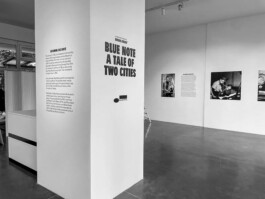


Art direction FOR HIGHSNOBIETY BERLIN, BERLIN 1–3, 2021–22 — Visual identity and design for locaslised creative platform: Initially launched as a digital exhibition during the Covid-19 lockdown to support Berlin’s creative scene, ‘Berlin, Berlin’ evolved into an omni-channel platform. Over three editions, the highly localised activation explored Berlin’s cultural identity through editorial storytelling, capsule collections with partners such as Neue Nationalgalerie and Tresor, as well as exhibitions, live streams and OOH campaigns. Contributions ranged from a live-streamed Ellen Allien set at the Boros Collection, a club night at Bierpinsel, to cultural formats like the Blue Note exhibition and an interactive city guide, alongside initiatives such as the ‘Berlin, Berlin Prize’ supporting local fashion designers. The series bridged physical and digital experiences. Design Director Chloé Techoueyres, VP, Brand Hendrik Jürgens, Brand Manager Anders Schans.
Art direction FOR HIGHSNOBIETY BERLIN, BERLIN 1–3, 2021–22 — Visual identity and design for locaslised creative platform: Initially launched as a digital exhibition during the Covid-19 lockdown to support Berlin’s creative scene, ‘Berlin, Berlin’ evolved into an omni-channel platform. Over three editions, the highly localised activation explored Berlin’s cultural identity through editorial storytelling, capsule collections with partners such as Neue Nationalgalerie and Tresor, as well as exhibitions, live streams and OOH campaigns. Contributions ranged from a live-streamed Ellen Allien set at the Boros Collection, a club night at Bierpinsel, to cultural formats like the Blue Note exhibition and an interactive city guide, alongside initiatives such as the ‘Berlin, Berlin Prize’ supporting local fashion designers. The series bridged physical and digital experiences. Design Director Chloé Techoueyres, VP, Brand Hendrik Jürgens, Brand Manager Anders Schans.
Art direction FOR HIGHSNOBIETY BERLIN, BERLIN 1–3, 2021–22 — Visual identity and design for locaslised creative platform: Initially launched as a digital exhibition during the Covid-19 lockdown to support Berlin’s creative scene, ‘Berlin, Berlin’ evolved into an omni-channel platform. Over three editions, the highly localised activation explored Berlin’s cultural identity through editorial storytelling, capsule collections with partners such as Neue Nationalgalerie and Tresor, as well as exhibitions, live streams and OOH campaigns. Contributions ranged from a live-streamed Ellen Allien set at the Boros Collection, a club night at Bierpinsel, to cultural formats like the Blue Note exhibition and an interactive city guide, alongside initiatives such as the ‘Berlin, Berlin Prize’ supporting local fashion designers. The series bridged physical and digital experiences. Design Director Chloé Techoueyres, VP, Brand Hendrik Jürgens, Brand Manager Anders Schans.
Art direction FOR HIGHSNOBIETY BERLIN, BERLIN 1–3, 2021–22 — Visual identity and design for locaslised creative platform: Initially launched as a digital exhibition during the Covid-19 lockdown to support Berlin’s creative scene, ‘Berlin, Berlin’ evolved into an omni-channel platform. Over three editions, the highly localised activation explored Berlin’s cultural identity through editorial storytelling, capsule collections with partners such as Neue Nationalgalerie and Tresor, as well as exhibitions, live streams and OOH campaigns. Contributions ranged from a live-streamed Ellen Allien set at the Boros Collection, a club night at Bierpinsel, to cultural formats like the Blue Note exhibition and an interactive city guide, alongside initiatives such as the ‘Berlin, Berlin Prize’ supporting local fashion designers. The series bridged physical and digital experiences. Design Director Chloé Techoueyres, VP, Brand Hendrik Jürgens, Brand Manager Anders Schans.
Art direction FOR HIGHSNOBIETY BERLIN, BERLIN 1–3, 2021–22 — Visual identity and design for locaslised creative platform: Initially launched as a digital exhibition during the Covid-19 lockdown to support Berlin’s creative scene, ‘Berlin, Berlin’ evolved into an omni-channel platform. Over three editions, the highly localised activation explored Berlin’s cultural identity through editorial storytelling, capsule collections with partners such as Neue Nationalgalerie and Tresor, as well as exhibitions, live streams and OOH campaigns. Contributions ranged from a live-streamed Ellen Allien set at the Boros Collection, a club night at Bierpinsel, to cultural formats like the Blue Note exhibition and an interactive city guide, alongside initiatives such as the ‘Berlin, Berlin Prize’ supporting local fashion designers. The series bridged physical and digital experiences. Design Director Chloé Techoueyres, VP, Brand Hendrik Jürgens, Brand Manager Anders Schans.
Art direction FOR HIGHSNOBIETY BERLIN, BERLIN 1–3, 2021–22 — Visual identity and design for locaslised creative platform: Initially launched as a digital exhibition during the Covid-19 lockdown to support Berlin’s creative scene, ‘Berlin, Berlin’ evolved into an omni-channel platform. Over three editions, the highly localised activation explored Berlin’s cultural identity through editorial storytelling, capsule collections with partners such as Neue Nationalgalerie and Tresor, as well as exhibitions, live streams and OOH campaigns. Contributions ranged from a live-streamed Ellen Allien set at the Boros Collection, a club night at Bierpinsel, to cultural formats like the Blue Note exhibition and an interactive city guide, alongside initiatives such as the ‘Berlin, Berlin Prize’ supporting local fashion designers. The series bridged physical and digital experiences. Design Director Chloé Techoueyres, VP, Brand Hendrik Jürgens, Brand Manager Anders Schans.
Art direction FOR HIGHSNOBIETY BERLIN, BERLIN 1–3, 2021–22 — Visual identity and design for locaslised creative platform: Initially launched as a digital exhibition during the Covid-19 lockdown to support Berlin’s creative scene, ‘Berlin, Berlin’ evolved into an omni-channel platform. Over three editions, the highly localised activation explored Berlin’s cultural identity through editorial storytelling, capsule collections with partners such as Neue Nationalgalerie and Tresor, as well as exhibitions, live streams and OOH campaigns. Contributions ranged from a live-streamed Ellen Allien set at the Boros Collection, a club night at Bierpinsel, to cultural formats like the Blue Note exhibition and an interactive city guide, alongside initiatives such as the ‘Berlin, Berlin Prize’ supporting local fashion designers. The series bridged physical and digital experiences. Design Director Chloé Techoueyres, VP, Brand Hendrik Jürgens, Brand Manager Anders Schans.
Art direction FOR HIGHSNOBIETY BERLIN, BERLIN 1–3, 2021–22 — Visual identity and design for locaslised creative platform: Initially launched as a digital exhibition during the Covid-19 lockdown to support Berlin’s creative scene, ‘Berlin, Berlin’ evolved into an omni-channel platform. Over three editions, the highly localised activation explored Berlin’s cultural identity through editorial storytelling, capsule collections with partners such as Neue Nationalgalerie and Tresor, as well as exhibitions, live streams and OOH campaigns. Contributions ranged from a live-streamed Ellen Allien set at the Boros Collection, a club night at Bierpinsel, to cultural formats like the Blue Note exhibition and an interactive city guide, alongside initiatives such as the ‘Berlin, Berlin Prize’ supporting local fashion designers. The series bridged physical and digital experiences. Design Director Chloé Techoueyres, VP, Brand Hendrik Jürgens, Brand Manager Anders Schans.
Art direction FOR HIGHSNOBIETY BERLIN, BERLIN 1–3, 2021–22 — Visual identity and design for locaslised creative platform: Initially launched as a digital exhibition during the Covid-19 lockdown to support Berlin’s creative scene, ‘Berlin, Berlin’ evolved into an omni-channel platform. Over three editions, the highly localised activation explored Berlin’s cultural identity through editorial storytelling, capsule collections with partners such as Neue Nationalgalerie and Tresor, as well as exhibitions, live streams and OOH campaigns. Contributions ranged from a live-streamed Ellen Allien set at the Boros Collection, a club night at Bierpinsel, to cultural formats like the Blue Note exhibition and an interactive city guide, alongside initiatives such as the ‘Berlin, Berlin Prize’ supporting local fashion designers. The series bridged physical and digital experiences. Design Director Chloé Techoueyres, VP, Brand Hendrik Jürgens, Brand Manager Anders Schans.
Art direction FOR HIGHSNOBIETY BERLIN, BERLIN 1–3, 2021–22 — Visual identity and design for locaslised creative platform: Initially launched as a digital exhibition during the Covid-19 lockdown to support Berlin’s creative scene, ‘Berlin, Berlin’ evolved into an omni-channel platform. Over three editions, the highly localised activation explored Berlin’s cultural identity through editorial storytelling, capsule collections with partners such as Neue Nationalgalerie and Tresor, as well as exhibitions, live streams and OOH campaigns. Contributions ranged from a live-streamed Ellen Allien set at the Boros Collection, a club night at Bierpinsel, to cultural formats like the Blue Note exhibition and an interactive city guide, alongside initiatives such as the ‘Berlin, Berlin Prize’ supporting local fashion designers. The series bridged physical and digital experiences. Design Director Chloé Techoueyres, VP, Brand Hendrik Jürgens, Brand Manager Anders Schans.
Art direction FOR HIGHSNOBIETY BERLIN, BERLIN 1–3, 2021–22 — Visual identity and design for locaslised creative platform: Initially launched as a digital exhibition during the Covid-19 lockdown to support Berlin’s creative scene, ‘Berlin, Berlin’ evolved into an omni-channel platform. Over three editions, the highly localised activation explored Berlin’s cultural identity through editorial storytelling, capsule collections with partners such as Neue Nationalgalerie and Tresor, as well as exhibitions, live streams and OOH campaigns. Contributions ranged from a live-streamed Ellen Allien set at the Boros Collection, a club night at Bierpinsel, to cultural formats like the Blue Note exhibition and an interactive city guide, alongside initiatives such as the ‘Berlin, Berlin Prize’ supporting local fashion designers. The series bridged physical and digital experiences. Design Director Chloé Techoueyres, VP, Brand Hendrik Jürgens, Brand Manager Anders Schans.
Art direction FOR HIGHSNOBIETY BERLIN, BERLIN 1–3, 2021–22 — Visual identity and design for locaslised creative platform: Initially launched as a digital exhibition during the Covid-19 lockdown to support Berlin’s creative scene, ‘Berlin, Berlin’ evolved into an omni-channel platform. Over three editions, the highly localised activation explored Berlin’s cultural identity through editorial storytelling, capsule collections with partners such as Neue Nationalgalerie and Tresor, as well as exhibitions, live streams and OOH campaigns. Contributions ranged from a live-streamed Ellen Allien set at the Boros Collection, a club night at Bierpinsel, to cultural formats like the Blue Note exhibition and an interactive city guide, alongside initiatives such as the ‘Berlin, Berlin Prize’ supporting local fashion designers. The series bridged physical and digital experiences. Design Director Chloé Techoueyres, VP, Brand Hendrik Jürgens, Brand Manager Anders Schans.
Art direction FOR HIGHSNOBIETY BERLIN, BERLIN 1–3, 2021–22 — Visual identity and design for locaslised creative platform: Initially launched as a digital exhibition during the Covid-19 lockdown to support Berlin’s creative scene, ‘Berlin, Berlin’ evolved into an omni-channel platform. Over three editions, the highly localised activation explored Berlin’s cultural identity through editorial storytelling, capsule collections with partners such as Neue Nationalgalerie and Tresor, as well as exhibitions, live streams and OOH campaigns. Contributions ranged from a live-streamed Ellen Allien set at the Boros Collection, a club night at Bierpinsel, to cultural formats like the Blue Note exhibition and an interactive city guide, alongside initiatives such as the ‘Berlin, Berlin Prize’ supporting local fashion designers. The series bridged physical and digital experiences. Design Director Chloé Techoueyres, VP, Brand Hendrik Jürgens, Brand Manager Anders Schans.
Art direction FOR HIGHSNOBIETY BERLIN, BERLIN 1–3, 2021–22 — Visual identity and design for locaslised creative platform: Initially launched as a digital exhibition during the Covid-19 lockdown to support Berlin’s creative scene, ‘Berlin, Berlin’ evolved into an omni-channel platform. Over three editions, the highly localised activation explored Berlin’s cultural identity through editorial storytelling, capsule collections with partners such as Neue Nationalgalerie and Tresor, as well as exhibitions, live streams and OOH campaigns. Contributions ranged from a live-streamed Ellen Allien set at the Boros Collection, a club night at Bierpinsel, to cultural formats like the Blue Note exhibition and an interactive city guide, alongside initiatives such as the ‘Berlin, Berlin Prize’ supporting local fashion designers. The series bridged physical and digital experiences. Design Director Chloé Techoueyres, VP, Brand Hendrik Jürgens, Brand Manager Anders Schans.
Art direction FOR HIGHSNOBIETY BERLIN, BERLIN 1–3, 2021–22 — Visual identity and design for locaslised creative platform: Initially launched as a digital exhibition during the Covid-19 lockdown to support Berlin’s creative scene, ‘Berlin, Berlin’ evolved into an omni-channel platform. Over three editions, the highly localised activation explored Berlin’s cultural identity through editorial storytelling, capsule collections with partners such as Neue Nationalgalerie and Tresor, as well as exhibitions, live streams and OOH campaigns. Contributions ranged from a live-streamed Ellen Allien set at the Boros Collection, a club night at Bierpinsel, to cultural formats like the Blue Note exhibition and an interactive city guide, alongside initiatives such as the ‘Berlin, Berlin Prize’ supporting local fashion designers. The series bridged physical and digital experiences. Design Director Chloé Techoueyres, VP, Brand Hendrik Jürgens, Brand Manager Anders Schans.
Art direction FOR HIGHSNOBIETY BERLIN, BERLIN 1–3, 2021–22 — Visual identity and design for locaslised creative platform: Initially launched as a digital exhibition during the Covid-19 lockdown to support Berlin’s creative scene, ‘Berlin, Berlin’ evolved into an omni-channel platform. Over three editions, the highly localised activation explored Berlin’s cultural identity through editorial storytelling, capsule collections with partners such as Neue Nationalgalerie and Tresor, as well as exhibitions, live streams and OOH campaigns. Contributions ranged from a live-streamed Ellen Allien set at the Boros Collection, a club night at Bierpinsel, to cultural formats like the Blue Note exhibition and an interactive city guide, alongside initiatives such as the ‘Berlin, Berlin Prize’ supporting local fashion designers. The series bridged physical and digital experiences. Design Director Chloé Techoueyres, VP, Brand Hendrik Jürgens, Brand Manager Anders Schans.
Art direction FOR HIGHSNOBIETY BERLIN, BERLIN 1–3, 2021–22 — Visual identity and design for locaslised creative platform: Initially launched as a digital exhibition during the Covid-19 lockdown to support Berlin’s creative scene, ‘Berlin, Berlin’ evolved into an omni-channel platform. Over three editions, the highly localised activation explored Berlin’s cultural identity through editorial storytelling, capsule collections with partners such as Neue Nationalgalerie and Tresor, as well as exhibitions, live streams and OOH campaigns. Contributions ranged from a live-streamed Ellen Allien set at the Boros Collection, a club night at Bierpinsel, to cultural formats like the Blue Note exhibition and an interactive city guide, alongside initiatives such as the ‘Berlin, Berlin Prize’ supporting local fashion designers. The series bridged physical and digital experiences. Design Director Chloé Techoueyres, VP, Brand Hendrik Jürgens, Brand Manager Anders Schans.
Art direction FOR HIGHSNOBIETY BERLIN, BERLIN 1–3, 2021–22 — Visual identity and design for locaslised creative platform: Initially launched as a digital exhibition during the Covid-19 lockdown to support Berlin’s creative scene, ‘Berlin, Berlin’ evolved into an omni-channel platform. Over three editions, the highly localised activation explored Berlin’s cultural identity through editorial storytelling, capsule collections with partners such as Neue Nationalgalerie and Tresor, as well as exhibitions, live streams and OOH campaigns. Contributions ranged from a live-streamed Ellen Allien set at the Boros Collection, a club night at Bierpinsel, to cultural formats like the Blue Note exhibition and an interactive city guide, alongside initiatives such as the ‘Berlin, Berlin Prize’ supporting local fashion designers. The series bridged physical and digital experiences. Design Director Chloé Techoueyres, VP, Brand Hendrik Jürgens, Brand Manager Anders Schans.
Art direction FOR HIGHSNOBIETY BERLIN, BERLIN 1–3, 2021–22 — Visual identity and design for locaslised creative platform: Initially launched as a digital exhibition during the Covid-19 lockdown to support Berlin’s creative scene, ‘Berlin, Berlin’ evolved into an omni-channel platform. Over three editions, the highly localised activation explored Berlin’s cultural identity through editorial storytelling, capsule collections with partners such as Neue Nationalgalerie and Tresor, as well as exhibitions, live streams and OOH campaigns. Contributions ranged from a live-streamed Ellen Allien set at the Boros Collection, a club night at Bierpinsel, to cultural formats like the Blue Note exhibition and an interactive city guide, alongside initiatives such as the ‘Berlin, Berlin Prize’ supporting local fashion designers. The series bridged physical and digital experiences. Design Director Chloé Techoueyres, VP, Brand Hendrik Jürgens, Brand Manager Anders Schans.
Art direction FOR HIGHSNOBIETY BERLIN, BERLIN 1–3, 2021–22 — Visual identity and design for locaslised creative platform: Initially launched as a digital exhibition during the Covid-19 lockdown to support Berlin’s creative scene, ‘Berlin, Berlin’ evolved into an omni-channel platform. Over three editions, the highly localised activation explored Berlin’s cultural identity through editorial storytelling, capsule collections with partners such as Neue Nationalgalerie and Tresor, as well as exhibitions, live streams and OOH campaigns. Contributions ranged from a live-streamed Ellen Allien set at the Boros Collection, a club night at Bierpinsel, to cultural formats like the Blue Note exhibition and an interactive city guide, alongside initiatives such as the ‘Berlin, Berlin Prize’ supporting local fashion designers. The series bridged physical and digital experiences. Design Director Chloé Techoueyres, VP, Brand Hendrik Jürgens, Brand Manager Anders Schans.
Art direction FOR HIGHSNOBIETY BERLIN, BERLIN 1–3, 2021–22 — Visual identity and design for locaslised creative platform: Initially launched as a digital exhibition during the Covid-19 lockdown to support Berlin’s creative scene, ‘Berlin, Berlin’ evolved into an omni-channel platform. Over three editions, the highly localised activation explored Berlin’s cultural identity through editorial storytelling, capsule collections with partners such as Neue Nationalgalerie and Tresor, as well as exhibitions, live streams and OOH campaigns. Contributions ranged from a live-streamed Ellen Allien set at the Boros Collection, a club night at Bierpinsel, to cultural formats like the Blue Note exhibition and an interactive city guide, alongside initiatives such as the ‘Berlin, Berlin Prize’ supporting local fashion designers. The series bridged physical and digital experiences. Design Director Chloé Techoueyres, VP, Brand Hendrik Jürgens, Brand Manager Anders Schans.
Art direction FOR HIGHSNOBIETY BERLIN, BERLIN 1–3, 2021–22 — Visual identity and design for locaslised creative platform: Initially launched as a digital exhibition during the Covid-19 lockdown to support Berlin’s creative scene, ‘Berlin, Berlin’ evolved into an omni-channel platform. Over three editions, the highly localised activation explored Berlin’s cultural identity through editorial storytelling, capsule collections with partners such as Neue Nationalgalerie and Tresor, as well as exhibitions, live streams and OOH campaigns. Contributions ranged from a live-streamed Ellen Allien set at the Boros Collection, a club night at Bierpinsel, to cultural formats like the Blue Note exhibition and an interactive city guide, alongside initiatives such as the ‘Berlin, Berlin Prize’ supporting local fashion designers. The series bridged physical and digital experiences. Design Director Chloé Techoueyres, VP, Brand Hendrik Jürgens, Brand Manager Anders Schans.
Art direction FOR HIGHSNOBIETY BERLIN, BERLIN 1–3, 2021–22 — Visual identity and design for locaslised creative platform: Initially launched as a digital exhibition during the Covid-19 lockdown to support Berlin’s creative scene, ‘Berlin, Berlin’ evolved into an omni-channel platform. Over three editions, the highly localised activation explored Berlin’s cultural identity through editorial storytelling, capsule collections with partners such as Neue Nationalgalerie and Tresor, as well as exhibitions, live streams and OOH campaigns. Contributions ranged from a live-streamed Ellen Allien set at the Boros Collection, a club night at Bierpinsel, to cultural formats like the Blue Note exhibition and an interactive city guide, alongside initiatives such as the ‘Berlin, Berlin Prize’ supporting local fashion designers. The series bridged physical and digital experiences. Design Director Chloé Techoueyres, VP, Brand Hendrik Jürgens, Brand Manager Anders Schans.
Art direction FOR HIGHSNOBIETY BERLIN, BERLIN 1–3, 2021–22 — Visual identity and design for locaslised creative platform: Initially launched as a digital exhibition during the Covid-19 lockdown to support Berlin’s creative scene, ‘Berlin, Berlin’ evolved into an omni-channel platform. Over three editions, the highly localised activation explored Berlin’s cultural identity through editorial storytelling, capsule collections with partners such as Neue Nationalgalerie and Tresor, as well as exhibitions, live streams and OOH campaigns. Contributions ranged from a live-streamed Ellen Allien set at the Boros Collection, a club night at Bierpinsel, to cultural formats like the Blue Note exhibition and an interactive city guide, alongside initiatives such as the ‘Berlin, Berlin Prize’ supporting local fashion designers. The series bridged physical and digital experiences. Design Director Chloé Techoueyres, VP, Brand Hendrik Jürgens, Brand Manager Anders Schans.
Art direction FOR HIGHSNOBIETY BERLIN, BERLIN 1–3, 2021–22 — Visual identity and design for locaslised creative platform: Initially launched as a digital exhibition during the Covid-19 lockdown to support Berlin’s creative scene, ‘Berlin, Berlin’ evolved into an omni-channel platform. Over three editions, the highly localised activation explored Berlin’s cultural identity through editorial storytelling, capsule collections with partners such as Neue Nationalgalerie and Tresor, as well as exhibitions, live streams and OOH campaigns. Contributions ranged from a live-streamed Ellen Allien set at the Boros Collection, a club night at Bierpinsel, to cultural formats like the Blue Note exhibition and an interactive city guide, alongside initiatives such as the ‘Berlin, Berlin Prize’ supporting local fashion designers. The series bridged physical and digital experiences. Design Director Chloé Techoueyres, VP, Brand Hendrik Jürgens, Brand Manager Anders Schans.


CONCEPT AND DESIGN FOR HIGHSNOBIETY X Nike Berlin Marathon, 2021 — Inspired by the Situationist concept of ‘Dérive’, the collection is based on the idea of traversing through a city with no end point in mind. Graphics represent Berlin landmarks, including the Berlin Bear and the typical ‘Plattenbau’, which are completed with each location's coordinates. Elsewhere, we track our route across the collection, following our own dérive exploring the city. The final ‘You Are Here’ graphic is referencing the common sign found on maps to identify one's location, and also serves as a nod to the importance of being "in the moment" for marathon runners. Creative concept with Chloé Techoueyres, Design with Nayan Graf Quartier, Chloé Techoueyres, Hampus Frage.
CONCEPT AND DESIGN FOR HIGHSNOBIETY X Nike Berlin Marathon, 2021 — Inspired by the Situationist concept of ‘Dérive’, the collection is based on the idea of traversing through a city with no end point in mind. Graphics represent Berlin landmarks, including the Berlin Bear and the typical ‘Plattenbau’, which are completed with each location's coordinates. Elsewhere, we track our route across the collection, following our own dérive exploring the city. The final ‘You Are Here’ graphic is referencing the common sign found on maps to identify one's location, and also serves as a nod to the importance of being "in the moment" for marathon runners. Creative concept with Chloé Techoueyres, Design with Nayan Graf Quartier, Chloé Techoueyres, Hampus Frage.
CONCEPT AND DESIGN FOR HIGHSNOBIETY X Nike Berlin Marathon, 2021 — Inspired by the Situationist concept of ‘Dérive’, the collection is based on the idea of traversing through a city with no end point in mind. Graphics represent Berlin landmarks, including the Berlin Bear and the typical ‘Plattenbau’, which are completed with each location's coordinates. Elsewhere, we track our route across the collection, following our own dérive exploring the city. The final ‘You Are Here’ graphic is referencing the common sign found on maps to identify one's location, and also serves as a nod to the importance of being "in the moment" for marathon runners. Creative concept with Chloé Techoueyres, Design with Nayan Graf Quartier, Chloé Techoueyres, Hampus Frage.
CONCEPT AND DESIGN FOR HIGHSNOBIETY X Nike Berlin Marathon, 2021 — Inspired by the Situationist concept of ‘Dérive’, the collection is based on the idea of traversing through a city with no end point in mind. Graphics represent Berlin landmarks, including the Berlin Bear and the typical ‘Plattenbau’, which are completed with each location's coordinates. Elsewhere, we track our route across the collection, following our own dérive exploring the city. The final ‘You Are Here’ graphic is referencing the common sign found on maps to identify one's location, and also serves as a nod to the importance of being "in the moment" for marathon runners. Creative concept with Chloé Techoueyres, Design with Nayan Graf Quartier, Chloé Techoueyres, Hampus Frage.
CONCEPT AND DESIGN FOR HIGHSNOBIETY X Nike Berlin Marathon, 2021 — Inspired by the Situationist concept of ‘Dérive’, the collection is based on the idea of traversing through a city with no end point in mind. Graphics represent Berlin landmarks, including the Berlin Bear and the typical ‘Plattenbau’, which are completed with each location's coordinates. Elsewhere, we track our route across the collection, following our own dérive exploring the city. The final ‘You Are Here’ graphic is referencing the common sign found on maps to identify one's location, and also serves as a nod to the importance of being "in the moment" for marathon runners. Creative concept with Chloé Techoueyres, Design with Nayan Graf Quartier, Chloé Techoueyres, Hampus Frage.
CONCEPT AND DESIGN FOR HIGHSNOBIETY X Nike Berlin Marathon, 2021 — Inspired by the Situationist concept of ‘Dérive’, the collection is based on the idea of traversing through a city with no end point in mind. Graphics represent Berlin landmarks, including the Berlin Bear and the typical ‘Plattenbau’, which are completed with each location's coordinates. Elsewhere, we track our route across the collection, following our own dérive exploring the city. The final ‘You Are Here’ graphic is referencing the common sign found on maps to identify one's location, and also serves as a nod to the importance of being "in the moment" for marathon runners. Creative concept with Chloé Techoueyres, Design with Nayan Graf Quartier, Chloé Techoueyres, Hampus Frage.
CONCEPT AND DESIGN FOR HIGHSNOBIETY X Nike Berlin Marathon, 2021 — Inspired by the Situationist concept of ‘Dérive’, the collection is based on the idea of traversing through a city with no end point in mind. Graphics represent Berlin landmarks, including the Berlin Bear and the typical ‘Plattenbau’, which are completed with each location's coordinates. Elsewhere, we track our route across the collection, following our own dérive exploring the city. The final ‘You Are Here’ graphic is referencing the common sign found on maps to identify one's location, and also serves as a nod to the importance of being "in the moment" for marathon runners. Creative concept with Chloé Techoueyres, Design with Nayan Graf Quartier, Chloé Techoueyres, Hampus Frage.
CONCEPT AND DESIGN FOR HIGHSNOBIETY X Nike Berlin Marathon, 2021 — Inspired by the Situationist concept of ‘Dérive’, the collection is based on the idea of traversing through a city with no end point in mind. Graphics represent Berlin landmarks, including the Berlin Bear and the typical ‘Plattenbau’, which are completed with each location's coordinates. Elsewhere, we track our route across the collection, following our own dérive exploring the city. The final ‘You Are Here’ graphic is referencing the common sign found on maps to identify one's location, and also serves as a nod to the importance of being "in the moment" for marathon runners. Creative concept with Chloé Techoueyres, Design with Nayan Graf Quartier, Chloé Techoueyres, Hampus Frage.
CONCEPT AND DESIGN FOR HIGHSNOBIETY X Nike Berlin Marathon, 2021 — Inspired by the Situationist concept of ‘Dérive’, the collection is based on the idea of traversing through a city with no end point in mind. Graphics represent Berlin landmarks, including the Berlin Bear and the typical ‘Plattenbau’, which are completed with each location's coordinates. Elsewhere, we track our route across the collection, following our own dérive exploring the city. The final ‘You Are Here’ graphic is referencing the common sign found on maps to identify one's location, and also serves as a nod to the importance of being "in the moment" for marathon runners. Creative concept with Chloé Techoueyres, Design with Nayan Graf Quartier, Chloé Techoueyres, Hampus Frage.
CONCEPT AND DESIGN FOR HIGHSNOBIETY X Nike Berlin Marathon, 2021 — Inspired by the Situationist concept of ‘Dérive’, the collection is based on the idea of traversing through a city with no end point in mind. Graphics represent Berlin landmarks, including the Berlin Bear and the typical ‘Plattenbau’, which are completed with each location's coordinates. Elsewhere, we track our route across the collection, following our own dérive exploring the city. The final ‘You Are Here’ graphic is referencing the common sign found on maps to identify one's location, and also serves as a nod to the importance of being "in the moment" for marathon runners. Creative concept with Chloé Techoueyres, Design with Nayan Graf Quartier, Chloé Techoueyres, Hampus Frage.


Design for MCM, 2019 — Miscellaneous graphics and branded materials. Global Art Director Timo Schmitt.
Design for MCM, 2019 — Miscellaneous graphics and branded materials. Global Art Director Timo Schmitt.
Design for MCM, 2019 — Miscellaneous graphics and branded materials. Global Art Director Timo Schmitt.
Design for MCM, 2019 — Miscellaneous graphics and branded materials. Global Art Director Timo Schmitt.
Design for MCM, 2019 — Miscellaneous graphics and branded materials. Global Art Director Timo Schmitt.
Design for MCM, 2019 — Miscellaneous graphics and branded materials. Global Art Director Timo Schmitt.
Design for MCM, 2019 — Miscellaneous graphics and branded materials. Global Art Director Timo Schmitt.
Design for MCM, 2019 — Miscellaneous graphics and branded materials. Global Art Director Timo Schmitt.
Design for MCM, 2019 — Miscellaneous graphics and branded materials. Global Art Director Timo Schmitt.
Design for MCM, 2019 — Miscellaneous graphics and branded materials. Global Art Director Timo Schmitt.


Concept and design for Highsnobiety x Braun, 2021 — 100 years on, Braun’s design ethos of simplicity and functionality lives on. The collection celebrates the impact Braun’s visual language continues to have on the aesthetic and functional aspects of product design. Creative Director Commerce Herbert Hofmann. Campaign with Laura Fritz, Filip Setmanuk (CGI).
Concept and design for Highsnobiety x Braun, 2021 — 100 years on, Braun’s design ethos of simplicity and functionality lives on. The collection celebrates the impact Braun’s visual language continues to have on the aesthetic and functional aspects of product design. Creative Director Commerce Herbert Hofmann. Campaign with Laura Fritz, Filip Setmanuk (CGI).
Concept and design for Highsnobiety x Braun, 2021 — 100 years on, Braun’s design ethos of simplicity and functionality lives on. The collection celebrates the impact Braun’s visual language continues to have on the aesthetic and functional aspects of product design. Creative Director Commerce Herbert Hofmann. Campaign with Laura Fritz, Filip Setmanuk (CGI).
Concept and design for Highsnobiety x Braun, 2021 — 100 years on, Braun’s design ethos of simplicity and functionality lives on. The collection celebrates the impact Braun’s visual language continues to have on the aesthetic and functional aspects of product design. Creative Director Commerce Herbert Hofmann. Campaign with Laura Fritz, Filip Setmanuk (CGI).
Concept and design for Highsnobiety x Braun, 2021 — 100 years on, Braun’s design ethos of simplicity and functionality lives on. The collection celebrates the impact Braun’s visual language continues to have on the aesthetic and functional aspects of product design. Creative Director Commerce Herbert Hofmann. Campaign with Laura Fritz, Filip Setmanuk (CGI).
Concept and design for Highsnobiety x Braun, 2021 — 100 years on, Braun’s design ethos of simplicity and functionality lives on. The collection celebrates the impact Braun’s visual language continues to have on the aesthetic and functional aspects of product design. Creative Director Commerce Herbert Hofmann. Campaign with Laura Fritz, Filip Setmanuk (CGI).
Concept and design for Highsnobiety x Braun, 2021 — 100 years on, Braun’s design ethos of simplicity and functionality lives on. The collection celebrates the impact Braun’s visual language continues to have on the aesthetic and functional aspects of product design. Creative Director Commerce Herbert Hofmann. Campaign with Laura Fritz, Filip Setmanuk (CGI).
Concept and design for Highsnobiety x Braun, 2021 — 100 years on, Braun’s design ethos of simplicity and functionality lives on. The collection celebrates the impact Braun’s visual language continues to have on the aesthetic and functional aspects of product design. Creative Director Commerce Herbert Hofmann. Campaign with Laura Fritz, Filip Setmanuk (CGI).
Concept and design for Highsnobiety x Braun, 2021 — 100 years on, Braun’s design ethos of simplicity and functionality lives on. The collection celebrates the impact Braun’s visual language continues to have on the aesthetic and functional aspects of product design. Creative Director Commerce Herbert Hofmann. Campaign with Laura Fritz, Filip Setmanuk (CGI).
Concept and design for Highsnobiety x Braun, 2021 — 100 years on, Braun’s design ethos of simplicity and functionality lives on. The collection celebrates the impact Braun’s visual language continues to have on the aesthetic and functional aspects of product design. Creative Director Commerce Herbert Hofmann. Campaign with Laura Fritz, Filip Setmanuk (CGI).
Concept and design for Highsnobiety x Braun, 2021 — 100 years on, Braun’s design ethos of simplicity and functionality lives on. The collection celebrates the impact Braun’s visual language continues to have on the aesthetic and functional aspects of product design. Creative Director Commerce Herbert Hofmann. Campaign with Laura Fritz, Filip Setmanuk (CGI).
Concept and design for Highsnobiety x Braun, 2021 — 100 years on, Braun’s design ethos of simplicity and functionality lives on. The collection celebrates the impact Braun’s visual language continues to have on the aesthetic and functional aspects of product design. Creative Director Commerce Herbert Hofmann. Campaign with Laura Fritz, Filip Setmanuk (CGI).
Concept and design for Highsnobiety x Braun, 2021 — 100 years on, Braun’s design ethos of simplicity and functionality lives on. The collection celebrates the impact Braun’s visual language continues to have on the aesthetic and functional aspects of product design. Creative Director Commerce Herbert Hofmann. Campaign with Laura Fritz, Filip Setmanuk (CGI).
Concept and design for Highsnobiety x Braun, 2021 — 100 years on, Braun’s design ethos of simplicity and functionality lives on. The collection celebrates the impact Braun’s visual language continues to have on the aesthetic and functional aspects of product design. Creative Director Commerce Herbert Hofmann. Campaign with Laura Fritz, Filip Setmanuk (CGI).


Art direction and design for Highsnobiety Not In Paris series, 2020–24 — Since launching in 2020 the ‘Not In Paris‘ evolved into a cultural platform spanning 6 editions and ran during Men’s Fashion Week; Encompassing pop-up spaces in Paris and brand collabs across fashion, food and music with partners such as Lacoste, Y-Project and Café de Flore. The visual language evolved with each edition and is rooted in surrealism subverted Parisian tropes across campaign, graphic and spatial executions. [IMG 1–3] OOH Poster campaign for NIP 4ème edition, 2022 [IMG 4–7] Art direction campaign for NIP 4ème edition: Shot by CG Watkins, styled by Kevin Lanoy, Creative concept and Art direction with Laura Fritz, 3D by Melanie Glück. [IMG 8–13] Spatial design for NIP 6ème edition, 2024: Referencing surrealist motifs: installation for Y-Project, upside-down café with Cedric Grolet, Baguette table with Café de Flore, installation for Lacoste [IMG 14–19] Visual Identity Misc. branded materials. VP, Creative Design Chloé Techoueyres.
Art direction and design for Highsnobiety Not In Paris series, 2020–24 — Since launching in 2020 the ‘Not In Paris‘ evolved into a cultural platform spanning 6 editions and ran during Men’s Fashion Week; Encompassing pop-up spaces in Paris and brand collabs across fashion, food and music with partners such as Lacoste, Y-Project and Café de Flore. The visual language evolved with each edition and is rooted in surrealism subverted Parisian tropes across campaign, graphic and spatial executions. [IMG 1–3] OOH Poster campaign for NIP 4ème edition, 2022 [IMG 4–7] Art direction campaign for NIP 4ème edition: Shot by CG Watkins, styled by Kevin Lanoy, Creative concept and Art direction with Laura Fritz, 3D by Melanie Glück. [IMG 8–13] Spatial design for NIP 6ème edition, 2024: Referencing surrealist motifs: installation for Y-Project, upside-down café with Cedric Grolet, Baguette table with Café de Flore, installation for Lacoste [IMG 14–19] Visual Identity Misc. branded materials. VP, Creative Design Chloé Techoueyres.
Art direction and design for Highsnobiety Not In Paris series, 2020–24 — Since launching in 2020 the ‘Not In Paris‘ evolved into a cultural platform spanning 6 editions and ran during Men’s Fashion Week; Encompassing pop-up spaces in Paris and brand collabs across fashion, food and music with partners such as Lacoste, Y-Project and Café de Flore. The visual language evolved with each edition and is rooted in surrealism subverted Parisian tropes across campaign, graphic and spatial executions. [IMG 1–3] OOH Poster campaign for NIP 4ème edition, 2022 [IMG 4–7] Art direction campaign for NIP 4ème edition: Shot by CG Watkins, styled by Kevin Lanoy, Creative concept and Art direction with Laura Fritz, 3D by Melanie Glück. [IMG 8–13] Spatial design for NIP 6ème edition, 2024: Referencing surrealist motifs: installation for Y-Project, upside-down café with Cedric Grolet, Baguette table with Café de Flore, installation for Lacoste [IMG 14–19] Visual Identity Misc. branded materials. VP, Creative Design Chloé Techoueyres.
Art direction and design for Highsnobiety Not In Paris series, 2020–24 — Since launching in 2020 the ‘Not In Paris‘ evolved into a cultural platform spanning 6 editions and ran during Men’s Fashion Week; Encompassing pop-up spaces in Paris and brand collabs across fashion, food and music with partners such as Lacoste, Y-Project and Café de Flore. The visual language evolved with each edition and is rooted in surrealism subverted Parisian tropes across campaign, graphic and spatial executions. [IMG 1–3] OOH Poster campaign for NIP 4ème edition, 2022 [IMG 4–7] Art direction campaign for NIP 4ème edition: Shot by CG Watkins, styled by Kevin Lanoy, Creative concept and Art direction with Laura Fritz, 3D by Melanie Glück. [IMG 8–13] Spatial design for NIP 6ème edition, 2024: Referencing surrealist motifs: installation for Y-Project, upside-down café with Cedric Grolet, Baguette table with Café de Flore, installation for Lacoste [IMG 14–19] Visual Identity Misc. branded materials. VP, Creative Design Chloé Techoueyres.
Art direction and design for Highsnobiety Not In Paris series, 2020–24 — Since launching in 2020 the ‘Not In Paris‘ evolved into a cultural platform spanning 6 editions and ran during Men’s Fashion Week; Encompassing pop-up spaces in Paris and brand collabs across fashion, food and music with partners such as Lacoste, Y-Project and Café de Flore. The visual language evolved with each edition and is rooted in surrealism subverted Parisian tropes across campaign, graphic and spatial executions. [IMG 1–3] OOH Poster campaign for NIP 4ème edition, 2022 [IMG 4–7] Art direction campaign for NIP 4ème edition: Shot by CG Watkins, styled by Kevin Lanoy, Creative concept and Art direction with Laura Fritz, 3D by Melanie Glück. [IMG 8–13] Spatial design for NIP 6ème edition, 2024: Referencing surrealist motifs: installation for Y-Project, upside-down café with Cedric Grolet, Baguette table with Café de Flore, installation for Lacoste [IMG 14–19] Visual Identity Misc. branded materials. VP, Creative Design Chloé Techoueyres.
Art direction and design for Highsnobiety Not In Paris series, 2020–24 — Since launching in 2020 the ‘Not In Paris‘ evolved into a cultural platform spanning 6 editions and ran during Men’s Fashion Week; Encompassing pop-up spaces in Paris and brand collabs across fashion, food and music with partners such as Lacoste, Y-Project and Café de Flore. The visual language evolved with each edition and is rooted in surrealism subverted Parisian tropes across campaign, graphic and spatial executions. [IMG 1–3] OOH Poster campaign for NIP 4ème edition, 2022 [IMG 4–7] Art direction campaign for NIP 4ème edition: Shot by CG Watkins, styled by Kevin Lanoy, Creative concept and Art direction with Laura Fritz, 3D by Melanie Glück. [IMG 8–13] Spatial design for NIP 6ème edition, 2024: Referencing surrealist motifs: installation for Y-Project, upside-down café with Cedric Grolet, Baguette table with Café de Flore, installation for Lacoste [IMG 14–19] Visual Identity Misc. branded materials. VP, Creative Design Chloé Techoueyres.
Art direction and design for Highsnobiety Not In Paris series, 2020–24 — Since launching in 2020 the ‘Not In Paris‘ evolved into a cultural platform spanning 6 editions and ran during Men’s Fashion Week; Encompassing pop-up spaces in Paris and brand collabs across fashion, food and music with partners such as Lacoste, Y-Project and Café de Flore. The visual language evolved with each edition and is rooted in surrealism subverted Parisian tropes across campaign, graphic and spatial executions. [IMG 1–3] OOH Poster campaign for NIP 4ème edition, 2022 [IMG 4–7] Art direction campaign for NIP 4ème edition: Shot by CG Watkins, styled by Kevin Lanoy, Creative concept and Art direction with Laura Fritz, 3D by Melanie Glück. [IMG 8–13] Spatial design for NIP 6ème edition, 2024: Referencing surrealist motifs: installation for Y-Project, upside-down café with Cedric Grolet, Baguette table with Café de Flore, installation for Lacoste [IMG 14–19] Visual Identity Misc. branded materials. VP, Creative Design Chloé Techoueyres.
Art direction and design for Highsnobiety Not In Paris series, 2020–24 — Since launching in 2020 the ‘Not In Paris‘ evolved into a cultural platform spanning 6 editions and ran during Men’s Fashion Week; Encompassing pop-up spaces in Paris and brand collabs across fashion, food and music with partners such as Lacoste, Y-Project and Café de Flore. The visual language evolved with each edition and is rooted in surrealism subverted Parisian tropes across campaign, graphic and spatial executions. [IMG 1–3] OOH Poster campaign for NIP 4ème edition, 2022 [IMG 4–7] Art direction campaign for NIP 4ème edition: Shot by CG Watkins, styled by Kevin Lanoy, Creative concept and Art direction with Laura Fritz, 3D by Melanie Glück. [IMG 8–13] Spatial design for NIP 6ème edition, 2024: Referencing surrealist motifs: installation for Y-Project, upside-down café with Cedric Grolet, Baguette table with Café de Flore, installation for Lacoste [IMG 14–19] Visual Identity Misc. branded materials. VP, Creative Design Chloé Techoueyres.
Art direction and design for Highsnobiety Not In Paris series, 2020–24 — Since launching in 2020 the ‘Not In Paris‘ evolved into a cultural platform spanning 6 editions and ran during Men’s Fashion Week; Encompassing pop-up spaces in Paris and brand collabs across fashion, food and music with partners such as Lacoste, Y-Project and Café de Flore. The visual language evolved with each edition and is rooted in surrealism subverted Parisian tropes across campaign, graphic and spatial executions. [IMG 1–3] OOH Poster campaign for NIP 4ème edition, 2022 [IMG 4–7] Art direction campaign for NIP 4ème edition: Shot by CG Watkins, styled by Kevin Lanoy, Creative concept and Art direction with Laura Fritz, 3D by Melanie Glück. [IMG 8–13] Spatial design for NIP 6ème edition, 2024: Referencing surrealist motifs: installation for Y-Project, upside-down café with Cedric Grolet, Baguette table with Café de Flore, installation for Lacoste [IMG 14–19] Visual Identity Misc. branded materials. VP, Creative Design Chloé Techoueyres.
Art direction and design for Highsnobiety Not In Paris series, 2020–24 — Since launching in 2020 the ‘Not In Paris‘ evolved into a cultural platform spanning 6 editions and ran during Men’s Fashion Week; Encompassing pop-up spaces in Paris and brand collabs across fashion, food and music with partners such as Lacoste, Y-Project and Café de Flore. The visual language evolved with each edition and is rooted in surrealism subverted Parisian tropes across campaign, graphic and spatial executions. [IMG 1–3] OOH Poster campaign for NIP 4ème edition, 2022 [IMG 4–7] Art direction campaign for NIP 4ème edition: Shot by CG Watkins, styled by Kevin Lanoy, Creative concept and Art direction with Laura Fritz, 3D by Melanie Glück. [IMG 8–13] Spatial design for NIP 6ème edition, 2024: Referencing surrealist motifs: installation for Y-Project, upside-down café with Cedric Grolet, Baguette table with Café de Flore, installation for Lacoste [IMG 14–19] Visual Identity Misc. branded materials. VP, Creative Design Chloé Techoueyres.
Art direction and design for Highsnobiety Not In Paris series, 2020–24 — Since launching in 2020 the ‘Not In Paris‘ evolved into a cultural platform spanning 6 editions and ran during Men’s Fashion Week; Encompassing pop-up spaces in Paris and brand collabs across fashion, food and music with partners such as Lacoste, Y-Project and Café de Flore. The visual language evolved with each edition and is rooted in surrealism subverted Parisian tropes across campaign, graphic and spatial executions. [IMG 1–3] OOH Poster campaign for NIP 4ème edition, 2022 [IMG 4–7] Art direction campaign for NIP 4ème edition: Shot by CG Watkins, styled by Kevin Lanoy, Creative concept and Art direction with Laura Fritz, 3D by Melanie Glück. [IMG 8–13] Spatial design for NIP 6ème edition, 2024: Referencing surrealist motifs: installation for Y-Project, upside-down café with Cedric Grolet, Baguette table with Café de Flore, installation for Lacoste [IMG 14–19] Visual Identity Misc. branded materials. VP, Creative Design Chloé Techoueyres.
Art direction and design for Highsnobiety Not In Paris series, 2020–24 — Since launching in 2020 the ‘Not In Paris‘ evolved into a cultural platform spanning 6 editions and ran during Men’s Fashion Week; Encompassing pop-up spaces in Paris and brand collabs across fashion, food and music with partners such as Lacoste, Y-Project and Café de Flore. The visual language evolved with each edition and is rooted in surrealism subverted Parisian tropes across campaign, graphic and spatial executions. [IMG 1–3] OOH Poster campaign for NIP 4ème edition, 2022 [IMG 4–7] Art direction campaign for NIP 4ème edition: Shot by CG Watkins, styled by Kevin Lanoy, Creative concept and Art direction with Laura Fritz, 3D by Melanie Glück. [IMG 8–13] Spatial design for NIP 6ème edition, 2024: Referencing surrealist motifs: installation for Y-Project, upside-down café with Cedric Grolet, Baguette table with Café de Flore, installation for Lacoste [IMG 14–19] Visual Identity Misc. branded materials. VP, Creative Design Chloé Techoueyres.
Art direction and design for Highsnobiety Not In Paris series, 2020–24 — Since launching in 2020 the ‘Not In Paris‘ evolved into a cultural platform spanning 6 editions and ran during Men’s Fashion Week; Encompassing pop-up spaces in Paris and brand collabs across fashion, food and music with partners such as Lacoste, Y-Project and Café de Flore. The visual language evolved with each edition and is rooted in surrealism subverted Parisian tropes across campaign, graphic and spatial executions. [IMG 1–3] OOH Poster campaign for NIP 4ème edition, 2022 [IMG 4–7] Art direction campaign for NIP 4ème edition: Shot by CG Watkins, styled by Kevin Lanoy, Creative concept and Art direction with Laura Fritz, 3D by Melanie Glück. [IMG 8–13] Spatial design for NIP 6ème edition, 2024: Referencing surrealist motifs: installation for Y-Project, upside-down café with Cedric Grolet, Baguette table with Café de Flore, installation for Lacoste [IMG 14–19] Visual Identity Misc. branded materials. VP, Creative Design Chloé Techoueyres.
Art direction and design for Highsnobiety Not In Paris series, 2020–24 — Since launching in 2020 the ‘Not In Paris‘ evolved into a cultural platform spanning 6 editions and ran during Men’s Fashion Week; Encompassing pop-up spaces in Paris and brand collabs across fashion, food and music with partners such as Lacoste, Y-Project and Café de Flore. The visual language evolved with each edition and is rooted in surrealism subverted Parisian tropes across campaign, graphic and spatial executions. [IMG 1–3] OOH Poster campaign for NIP 4ème edition, 2022 [IMG 4–7] Art direction campaign for NIP 4ème edition: Shot by CG Watkins, styled by Kevin Lanoy, Creative concept and Art direction with Laura Fritz, 3D by Melanie Glück. [IMG 8–13] Spatial design for NIP 6ème edition, 2024: Referencing surrealist motifs: installation for Y-Project, upside-down café with Cedric Grolet, Baguette table with Café de Flore, installation for Lacoste [IMG 14–19] Visual Identity Misc. branded materials. VP, Creative Design Chloé Techoueyres.
Art direction and design for Highsnobiety Not In Paris series, 2020–24 — Since launching in 2020 the ‘Not In Paris‘ evolved into a cultural platform spanning 6 editions and ran during Men’s Fashion Week; Encompassing pop-up spaces in Paris and brand collabs across fashion, food and music with partners such as Lacoste, Y-Project and Café de Flore. The visual language evolved with each edition and is rooted in surrealism subverted Parisian tropes across campaign, graphic and spatial executions. [IMG 1–3] OOH Poster campaign for NIP 4ème edition, 2022 [IMG 4–7] Art direction campaign for NIP 4ème edition: Shot by CG Watkins, styled by Kevin Lanoy, Creative concept and Art direction with Laura Fritz, 3D by Melanie Glück. [IMG 8–13] Spatial design for NIP 6ème edition, 2024: Referencing surrealist motifs: installation for Y-Project, upside-down café with Cedric Grolet, Baguette table with Café de Flore, installation for Lacoste [IMG 14–19] Visual Identity Misc. branded materials. VP, Creative Design Chloé Techoueyres.
Art direction and design for Highsnobiety Not In Paris series, 2020–24 — Since launching in 2020 the ‘Not In Paris‘ evolved into a cultural platform spanning 6 editions and ran during Men’s Fashion Week; Encompassing pop-up spaces in Paris and brand collabs across fashion, food and music with partners such as Lacoste, Y-Project and Café de Flore. The visual language evolved with each edition and is rooted in surrealism subverted Parisian tropes across campaign, graphic and spatial executions. [IMG 1–3] OOH Poster campaign for NIP 4ème edition, 2022 [IMG 4–7] Art direction campaign for NIP 4ème edition: Shot by CG Watkins, styled by Kevin Lanoy, Creative concept and Art direction with Laura Fritz, 3D by Melanie Glück. [IMG 8–13] Spatial design for NIP 6ème edition, 2024: Referencing surrealist motifs: installation for Y-Project, upside-down café with Cedric Grolet, Baguette table with Café de Flore, installation for Lacoste [IMG 14–19] Visual Identity Misc. branded materials. VP, Creative Design Chloé Techoueyres.
Art direction and design for Highsnobiety Not In Paris series, 2020–24 — Since launching in 2020 the ‘Not In Paris‘ evolved into a cultural platform spanning 6 editions and ran during Men’s Fashion Week; Encompassing pop-up spaces in Paris and brand collabs across fashion, food and music with partners such as Lacoste, Y-Project and Café de Flore. The visual language evolved with each edition and is rooted in surrealism subverted Parisian tropes across campaign, graphic and spatial executions. [IMG 1–3] OOH Poster campaign for NIP 4ème edition, 2022 [IMG 4–7] Art direction campaign for NIP 4ème edition: Shot by CG Watkins, styled by Kevin Lanoy, Creative concept and Art direction with Laura Fritz, 3D by Melanie Glück. [IMG 8–13] Spatial design for NIP 6ème edition, 2024: Referencing surrealist motifs: installation for Y-Project, upside-down café with Cedric Grolet, Baguette table with Café de Flore, installation for Lacoste [IMG 14–19] Visual Identity Misc. branded materials. VP, Creative Design Chloé Techoueyres.
Art direction and design for Highsnobiety Not In Paris series, 2020–24 — Since launching in 2020 the ‘Not In Paris‘ evolved into a cultural platform spanning 6 editions and ran during Men’s Fashion Week; Encompassing pop-up spaces in Paris and brand collabs across fashion, food and music with partners such as Lacoste, Y-Project and Café de Flore. The visual language evolved with each edition and is rooted in surrealism subverted Parisian tropes across campaign, graphic and spatial executions. [IMG 1–3] OOH Poster campaign for NIP 4ème edition, 2022 [IMG 4–7] Art direction campaign for NIP 4ème edition: Shot by CG Watkins, styled by Kevin Lanoy, Creative concept and Art direction with Laura Fritz, 3D by Melanie Glück. [IMG 8–13] Spatial design for NIP 6ème edition, 2024: Referencing surrealist motifs: installation for Y-Project, upside-down café with Cedric Grolet, Baguette table with Café de Flore, installation for Lacoste [IMG 14–19] Visual Identity Misc. branded materials. VP, Creative Design Chloé Techoueyres.
Art direction and design for Highsnobiety Not In Paris series, 2020–24 — Since launching in 2020 the ‘Not In Paris‘ evolved into a cultural platform spanning 6 editions and ran during Men’s Fashion Week; Encompassing pop-up spaces in Paris and brand collabs across fashion, food and music with partners such as Lacoste, Y-Project and Café de Flore. The visual language evolved with each edition and is rooted in surrealism subverted Parisian tropes across campaign, graphic and spatial executions. [IMG 1–3] OOH Poster campaign for NIP 4ème edition, 2022 [IMG 4–7] Art direction campaign for NIP 4ème edition: Shot by CG Watkins, styled by Kevin Lanoy, Creative concept and Art direction with Laura Fritz, 3D by Melanie Glück. [IMG 8–13] Spatial design for NIP 6ème edition, 2024: Referencing surrealist motifs: installation for Y-Project, upside-down café with Cedric Grolet, Baguette table with Café de Flore, installation for Lacoste [IMG 14–19] Visual Identity Misc. branded materials. VP, Creative Design Chloé Techoueyres.
Art direction and design for Highsnobiety Not In Paris series, 2020–24 — Since launching in 2020 the ‘Not In Paris‘ evolved into a cultural platform spanning 6 editions and ran during Men’s Fashion Week; Encompassing pop-up spaces in Paris and brand collabs across fashion, food and music with partners such as Lacoste, Y-Project and Café de Flore. The visual language evolved with each edition and is rooted in surrealism subverted Parisian tropes across campaign, graphic and spatial executions. [IMG 1–3] OOH Poster campaign for NIP 4ème edition, 2022 [IMG 4–7] Art direction campaign for NIP 4ème edition: Shot by CG Watkins, styled by Kevin Lanoy, Creative concept and Art direction with Laura Fritz, 3D by Melanie Glück. [IMG 8–13] Spatial design for NIP 6ème edition, 2024: Referencing surrealist motifs: installation for Y-Project, upside-down café with Cedric Grolet, Baguette table with Café de Flore, installation for Lacoste [IMG 14–19] Visual Identity Misc. branded materials. VP, Creative Design Chloé Techoueyres.


Art direction for Highsnobiety GATZEZERO Campaign, 2022 — Creative concept with Laura Fritz. Out-of-home takeover at CPH airport for GATEZERO’s Copenhagen store launch. Shot by Polo Lindström Muller, Video Miriam Woodburn, Production Jerome Glock.
Art direction for Highsnobiety GATZEZERO Campaign, 2022 — Creative concept with Laura Fritz. Out-of-home takeover at CPH airport for GATEZERO’s Copenhagen store launch. Shot by Polo Lindström Muller, Video Miriam Woodburn, Production Jerome Glock.
Art direction for Highsnobiety GATZEZERO Campaign, 2022 — Creative concept with Laura Fritz. Out-of-home takeover at CPH airport for GATEZERO’s Copenhagen store launch. Shot by Polo Lindström Muller, Video Miriam Woodburn, Production Jerome Glock.
Art direction for Highsnobiety GATZEZERO Campaign, 2022 — Creative concept with Laura Fritz. Out-of-home takeover at CPH airport for GATEZERO’s Copenhagen store launch. Shot by Polo Lindström Muller, Video Miriam Woodburn, Production Jerome Glock.
Art direction for Highsnobiety GATZEZERO Campaign, 2022 — Creative concept with Laura Fritz. Out-of-home takeover at CPH airport for GATEZERO’s Copenhagen store launch. Shot by Polo Lindström Muller, Video Miriam Woodburn, Production Jerome Glock.
Art direction for Highsnobiety GATZEZERO Campaign, 2022 — Creative concept with Laura Fritz. Out-of-home takeover at CPH airport for GATEZERO’s Copenhagen store launch. Shot by Polo Lindström Muller, Video Miriam Woodburn, Production Jerome Glock.
Art direction for Highsnobiety GATZEZERO Campaign, 2022 — Creative concept with Laura Fritz. Out-of-home takeover at CPH airport for GATEZERO’s Copenhagen store launch. Shot by Polo Lindström Muller, Video Miriam Woodburn, Production Jerome Glock.


Design for Uppers & Downers Store, 2024 — ‘Rose’ key visual developed as a unifying motif across packaging and in-store touchpoints for the Vienna concept store.
Design for Uppers & Downers Store, 2024 — ‘Rose’ key visual developed as a unifying motif across packaging and in-store touchpoints for the Vienna concept store.
Design for Uppers & Downers Store, 2024 — ‘Rose’ key visual developed as a unifying motif across packaging and in-store touchpoints for the Vienna concept store.
Design for Uppers & Downers Store, 2024 — ‘Rose’ key visual developed as a unifying motif across packaging and in-store touchpoints for the Vienna concept store.


BE@RBRICK “World Wide Tour 3” for Highsnobiety, Medicom Toy, 2021 — Using the bear as a canvas, the design concept evolved from Highsnobiety’s legacy as a publisher. We are paying tribute to our origin as a news platform by printing a graphic interpretation of an article onto the bear, that will be published on Highsnobiety.com. The graphic language takes cues from traditional newspaper design, while the image layer of semi-transparent hyperreal renderings ties back to the icon status of the bear. Exhibited in Tokyo, December 2021. Editor-in-Chief Thom Bettridge.
BE@RBRICK “World Wide Tour 3” for Highsnobiety, Medicom Toy, 2021 — Using the bear as a canvas, the design concept evolved from Highsnobiety’s legacy as a publisher. We are paying tribute to our origin as a news platform by printing a graphic interpretation of an article onto the bear, that will be published on Highsnobiety.com. The graphic language takes cues from traditional newspaper design, while the image layer of semi-transparent hyperreal renderings ties back to the icon status of the bear. Exhibited in Tokyo, December 2021. Editor-in-Chief Thom Bettridge.
BE@RBRICK “World Wide Tour 3” for Highsnobiety, Medicom Toy, 2021 — Using the bear as a canvas, the design concept evolved from Highsnobiety’s legacy as a publisher. We are paying tribute to our origin as a news platform by printing a graphic interpretation of an article onto the bear, that will be published on Highsnobiety.com. The graphic language takes cues from traditional newspaper design, while the image layer of semi-transparent hyperreal renderings ties back to the icon status of the bear. Exhibited in Tokyo, December 2021. Editor-in-Chief Thom Bettridge.
BE@RBRICK “World Wide Tour 3” for Highsnobiety, Medicom Toy, 2021 — Using the bear as a canvas, the design concept evolved from Highsnobiety’s legacy as a publisher. We are paying tribute to our origin as a news platform by printing a graphic interpretation of an article onto the bear, that will be published on Highsnobiety.com. The graphic language takes cues from traditional newspaper design, while the image layer of semi-transparent hyperreal renderings ties back to the icon status of the bear. Exhibited in Tokyo, December 2021. Editor-in-Chief Thom Bettridge.
BE@RBRICK “World Wide Tour 3” for Highsnobiety, Medicom Toy, 2021 — Using the bear as a canvas, the design concept evolved from Highsnobiety’s legacy as a publisher. We are paying tribute to our origin as a news platform by printing a graphic interpretation of an article onto the bear, that will be published on Highsnobiety.com. The graphic language takes cues from traditional newspaper design, while the image layer of semi-transparent hyperreal renderings ties back to the icon status of the bear. Exhibited in Tokyo, December 2021. Editor-in-Chief Thom Bettridge.
BE@RBRICK “World Wide Tour 3” for Highsnobiety, Medicom Toy, 2021 — Using the bear as a canvas, the design concept evolved from Highsnobiety’s legacy as a publisher. We are paying tribute to our origin as a news platform by printing a graphic interpretation of an article onto the bear, that will be published on Highsnobiety.com. The graphic language takes cues from traditional newspaper design, while the image layer of semi-transparent hyperreal renderings ties back to the icon status of the bear. Exhibited in Tokyo, December 2021. Editor-in-Chief Thom Bettridge.
1/1
Art Direction and Interview for Chapter TV: Jakob Kudsk Steensen: »Berl-Berl«, 2021 — A documentary about the immersive live-simulation »Berl-Berl« by Danish artist Jakob Kudsk Steensen at Halle am Berghain. Commissioned by Light Art Space (LAS), and in collaboration with sound composer Matt McCorkle, spatial sound designer Lugh O’Neill, as well as musician Arca, Steensen has created a multilayered, digital installation that takes visitors back to Berlin’s origin as a swamp. In this documentary, the artists give us insights into the visual and audio concept of »Berl-Berl« and the complex technology that brings it to life. Videography and Editing Frank Zerban, Sound Composer Matt McCorkle, Creative Producer Vanessa Mitchell.


Textile Graphics for MCM AW20 collection ‘Hypertechnoreality’, 2019 — Global Art Director Timo Schmitt, Creative Director Dirk Schönberger.
Textile Graphics for MCM AW20 collection ‘Hypertechnoreality’, 2019 — Global Art Director Timo Schmitt, Creative Director Dirk Schönberger.
Textile Graphics for MCM AW20 collection ‘Hypertechnoreality’, 2019 — Global Art Director Timo Schmitt, Creative Director Dirk Schönberger.
Textile Graphics for MCM AW20 collection ‘Hypertechnoreality’, 2019 — Global Art Director Timo Schmitt, Creative Director Dirk Schönberger.
Textile Graphics for MCM AW20 collection ‘Hypertechnoreality’, 2019 — Global Art Director Timo Schmitt, Creative Director Dirk Schönberger.
Textile Graphics for MCM AW20 collection ‘Hypertechnoreality’, 2019 — Global Art Director Timo Schmitt, Creative Director Dirk Schönberger.
Textile Graphics for MCM AW20 collection ‘Hypertechnoreality’, 2019 — Global Art Director Timo Schmitt, Creative Director Dirk Schönberger.
Textile Graphics for MCM AW20 collection ‘Hypertechnoreality’, 2019 — Global Art Director Timo Schmitt, Creative Director Dirk Schönberger.


Identity and store design concept for HIGHArt, 2021 — Highsnobitey pop-up store located in Miami's Design District during Art Basel: HIGHArt – A Museum Store Without the Museum. Design Director Chloé Techoueyres, Editor-in-Chief Thom Bettridge.
Identity and store design concept for HIGHArt, 2021 — Highsnobitey pop-up store located in Miami's Design District during Art Basel: HIGHArt – A Museum Store Without the Museum. Design Director Chloé Techoueyres, Editor-in-Chief Thom Bettridge.
Identity and store design concept for HIGHArt, 2021 — Highsnobitey pop-up store located in Miami's Design District during Art Basel: HIGHArt – A Museum Store Without the Museum. Design Director Chloé Techoueyres, Editor-in-Chief Thom Bettridge.
Identity and store design concept for HIGHArt, 2021 — Highsnobitey pop-up store located in Miami's Design District during Art Basel: HIGHArt – A Museum Store Without the Museum. Design Director Chloé Techoueyres, Editor-in-Chief Thom Bettridge.
Identity and store design concept for HIGHArt, 2021 — Highsnobitey pop-up store located in Miami's Design District during Art Basel: HIGHArt – A Museum Store Without the Museum. Design Director Chloé Techoueyres, Editor-in-Chief Thom Bettridge.
Identity and store design concept for HIGHArt, 2021 — Highsnobitey pop-up store located in Miami's Design District during Art Basel: HIGHArt – A Museum Store Without the Museum. Design Director Chloé Techoueyres, Editor-in-Chief Thom Bettridge.


Design for Highsnobiety Jazz TV, Merch design, visual identity and video graphics, 2020 — Highsnobiety teamed up with the iconic Newport Jazz Festival for a charitable three-day musical program that turned Highsnobiety into a public access television station dedicated to the art form of jazz, and also included a merch drop. The program featured a line-up of performances, DJ sets, and panels from across the worlds of music and fashion, including Virgil Abloh, Alex Da Kid, Tremaine Emory, Ali Shaheed Muhammad, among others. Design Director Chloé Techoueyres, Video editing Louie Mcpherson, Creative Director Commerce Herbert Hofmann, Editor-in-Chief Thom Bettridge.
Design for Highsnobiety Jazz TV, Merch design, visual identity and video graphics, 2020 — Highsnobiety teamed up with the iconic Newport Jazz Festival for a charitable three-day musical program that turned Highsnobiety into a public access television station dedicated to the art form of jazz, and also included a merch drop. The program featured a line-up of performances, DJ sets, and panels from across the worlds of music and fashion, including Virgil Abloh, Alex Da Kid, Tremaine Emory, Ali Shaheed Muhammad, among others. Design Director Chloé Techoueyres, Video editing Louie Mcpherson, Creative Director Commerce Herbert Hofmann, Editor-in-Chief Thom Bettridge.
Design for Highsnobiety Jazz TV, Merch design, visual identity and video graphics, 2020 — Highsnobiety teamed up with the iconic Newport Jazz Festival for a charitable three-day musical program that turned Highsnobiety into a public access television station dedicated to the art form of jazz, and also included a merch drop. The program featured a line-up of performances, DJ sets, and panels from across the worlds of music and fashion, including Virgil Abloh, Alex Da Kid, Tremaine Emory, Ali Shaheed Muhammad, among others. Design Director Chloé Techoueyres, Video editing Louie Mcpherson, Creative Director Commerce Herbert Hofmann, Editor-in-Chief Thom Bettridge.
Design for Highsnobiety Jazz TV, Merch design, visual identity and video graphics, 2020 — Highsnobiety teamed up with the iconic Newport Jazz Festival for a charitable three-day musical program that turned Highsnobiety into a public access television station dedicated to the art form of jazz, and also included a merch drop. The program featured a line-up of performances, DJ sets, and panels from across the worlds of music and fashion, including Virgil Abloh, Alex Da Kid, Tremaine Emory, Ali Shaheed Muhammad, among others. Design Director Chloé Techoueyres, Video editing Louie Mcpherson, Creative Director Commerce Herbert Hofmann, Editor-in-Chief Thom Bettridge.
Design for Highsnobiety Jazz TV, Merch design, visual identity and video graphics, 2020 — Highsnobiety teamed up with the iconic Newport Jazz Festival for a charitable three-day musical program that turned Highsnobiety into a public access television station dedicated to the art form of jazz, and also included a merch drop. The program featured a line-up of performances, DJ sets, and panels from across the worlds of music and fashion, including Virgil Abloh, Alex Da Kid, Tremaine Emory, Ali Shaheed Muhammad, among others. Design Director Chloé Techoueyres, Video editing Louie Mcpherson, Creative Director Commerce Herbert Hofmann, Editor-in-Chief Thom Bettridge.
Design for Highsnobiety Jazz TV, Merch design, visual identity and video graphics, 2020 — Highsnobiety teamed up with the iconic Newport Jazz Festival for a charitable three-day musical program that turned Highsnobiety into a public access television station dedicated to the art form of jazz, and also included a merch drop. The program featured a line-up of performances, DJ sets, and panels from across the worlds of music and fashion, including Virgil Abloh, Alex Da Kid, Tremaine Emory, Ali Shaheed Muhammad, among others. Design Director Chloé Techoueyres, Video editing Louie Mcpherson, Creative Director Commerce Herbert Hofmann, Editor-in-Chief Thom Bettridge.
Design for Highsnobiety Jazz TV, Merch design, visual identity and video graphics, 2020 — Highsnobiety teamed up with the iconic Newport Jazz Festival for a charitable three-day musical program that turned Highsnobiety into a public access television station dedicated to the art form of jazz, and also included a merch drop. The program featured a line-up of performances, DJ sets, and panels from across the worlds of music and fashion, including Virgil Abloh, Alex Da Kid, Tremaine Emory, Ali Shaheed Muhammad, among others. Design Director Chloé Techoueyres, Video editing Louie Mcpherson, Creative Director Commerce Herbert Hofmann, Editor-in-Chief Thom Bettridge.

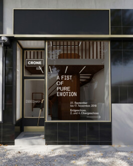
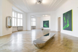


Visual identity for CRONE Side, 2018 — Visual identity for Galerie CRONE’s offsite location and exhibition “A Fist Of Pure Emotion,” featuring works by 22 artists. The identity system was built around the interplay of two contrasting typefaces and extended across printed matter, signage and spatial applications. Concept and design with Timo Schmitt.
Visual identity for CRONE Side, 2018 — Visual identity for Galerie CRONE’s offsite location and exhibition “A Fist Of Pure Emotion,” featuring works by 22 artists. The identity system was built around the interplay of two contrasting typefaces and extended across printed matter, signage and spatial applications. Concept and design with Timo Schmitt.
Visual identity for CRONE Side, 2018 — Visual identity for Galerie CRONE’s offsite location and exhibition “A Fist Of Pure Emotion,” featuring works by 22 artists. The identity system was built around the interplay of two contrasting typefaces and extended across printed matter, signage and spatial applications. Concept and design with Timo Schmitt.
Visual identity for CRONE Side, 2018 — Visual identity for Galerie CRONE’s offsite location and exhibition “A Fist Of Pure Emotion,” featuring works by 22 artists. The identity system was built around the interplay of two contrasting typefaces and extended across printed matter, signage and spatial applications. Concept and design with Timo Schmitt.
Visual identity for CRONE Side, 2018 — Visual identity for Galerie CRONE’s offsite location and exhibition “A Fist Of Pure Emotion,” featuring works by 22 artists. The identity system was built around the interplay of two contrasting typefaces and extended across printed matter, signage and spatial applications. Concept and design with Timo Schmitt.
Visual identity for CRONE Side, 2018 — Visual identity for Galerie CRONE’s offsite location and exhibition “A Fist Of Pure Emotion,” featuring works by 22 artists. The identity system was built around the interplay of two contrasting typefaces and extended across printed matter, signage and spatial applications. Concept and design with Timo Schmitt.
Visual identity for CRONE Side, 2018 — Visual identity for Galerie CRONE’s offsite location and exhibition “A Fist Of Pure Emotion,” featuring works by 22 artists. The identity system was built around the interplay of two contrasting typefaces and extended across printed matter, signage and spatial applications. Concept and design with Timo Schmitt.


‘Iconic Chairs’ series for Chapter Magazine Issue N° IV, 2020
‘Iconic Chairs’ series for Chapter Magazine Issue N° IV, 2020
‘Iconic Chairs’ series for Chapter Magazine Issue N° IV, 2020
‘Iconic Chairs’ series for Chapter Magazine Issue N° IV, 2020


Max Faber: Klapp-Stullen, Book Design, 200 pages, 2019 — In ‘Klapp-Stullen' (English: sandwich) the trained chef and food stylist Max Faber dissects and analyzes the cultural heritage of the sandwich using a scanner. We paired the high resolution images with statistics, infographics and essays. Thus, creating a unique mix of art book, cookbook and encyclopedia. Hardcover with black thread and open spine. Concept and design with Timo Schmitt. The book was shortlisted and awarded Silver in “The Most Beautiful German Books 2019” competition by “Stiftung Buchkunst” (Book Art Foundation).
Max Faber: Klapp-Stullen, Book Design, 200 pages, 2019 — In ‘Klapp-Stullen' (English: sandwich) the trained chef and food stylist Max Faber dissects and analyzes the cultural heritage of the sandwich using a scanner. We paired the high resolution images with statistics, infographics and essays. Thus, creating a unique mix of art book, cookbook and encyclopedia. Hardcover with black thread and open spine. Concept and design with Timo Schmitt. The book was shortlisted and awarded Silver in “The Most Beautiful German Books 2019” competition by “Stiftung Buchkunst” (Book Art Foundation).
Max Faber: Klapp-Stullen, Book Design, 200 pages, 2019 — In ‘Klapp-Stullen' (English: sandwich) the trained chef and food stylist Max Faber dissects and analyzes the cultural heritage of the sandwich using a scanner. We paired the high resolution images with statistics, infographics and essays. Thus, creating a unique mix of art book, cookbook and encyclopedia. Hardcover with black thread and open spine. Concept and design with Timo Schmitt. The book was shortlisted and awarded Silver in “The Most Beautiful German Books 2019” competition by “Stiftung Buchkunst” (Book Art Foundation).
Max Faber: Klapp-Stullen, Book Design, 200 pages, 2019 — In ‘Klapp-Stullen' (English: sandwich) the trained chef and food stylist Max Faber dissects and analyzes the cultural heritage of the sandwich using a scanner. We paired the high resolution images with statistics, infographics and essays. Thus, creating a unique mix of art book, cookbook and encyclopedia. Hardcover with black thread and open spine. Concept and design with Timo Schmitt. The book was shortlisted and awarded Silver in “The Most Beautiful German Books 2019” competition by “Stiftung Buchkunst” (Book Art Foundation).
Max Faber: Klapp-Stullen, Book Design, 200 pages, 2019 — In ‘Klapp-Stullen' (English: sandwich) the trained chef and food stylist Max Faber dissects and analyzes the cultural heritage of the sandwich using a scanner. We paired the high resolution images with statistics, infographics and essays. Thus, creating a unique mix of art book, cookbook and encyclopedia. Hardcover with black thread and open spine. Concept and design with Timo Schmitt. The book was shortlisted and awarded Silver in “The Most Beautiful German Books 2019” competition by “Stiftung Buchkunst” (Book Art Foundation).
Max Faber: Klapp-Stullen, Book Design, 200 pages, 2019 — In ‘Klapp-Stullen' (English: sandwich) the trained chef and food stylist Max Faber dissects and analyzes the cultural heritage of the sandwich using a scanner. We paired the high resolution images with statistics, infographics and essays. Thus, creating a unique mix of art book, cookbook and encyclopedia. Hardcover with black thread and open spine. Concept and design with Timo Schmitt. The book was shortlisted and awarded Silver in “The Most Beautiful German Books 2019” competition by “Stiftung Buchkunst” (Book Art Foundation).
Max Faber: Klapp-Stullen, Book Design, 200 pages, 2019 — In ‘Klapp-Stullen' (English: sandwich) the trained chef and food stylist Max Faber dissects and analyzes the cultural heritage of the sandwich using a scanner. We paired the high resolution images with statistics, infographics and essays. Thus, creating a unique mix of art book, cookbook and encyclopedia. Hardcover with black thread and open spine. Concept and design with Timo Schmitt. The book was shortlisted and awarded Silver in “The Most Beautiful German Books 2019” competition by “Stiftung Buchkunst” (Book Art Foundation).
Max Faber: Klapp-Stullen, Book Design, 200 pages, 2019 — In ‘Klapp-Stullen' (English: sandwich) the trained chef and food stylist Max Faber dissects and analyzes the cultural heritage of the sandwich using a scanner. We paired the high resolution images with statistics, infographics and essays. Thus, creating a unique mix of art book, cookbook and encyclopedia. Hardcover with black thread and open spine. Concept and design with Timo Schmitt. The book was shortlisted and awarded Silver in “The Most Beautiful German Books 2019” competition by “Stiftung Buchkunst” (Book Art Foundation).
Max Faber: Klapp-Stullen, Book Design, 200 pages, 2019 — In ‘Klapp-Stullen' (English: sandwich) the trained chef and food stylist Max Faber dissects and analyzes the cultural heritage of the sandwich using a scanner. We paired the high resolution images with statistics, infographics and essays. Thus, creating a unique mix of art book, cookbook and encyclopedia. Hardcover with black thread and open spine. Concept and design with Timo Schmitt. The book was shortlisted and awarded Silver in “The Most Beautiful German Books 2019” competition by “Stiftung Buchkunst” (Book Art Foundation).
Max Faber: Klapp-Stullen, Book Design, 200 pages, 2019 — In ‘Klapp-Stullen' (English: sandwich) the trained chef and food stylist Max Faber dissects and analyzes the cultural heritage of the sandwich using a scanner. We paired the high resolution images with statistics, infographics and essays. Thus, creating a unique mix of art book, cookbook and encyclopedia. Hardcover with black thread and open spine. Concept and design with Timo Schmitt. The book was shortlisted and awarded Silver in “The Most Beautiful German Books 2019” competition by “Stiftung Buchkunst” (Book Art Foundation).


LeadAwards 2018, Visual Identity, 2018 — LeadAwards is one of Germany’s most important media awards for newspapers, magazines and online media. After a one year hiatus, the format was restructured to honour publishers and chief editors in seven categories. In times of fake news debates and manipulation allegations, the LeadAcademy sees the personalisation of the award as a necessary signal to strengthen a free, independent, high quality journalism. The visual identity centers around the keyvisual, a sculptural rendering of a blank newspaper. For the winner certificates, white UV-ink was printed on gold, platinum and bronze paper. Concept and design with Timo Schmitt.
LeadAwards 2018, Visual Identity, 2018 — LeadAwards is one of Germany’s most important media awards for newspapers, magazines and online media. After a one year hiatus, the format was restructured to honour publishers and chief editors in seven categories. In times of fake news debates and manipulation allegations, the LeadAcademy sees the personalisation of the award as a necessary signal to strengthen a free, independent, high quality journalism. The visual identity centers around the keyvisual, a sculptural rendering of a blank newspaper. For the winner certificates, white UV-ink was printed on gold, platinum and bronze paper. Concept and design with Timo Schmitt.
LeadAwards 2018, Visual Identity, 2018 — LeadAwards is one of Germany’s most important media awards for newspapers, magazines and online media. After a one year hiatus, the format was restructured to honour publishers and chief editors in seven categories. In times of fake news debates and manipulation allegations, the LeadAcademy sees the personalisation of the award as a necessary signal to strengthen a free, independent, high quality journalism. The visual identity centers around the keyvisual, a sculptural rendering of a blank newspaper. For the winner certificates, white UV-ink was printed on gold, platinum and bronze paper. Concept and design with Timo Schmitt.
LeadAwards 2018, Visual Identity, 2018 — LeadAwards is one of Germany’s most important media awards for newspapers, magazines and online media. After a one year hiatus, the format was restructured to honour publishers and chief editors in seven categories. In times of fake news debates and manipulation allegations, the LeadAcademy sees the personalisation of the award as a necessary signal to strengthen a free, independent, high quality journalism. The visual identity centers around the keyvisual, a sculptural rendering of a blank newspaper. For the winner certificates, white UV-ink was printed on gold, platinum and bronze paper. Concept and design with Timo Schmitt.
LeadAwards 2018, Visual Identity, 2018 — LeadAwards is one of Germany’s most important media awards for newspapers, magazines and online media. After a one year hiatus, the format was restructured to honour publishers and chief editors in seven categories. In times of fake news debates and manipulation allegations, the LeadAcademy sees the personalisation of the award as a necessary signal to strengthen a free, independent, high quality journalism. The visual identity centers around the keyvisual, a sculptural rendering of a blank newspaper. For the winner certificates, white UV-ink was printed on gold, platinum and bronze paper. Concept and design with Timo Schmitt.


VEIT, Corporate design and art direction, 2016/2017 — VEIT was a vertically-integrated furniture brand centered on a modular furniture design system. The branding was developed to reflect the system’s minimalist design, high quality and adaptability. A timeless wordmark was paired with a minimalist graphic interpretation of the corner connector, the system’s defining structural element. The product photography continued this approach through clean compositions, controlled lighting and precise angles that highlighted material quality and the modular logic of the system.
VEIT, Corporate design and art direction, 2016/2017 — VEIT was a vertically-integrated furniture brand centered on a modular furniture design system. The branding was developed to reflect the system’s minimalist design, high quality and adaptability. A timeless wordmark was paired with a minimalist graphic interpretation of the corner connector, the system’s defining structural element. The product photography continued this approach through clean compositions, controlled lighting and precise angles that highlighted material quality and the modular logic of the system.
VEIT, Corporate design and art direction, 2016/2017 — VEIT was a vertically-integrated furniture brand centered on a modular furniture design system. The branding was developed to reflect the system’s minimalist design, high quality and adaptability. A timeless wordmark was paired with a minimalist graphic interpretation of the corner connector, the system’s defining structural element. The product photography continued this approach through clean compositions, controlled lighting and precise angles that highlighted material quality and the modular logic of the system.
VEIT, Corporate design and art direction, 2016/2017 — VEIT was a vertically-integrated furniture brand centered on a modular furniture design system. The branding was developed to reflect the system’s minimalist design, high quality and adaptability. A timeless wordmark was paired with a minimalist graphic interpretation of the corner connector, the system’s defining structural element. The product photography continued this approach through clean compositions, controlled lighting and precise angles that highlighted material quality and the modular logic of the system.
VEIT, Corporate design and art direction, 2016/2017 — VEIT was a vertically-integrated furniture brand centered on a modular furniture design system. The branding was developed to reflect the system’s minimalist design, high quality and adaptability. A timeless wordmark was paired with a minimalist graphic interpretation of the corner connector, the system’s defining structural element. The product photography continued this approach through clean compositions, controlled lighting and precise angles that highlighted material quality and the modular logic of the system.
VEIT, Corporate design and art direction, 2016/2017 — VEIT was a vertically-integrated furniture brand centered on a modular furniture design system. The branding was developed to reflect the system’s minimalist design, high quality and adaptability. A timeless wordmark was paired with a minimalist graphic interpretation of the corner connector, the system’s defining structural element. The product photography continued this approach through clean compositions, controlled lighting and precise angles that highlighted material quality and the modular logic of the system.
VEIT, Corporate design and art direction, 2016/2017 — VEIT was a vertically-integrated furniture brand centered on a modular furniture design system. The branding was developed to reflect the system’s minimalist design, high quality and adaptability. A timeless wordmark was paired with a minimalist graphic interpretation of the corner connector, the system’s defining structural element. The product photography continued this approach through clean compositions, controlled lighting and precise angles that highlighted material quality and the modular logic of the system.
VEIT, Corporate design and art direction, 2016/2017 — VEIT was a vertically-integrated furniture brand centered on a modular furniture design system. The branding was developed to reflect the system’s minimalist design, high quality and adaptability. A timeless wordmark was paired with a minimalist graphic interpretation of the corner connector, the system’s defining structural element. The product photography continued this approach through clean compositions, controlled lighting and precise angles that highlighted material quality and the modular logic of the system.
VEIT, Corporate design and art direction, 2016/2017 — VEIT was a vertically-integrated furniture brand centered on a modular furniture design system. The branding was developed to reflect the system’s minimalist design, high quality and adaptability. A timeless wordmark was paired with a minimalist graphic interpretation of the corner connector, the system’s defining structural element. The product photography continued this approach through clean compositions, controlled lighting and precise angles that highlighted material quality and the modular logic of the system.
VEIT, Corporate design and art direction, 2016/2017 — VEIT was a vertically-integrated furniture brand centered on a modular furniture design system. The branding was developed to reflect the system’s minimalist design, high quality and adaptability. A timeless wordmark was paired with a minimalist graphic interpretation of the corner connector, the system’s defining structural element. The product photography continued this approach through clean compositions, controlled lighting and precise angles that highlighted material quality and the modular logic of the system.
VEIT, Corporate design and art direction, 2016/2017 — VEIT was a vertically-integrated furniture brand centered on a modular furniture design system. The branding was developed to reflect the system’s minimalist design, high quality and adaptability. A timeless wordmark was paired with a minimalist graphic interpretation of the corner connector, the system’s defining structural element. The product photography continued this approach through clean compositions, controlled lighting and precise angles that highlighted material quality and the modular logic of the system.


Bauhaus Centenary, Campaign visuals, Stan Hema, 2019 — The key visual of the number “100” is characteristic for the visual identity of the 2019 centenary and consistently brands the many projects and events that are part of it. Stan Hema developed the corporate identity for the Bauhaus Centenary “100 years of bauhaus”. For and with Stan Hema.
Bauhaus Centenary, Campaign visuals, Stan Hema, 2019 — The key visual of the number “100” is characteristic for the visual identity of the 2019 centenary and consistently brands the many projects and events that are part of it. Stan Hema developed the corporate identity for the Bauhaus Centenary “100 years of bauhaus”. For and with Stan Hema.
Bauhaus Centenary, Campaign visuals, Stan Hema, 2019 — The key visual of the number “100” is characteristic for the visual identity of the 2019 centenary and consistently brands the many projects and events that are part of it. Stan Hema developed the corporate identity for the Bauhaus Centenary “100 years of bauhaus”. For and with Stan Hema.
Bauhaus Centenary, Campaign visuals, Stan Hema, 2019 — The key visual of the number “100” is characteristic for the visual identity of the 2019 centenary and consistently brands the many projects and events that are part of it. Stan Hema developed the corporate identity for the Bauhaus Centenary “100 years of bauhaus”. For and with Stan Hema.
Bauhaus Centenary, Campaign visuals, Stan Hema, 2019 — The key visual of the number “100” is characteristic for the visual identity of the 2019 centenary and consistently brands the many projects and events that are part of it. Stan Hema developed the corporate identity for the Bauhaus Centenary “100 years of bauhaus”. For and with Stan Hema.


Poetic Critique conference, Poster options, 2018 — For this academic conference poster I developed three options, each is reminiscent of the design language of mid-century Swiss poster design, playing with space and negative space in different ways. Hosted by Freie Universität and Indiana University.
Poetic Critique conference, Poster options, 2018 — For this academic conference poster I developed three options, each is reminiscent of the design language of mid-century Swiss poster design, playing with space and negative space in different ways. Hosted by Freie Universität and Indiana University.


Morgen und davor, Book design and editing, 192 pages, 2017 — Exploring a decade of graphic design within the visual communication class of Fons Hickmann at Berlin University of the Arts, the anthology is a comment on the past and future of teaching. Featuring 100 works by students as well as essays by designers Fons Hickmann, Franziska Morlok and others. The layout is dense, colorful and varied while allowing the individual works to make an impact. Overlapping images and text are compiled differently on each page. Concept and design with Lena Drießen, editing with Fons Hickmann, Pascal Kress and Lena Drießen, published by Verlag Hermann Schmidt.
Morgen und davor, Book design and editing, 192 pages, 2017 — Exploring a decade of graphic design within the visual communication class of Fons Hickmann at Berlin University of the Arts, the anthology is a comment on the past and future of teaching. Featuring 100 works by students as well as essays by designers Fons Hickmann, Franziska Morlok and others. The layout is dense, colorful and varied while allowing the individual works to make an impact. Overlapping images and text are compiled differently on each page. Concept and design with Lena Drießen, editing with Fons Hickmann, Pascal Kress and Lena Drießen, published by Verlag Hermann Schmidt.
Morgen und davor, Book design and editing, 192 pages, 2017 — Exploring a decade of graphic design within the visual communication class of Fons Hickmann at Berlin University of the Arts, the anthology is a comment on the past and future of teaching. Featuring 100 works by students as well as essays by designers Fons Hickmann, Franziska Morlok and others. The layout is dense, colorful and varied while allowing the individual works to make an impact. Overlapping images and text are compiled differently on each page. Concept and design with Lena Drießen, editing with Fons Hickmann, Pascal Kress and Lena Drießen, published by Verlag Hermann Schmidt.
Morgen und davor, Book design and editing, 192 pages, 2017 — Exploring a decade of graphic design within the visual communication class of Fons Hickmann at Berlin University of the Arts, the anthology is a comment on the past and future of teaching. Featuring 100 works by students as well as essays by designers Fons Hickmann, Franziska Morlok and others. The layout is dense, colorful and varied while allowing the individual works to make an impact. Overlapping images and text are compiled differently on each page. Concept and design with Lena Drießen, editing with Fons Hickmann, Pascal Kress and Lena Drießen, published by Verlag Hermann Schmidt.
Morgen und davor, Book design and editing, 192 pages, 2017 — Exploring a decade of graphic design within the visual communication class of Fons Hickmann at Berlin University of the Arts, the anthology is a comment on the past and future of teaching. Featuring 100 works by students as well as essays by designers Fons Hickmann, Franziska Morlok and others. The layout is dense, colorful and varied while allowing the individual works to make an impact. Overlapping images and text are compiled differently on each page. Concept and design with Lena Drießen, editing with Fons Hickmann, Pascal Kress and Lena Drießen, published by Verlag Hermann Schmidt.
Morgen und davor, Book design and editing, 192 pages, 2017 — Exploring a decade of graphic design within the visual communication class of Fons Hickmann at Berlin University of the Arts, the anthology is a comment on the past and future of teaching. Featuring 100 works by students as well as essays by designers Fons Hickmann, Franziska Morlok and others. The layout is dense, colorful and varied while allowing the individual works to make an impact. Overlapping images and text are compiled differently on each page. Concept and design with Lena Drießen, editing with Fons Hickmann, Pascal Kress and Lena Drießen, published by Verlag Hermann Schmidt.
Morgen und davor, Book design and editing, 192 pages, 2017 — Exploring a decade of graphic design within the visual communication class of Fons Hickmann at Berlin University of the Arts, the anthology is a comment on the past and future of teaching. Featuring 100 works by students as well as essays by designers Fons Hickmann, Franziska Morlok and others. The layout is dense, colorful and varied while allowing the individual works to make an impact. Overlapping images and text are compiled differently on each page. Concept and design with Lena Drießen, editing with Fons Hickmann, Pascal Kress and Lena Drießen, published by Verlag Hermann Schmidt.
Morgen und davor, Book design and editing, 192 pages, 2017 — Exploring a decade of graphic design within the visual communication class of Fons Hickmann at Berlin University of the Arts, the anthology is a comment on the past and future of teaching. Featuring 100 works by students as well as essays by designers Fons Hickmann, Franziska Morlok and others. The layout is dense, colorful and varied while allowing the individual works to make an impact. Overlapping images and text are compiled differently on each page. Concept and design with Lena Drießen, editing with Fons Hickmann, Pascal Kress and Lena Drießen, published by Verlag Hermann Schmidt.
Morgen und davor, Book design and editing, 192 pages, 2017 — Exploring a decade of graphic design within the visual communication class of Fons Hickmann at Berlin University of the Arts, the anthology is a comment on the past and future of teaching. Featuring 100 works by students as well as essays by designers Fons Hickmann, Franziska Morlok and others. The layout is dense, colorful and varied while allowing the individual works to make an impact. Overlapping images and text are compiled differently on each page. Concept and design with Lena Drießen, editing with Fons Hickmann, Pascal Kress and Lena Drießen, published by Verlag Hermann Schmidt.
Morgen und davor, Book design and editing, 192 pages, 2017 — Exploring a decade of graphic design within the visual communication class of Fons Hickmann at Berlin University of the Arts, the anthology is a comment on the past and future of teaching. Featuring 100 works by students as well as essays by designers Fons Hickmann, Franziska Morlok and others. The layout is dense, colorful and varied while allowing the individual works to make an impact. Overlapping images and text are compiled differently on each page. Concept and design with Lena Drießen, editing with Fons Hickmann, Pascal Kress and Lena Drießen, published by Verlag Hermann Schmidt.


Staatstheater Hannover, Poster series, stan Hema, 2018 — The Staatstheater Hannover (Hanover State Theatres) is a repertory theatre offering several theatrical genres: drama, opera and ballet. Stills from video recordings and other material are arranged into pairs creating visual references. Concept and design for and with Stan Hema.
Staatstheater Hannover, Poster series, stan Hema, 2018 — The Staatstheater Hannover (Hanover State Theatres) is a repertory theatre offering several theatrical genres: drama, opera and ballet. Stills from video recordings and other material are arranged into pairs creating visual references. Concept and design for and with Stan Hema.


A-B.international, Cultural journal, Founding member and Art Direction, 2018 — A-B.international is the first independent magazine in Greek and German to deal with political and social matters from both countries. The content of the first issue was created in collaboration with journalists, photographers and writers to encourage intercultural exchange and reinforce unity and solidarity between Greece and Germany and across Europe. Type-set in both German and Greek, the challenge of multiple scripts is addressed differently in each category with various layout approaches. As well as being a co-founder and part of the editorial team, I was responsible for the art direction and graphic design of the magazine. Editing with Danai Moschona and Theodor Hillmann.
A-B.international, Cultural journal, Founding member and Art Direction, 2018 — A-B.international is the first independent magazine in Greek and German to deal with political and social matters from both countries. The content of the first issue was created in collaboration with journalists, photographers and writers to encourage intercultural exchange and reinforce unity and solidarity between Greece and Germany and across Europe. Type-set in both German and Greek, the challenge of multiple scripts is addressed differently in each category with various layout approaches. As well as being a co-founder and part of the editorial team, I was responsible for the art direction and graphic design of the magazine. Editing with Danai Moschona and Theodor Hillmann.


Die Entfremdung im Raum (“spatial alienation”), Art show, 2018 — “Die Entfremdung im Raum” evokes connotations of a tour through displaced model scenes of social housing projects in a state of timeless purity. The project explores the feeling of alienation in urban living spaces. The images are the result of a multi-stage process of transformation: Based on photographs taken in Berlin, Tokyo and Hong Kong, the cityscapes are reconstructed as 3D-models, which are then rendered and displayed as large format prints. Thus, architecture is preserved at the moment of its creative perfection. Pristine building reliefs linger in a suspended state between fiction and reality, which persists even when the viewer has recognized the difference between rendering and photography. In this parallel world, there is an uncanny beauty and melancholy of the absence of men in man-made structures. Developed within the frame of my bachelor’s degree in 2017 at the Berlin University of the Arts, the work was nominated for the IBB-Preis für Fotografie (Karl-Hofer-Gesellschaft and Investionsbank Berlin) and was subject of a solo show in the gallery space of Fotopioniere in August/September 2018.
Die Entfremdung im Raum (“spatial alienation”), Art show, 2018 — “Die Entfremdung im Raum” evokes connotations of a tour through displaced model scenes of social housing projects in a state of timeless purity. The project explores the feeling of alienation in urban living spaces. The images are the result of a multi-stage process of transformation: Based on photographs taken in Berlin, Tokyo and Hong Kong, the cityscapes are reconstructed as 3D-models, which are then rendered and displayed as large format prints. Thus, architecture is preserved at the moment of its creative perfection. Pristine building reliefs linger in a suspended state between fiction and reality, which persists even when the viewer has recognized the difference between rendering and photography. In this parallel world, there is an uncanny beauty and melancholy of the absence of men in man-made structures. Developed within the frame of my bachelor’s degree in 2017 at the Berlin University of the Arts, the work was nominated for the IBB-Preis für Fotografie (Karl-Hofer-Gesellschaft and Investionsbank Berlin) and was subject of a solo show in the gallery space of Fotopioniere in August/September 2018.
Die Entfremdung im Raum (“spatial alienation”), Art show, 2018 — “Die Entfremdung im Raum” evokes connotations of a tour through displaced model scenes of social housing projects in a state of timeless purity. The project explores the feeling of alienation in urban living spaces. The images are the result of a multi-stage process of transformation: Based on photographs taken in Berlin, Tokyo and Hong Kong, the cityscapes are reconstructed as 3D-models, which are then rendered and displayed as large format prints. Thus, architecture is preserved at the moment of its creative perfection. Pristine building reliefs linger in a suspended state between fiction and reality, which persists even when the viewer has recognized the difference between rendering and photography. In this parallel world, there is an uncanny beauty and melancholy of the absence of men in man-made structures. Developed within the frame of my bachelor’s degree in 2017 at the Berlin University of the Arts, the work was nominated for the IBB-Preis für Fotografie (Karl-Hofer-Gesellschaft and Investionsbank Berlin) and was subject of a solo show in the gallery space of Fotopioniere in August/September 2018.
Die Entfremdung im Raum (“spatial alienation”), Art show, 2018 — “Die Entfremdung im Raum” evokes connotations of a tour through displaced model scenes of social housing projects in a state of timeless purity. The project explores the feeling of alienation in urban living spaces. The images are the result of a multi-stage process of transformation: Based on photographs taken in Berlin, Tokyo and Hong Kong, the cityscapes are reconstructed as 3D-models, which are then rendered and displayed as large format prints. Thus, architecture is preserved at the moment of its creative perfection. Pristine building reliefs linger in a suspended state between fiction and reality, which persists even when the viewer has recognized the difference between rendering and photography. In this parallel world, there is an uncanny beauty and melancholy of the absence of men in man-made structures. Developed within the frame of my bachelor’s degree in 2017 at the Berlin University of the Arts, the work was nominated for the IBB-Preis für Fotografie (Karl-Hofer-Gesellschaft and Investionsbank Berlin) and was subject of a solo show in the gallery space of Fotopioniere in August/September 2018.
Die Entfremdung im Raum (“spatial alienation”), Art show, 2018 — “Die Entfremdung im Raum” evokes connotations of a tour through displaced model scenes of social housing projects in a state of timeless purity. The project explores the feeling of alienation in urban living spaces. The images are the result of a multi-stage process of transformation: Based on photographs taken in Berlin, Tokyo and Hong Kong, the cityscapes are reconstructed as 3D-models, which are then rendered and displayed as large format prints. Thus, architecture is preserved at the moment of its creative perfection. Pristine building reliefs linger in a suspended state between fiction and reality, which persists even when the viewer has recognized the difference between rendering and photography. In this parallel world, there is an uncanny beauty and melancholy of the absence of men in man-made structures. Developed within the frame of my bachelor’s degree in 2017 at the Berlin University of the Arts, the work was nominated for the IBB-Preis für Fotografie (Karl-Hofer-Gesellschaft and Investionsbank Berlin) and was subject of a solo show in the gallery space of Fotopioniere in August/September 2018.
Die Entfremdung im Raum (“spatial alienation”), Art show, 2018 — “Die Entfremdung im Raum” evokes connotations of a tour through displaced model scenes of social housing projects in a state of timeless purity. The project explores the feeling of alienation in urban living spaces. The images are the result of a multi-stage process of transformation: Based on photographs taken in Berlin, Tokyo and Hong Kong, the cityscapes are reconstructed as 3D-models, which are then rendered and displayed as large format prints. Thus, architecture is preserved at the moment of its creative perfection. Pristine building reliefs linger in a suspended state between fiction and reality, which persists even when the viewer has recognized the difference between rendering and photography. In this parallel world, there is an uncanny beauty and melancholy of the absence of men in man-made structures. Developed within the frame of my bachelor’s degree in 2017 at the Berlin University of the Arts, the work was nominated for the IBB-Preis für Fotografie (Karl-Hofer-Gesellschaft and Investionsbank Berlin) and was subject of a solo show in the gallery space of Fotopioniere in August/September 2018.
Die Entfremdung im Raum (“spatial alienation”), Art show, 2018 — “Die Entfremdung im Raum” evokes connotations of a tour through displaced model scenes of social housing projects in a state of timeless purity. The project explores the feeling of alienation in urban living spaces. The images are the result of a multi-stage process of transformation: Based on photographs taken in Berlin, Tokyo and Hong Kong, the cityscapes are reconstructed as 3D-models, which are then rendered and displayed as large format prints. Thus, architecture is preserved at the moment of its creative perfection. Pristine building reliefs linger in a suspended state between fiction and reality, which persists even when the viewer has recognized the difference between rendering and photography. In this parallel world, there is an uncanny beauty and melancholy of the absence of men in man-made structures. Developed within the frame of my bachelor’s degree in 2017 at the Berlin University of the Arts, the work was nominated for the IBB-Preis für Fotografie (Karl-Hofer-Gesellschaft and Investionsbank Berlin) and was subject of a solo show in the gallery space of Fotopioniere in August/September 2018.


Die Entfremdung im Raum (“spatial alienation”), Monograph, 132 pages, 2017/2018 — Developed within the frame of my bachelor’s degree in 2017 at the Berlin University of the Arts, the work was nominated for the IBB-Preis für Fotografie (Karl-Hofer-Gesellschaft and Investionsbank Berlin) and was subject of a solo show in the gallery space of Fotopioniere in August/September 2018.
Die Entfremdung im Raum (“spatial alienation”), Monograph, 132 pages, 2017/2018 — Developed within the frame of my bachelor’s degree in 2017 at the Berlin University of the Arts, the work was nominated for the IBB-Preis für Fotografie (Karl-Hofer-Gesellschaft and Investionsbank Berlin) and was subject of a solo show in the gallery space of Fotopioniere in August/September 2018.
Die Entfremdung im Raum (“spatial alienation”), Monograph, 132 pages, 2017/2018 — Developed within the frame of my bachelor’s degree in 2017 at the Berlin University of the Arts, the work was nominated for the IBB-Preis für Fotografie (Karl-Hofer-Gesellschaft and Investionsbank Berlin) and was subject of a solo show in the gallery space of Fotopioniere in August/September 2018.
Die Entfremdung im Raum (“spatial alienation”), Monograph, 132 pages, 2017/2018 — Developed within the frame of my bachelor’s degree in 2017 at the Berlin University of the Arts, the work was nominated for the IBB-Preis für Fotografie (Karl-Hofer-Gesellschaft and Investionsbank Berlin) and was subject of a solo show in the gallery space of Fotopioniere in August/September 2018.
Die Entfremdung im Raum (“spatial alienation”), Monograph, 132 pages, 2017/2018 — Developed within the frame of my bachelor’s degree in 2017 at the Berlin University of the Arts, the work was nominated for the IBB-Preis für Fotografie (Karl-Hofer-Gesellschaft and Investionsbank Berlin) and was subject of a solo show in the gallery space of Fotopioniere in August/September 2018.
back to top